
Meleica
-
I consider myself an advanced amateur photographer ( and "professional" equipment junkie ). I have had some of my best photos purchased to be used in a commercial setting, but I still consider myself an advanced amateur.
Over the years, I think my wife has become my harshest critic. Shots that I think are excellent, she'll say are "ok.." Yet, others who see my work ( average Joe's ) think its "awesome" or "excellent"
Who's more right ?
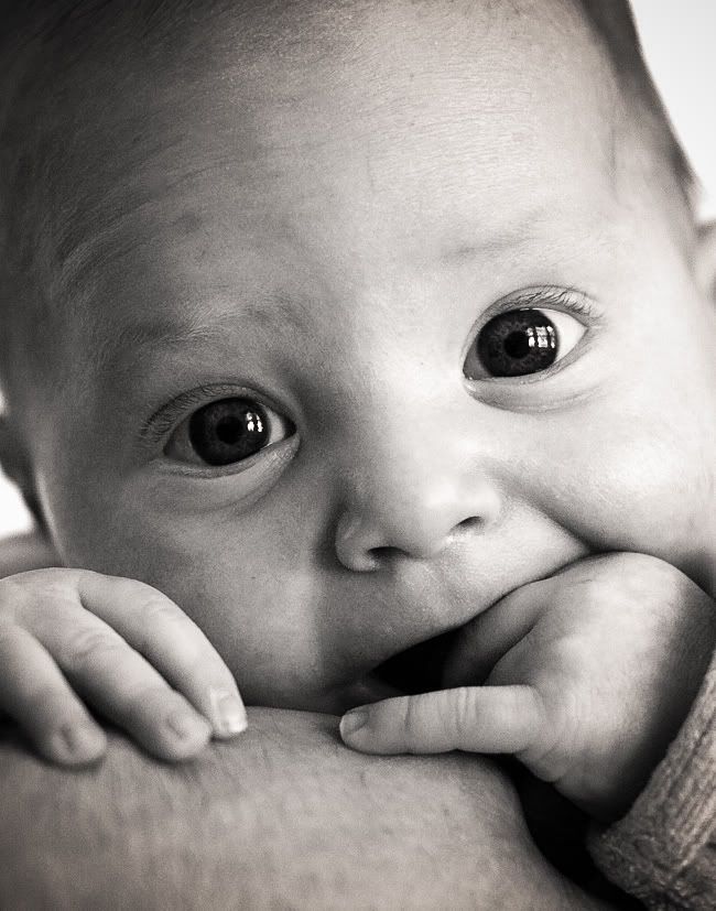
How would you rate the image below. Poor, Fair, Good, Very Good, Excellent or "Professional Grade" Lets say 1 being the lowest, 5 being the highest (best) score.
Shot handheld, available light, 1/50 F2 at iso 800. 8x10 image format.

Dan
Over the years, I think my wife has become my harshest critic. Shots that I think are excellent, she'll say are "ok.." Yet, others who see my work ( average Joe's ) think its "awesome" or "excellent"
Who's more right ?
How would you rate the image below. Poor, Fair, Good, Very Good, Excellent or "Professional Grade" Lets say 1 being the lowest, 5 being the highest (best) score.
Shot handheld, available light, 1/50 F2 at iso 800. 8x10 image format.
Dan
Last edited:
Good in what context?
It's a technically competent snapshot of a healthy baby. In that sense it's "good".
As far as any other criteria, the "goodness" depends on the value of the photo to you. If it's your baby and you want a memento, it's "very good".
It looks like any one of millions or billions of other baby photos that have been taken.
gavinlg
Mentor
Personally I don't like sepia tones in images - it's largely a personal thing, even the slightest tinge of sepia gets on my nerves. However, the image is really quite strong. The expression, composition and technicalities of the image are really great - If you were a working pro, most client would LOVE this sort of their child.
As it stands, because of my distaste for sepia toned images, I'd give it a 3 out of 5.
With a B&W conversion, it could possibly go up a star, depending on how good the conversion is.
Cute kid by the way!
As it stands, because of my distaste for sepia toned images, I'd give it a 3 out of 5.
With a B&W conversion, it could possibly go up a star, depending on how good the conversion is.
Cute kid by the way!
robin a
Well-known
Man, thats a 5,great eyes and composition.And,a even cuter subject..........Robin
Meleica
-
context doesnt really matter.... the viewer defines "good"......do we think master photographers work is only good or bad in a certain context ? this may be a great side conversation too !
mfogiel
Mentor
Technically, this shot is plenty sharp, although one eye is sharper than the other, so this takes away a little bit of sparkle. The crop is acceptable, but in my opinion, the object is the expression of the eyes, and the mouth, so it could be a bit tighter on the forehead. The expression is very well captured. Now we come to the painful part: the tonality is barely sufficient for getting the "professional" grade in B&W - and is typical of digital camera sensors, so to sum up:
sharpness:4,5
crop: 4
expression:5
tonality:2
average:3.68
sharpness:4,5
crop: 4
expression:5
tonality:2
average:3.68
PS: I'm not implying that there's anything wrong with baby photos. I have taken hundreds of photos of my own baby in the last few weeks.
I think they're "good" too, but whether they are of any interest to anyone other than my immediate family or circle of friends is highly doubtful.
My photos are "good" in a technical sense. As far as "art" or other weights applied to judging them, they are decidedly average.
I think they're "good" too, but whether they are of any interest to anyone other than my immediate family or circle of friends is highly doubtful.
My photos are "good" in a technical sense. As far as "art" or other weights applied to judging them, they are decidedly average.
This is professional quality. Parents should be so lucky to get quality shots like this from a professional studio.
LOOP
maraboutflash
A natural link !
A natural link !
Human beings allways think that their baby is so cute ... it is a good thing because a baby has nothing else to ask for the protection that he/she needs....
But a "stranger" has nothing to say about it... It is difficult to comment your picture.
To my own taste babies are ugly and not very attractives apart from the "natural connection"... "Ohhhh It is mine I have created a genious... I am so proud ..."
This feeling will help you to get up at night when he'll be crying for hours....
I wish to him/her a good life !!!!!
Meleica
-
You are assuming its my baby...
I take lots of "people" pics...

AND EVEN SOME NON-PEOPLE PICS.

I take lots of "people" pics...
AND EVEN SOME NON-PEOPLE PICS.
Last edited:
payasam
a.k.a. Mukul Dube
Because I abhor the misuse of the work "awesome", I must call this picture excellent. The baby's parents will love it, others will objectively evaluate its quality.
Robert Price
I missed what?
I love the photo. I would give it a 5 but I would have shot it at f4 to get a little more sharpness out of the foreground. Beatiful child, great moment captured!
gavinlg
Mentor
Dan - May I have permission to post my interpretation of the post processing of the first image? It's just a black and white conversion - I'm willing to post up how it was done as well. If you'd prefer me not to I would completely understand!
Gavin
Gavin
I like the train photo very much, the other child photo is also very well done, I think much better than the original baby photo.
The train photo is dramatic, well exposed, sharp and conveys a good dynamic. I would not hesitate to use this photo as an illustration for publication if I was an editor.
The train photo is dramatic, well exposed, sharp and conveys a good dynamic. I would not hesitate to use this photo as an illustration for publication if I was an editor.
Meleica
-
good ahead with your version - I am no expert with post processing. The image went from a 11mb RAW file down to a reasonable jpg...
Dan
Dan
mike goldberg
The Peaceful Pacific
As for me, I like sepia. I'd give the child shot a 5, and the locomotive a 4.
Keep shooting! Mike
Keep shooting! Mike
gavinlg
Mentor
I realize this would most likely be too dramatic for parents wanting a portrait of their kid, but I wanted to do more a dramatic art sort of style version, and also I wanted to see what it would look like in B&W.
Basically in Adobe lightroom I brought the saturation all the way down, but left the vibrancy in the middle. This took most of the colour out. In the selective colour, I bumped up the orange so to give the image a slight tone. I then bumped the contrast of the dark areas up a tad, and opened in cs3, copied the main layer into an overlay style one, added slight monochromatic grain and then gaussian blurred it slightly to keep the high contrast as subtle as possible.
If you don't like it, I won't mind if you say so -
Thanks for letting me do that!
NickTrop
Mentor
It's very nice (the baby one). All of them are. The only quibble I have with the first shot of the baby is that because the baby's forehead extends out of the frame, it gives the illusion - to me, of "infiniteness" and hence exaggerated size. However, if it was my kid, and I'd have taken it, I would be quite proud of it too.
Pherdinand
the snow must go on
4.
The last line, the tech details, in your question, is completely irrelevant IMO.
The last line, the tech details, in your question, is completely irrelevant IMO.
In my opinion, fdigital's version is very much improved. His interpretation would make a more dramatic shot for an ad, for example, the eyes "pull" more as the center of attention and the overall look is more dynamic. The photo becomes riveting and stops the eye, which is a major function of advertising commercial photography.
I also agree that many parents would not like his version. Parents for the most part want a more "cute" photo in a plain vanilla style. This is what would be profitably churned out by commercial "baby photography" studios.
Still, as a "photo for the ages", I still reserve judgement, but now we're talking art and not a commercial product. Sometimes there a fortuitous blend of the two, sometimes not.
In illustrations, for example, Norman Rockwell comes to mind as something which manages to transcend his commercial roots.
Share:
-
This site uses cookies to help personalise content, tailor your experience and to keep you logged in if you register.
By continuing to use this site, you are consenting to our use of cookies.