
nightfly
Well-known
I'm looking to get an approximation of the type of color of Stephen Shore's Uncommon Places, that sort of low saturation, vintage look either with film, post processing or straight digital, whatever works.
I realize his was a product of large format and the materials of that time. I'm looking to do it in either 35mm or digital or 120 if necessary. Basically whatever works.
Any suggestions for film stock or digital recipes?
I realize his was a product of large format and the materials of that time. I'm looking to do it in either 35mm or digital or 120 if necessary. Basically whatever works.
Any suggestions for film stock or digital recipes?
porktaco
Well-known
this thread is relevant to my interests
nightfly
Well-known
There seem to be a lot of iPhone apps to do this sort of thing, however they tend to overdo it and include cheesy borders and things like lens flare and scratches.
Just looking for a more subtle color palette with this sort of feel.
Just looking for a more subtle color palette with this sort of feel.
ottluuk
the indecisive eternity
IMO, the last crop of negative films are too neutral-looking in their colour balance, but also more saturated (Portra 160NC ant its Fuji counterpart (NPS? NPH? - can't recall) are the exceptions). With digital files in Lightroom, I have found that I can approximate the look of older materials by a gentle desaturation (either via negative Vibrance or selectively by colour) and then a _slight_ touch of Split Toning with pastel tones (don't go crazy with teal and orange  ).
).
).Or, you can use a digital and lower contrast glass... the iphone apps won't get you there, nor will plugins for lightroom. aperture64 seems to me to be giving the best advice.
celluloidprop
Well-known
Scanned MF (Portra 160 would be my choice if you'll be working off a tripod) worked in LR/PS would also be a possibility if you want to go more traditional than digital.
Jamie123
Mentor
Forget 35mm film or digital. 8x10 would be best although 4x5 is fine aswell. If that's really not a possibility I guess 120 is better than nothing. Use color negative film (I recommend Kodak Portra 160) and overexpose a bit for lower saturation. This should get you close.
Forget about trying to do it solely in post. You can process the picture to have the same colors but you cannot add the tonal gradations of a large negative in post.
Forget about trying to do it solely in post. You can process the picture to have the same colors but you cannot add the tonal gradations of a large negative in post.
lynnb
Mentor
Interesting challenge! I like that look too. Here's a quick try using digital original (5D, RAW), processing in LR3 then CS4. For the second attempt I used Magic Bullet Photo Looks AG Film Stock, then adjusted vibrance (-), saturation (+) and reduced the contrast a little.
Original, no processing apart from perspective correction:

First attempt: reduce vibrance, increase saturation, adjust black point, fill light, recovery to simulate film, all in LR3, then use auto tone in CS4

Second attempt: apply Magic Bullet preset and adjustments as above

I don't think I'm very close yet - is this the right direction?
Original, no processing apart from perspective correction:
First attempt: reduce vibrance, increase saturation, adjust black point, fill light, recovery to simulate film, all in LR3, then use auto tone in CS4
Second attempt: apply Magic Bullet preset and adjustments as above
I don't think I'm very close yet - is this the right direction?
celluloidprop
Well-known
That scene is probably a bit too harsh to ever get real close.
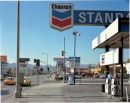
There are some famous Shores shot in sunlight (the Chevron station), but for the most part he was using diffuse, flat light. The tone was often quite warm as well.
There are some famous Shores shot in sunlight (the Chevron station), but for the most part he was using diffuse, flat light. The tone was often quite warm as well.
lynnb
Mentor
thanks celluloidprop, I agree with you. It was fun trying..
Jamie123
Mentor
I don't think I'm very close yet - is this the right direction?
You could add a bit of a warming filter over the whole image and maybe even tone the blacks a tiny bit if the warming filter hasn't given them enough of a brown tint already but you'll really hardly be able to get something close to that same look from a 35mm digital file.
Edit: And most importantly, crop the image to 4x5
Lilserenity
Well-known
This might be risky to say it but I don't think the issue is low contrast here, the pictures to me have a reasonable amount of contrast.
The biggest factor must surely be the use of 8x10" which gives a very different tonality.
That said from my own workflow I have found that Ektar and Elite Chrome/E100G come the closest to that Uncommon Places look.
There are a few shots in his book that have the lower contrast appearance but by far I get a similar-ish look to my eyes with Ektar.
d_ross
Registered User
If you can shoot negative film, the larger the better, and with an 81a or b filter, and remember the light he shot in was a huge part why the photographs look the way they look. Also keep in mind the relationship between colours in the image can effect the way the overall image appears. If you look at his Chevron sign image, it is very much the relationship of the colours in the sign and the blue of the sky that help to creates the look, part of this is what the chevron marketing team wanted as well. This is carried on through to the relationship between the Texaco sign and and no stamp signs in the background of the image. So perhaps the best way to get the Shore look is to shoot in similar light and look for the visual indicators that make his work work.
If I was shooting this scene today, I would use Ektar and slightly overexpose with an 81b filter.
If I was shooting this scene today, I would use Ektar and slightly overexpose with an 81b filter.
Attachments
Last edited:
d_ross
Registered User
The best place to look is the shadows! They tell us everything we need to know about an image.
nightfly
Well-known
I'm wondering how much an older, lower contrast and possibly uncoated lens might help in getting the colors like this.
d_ross
Registered User
I don't believe the contrast or coating of the lens is the real thing you should look at, after all if you want to replicate the Shore look they are not low contrast, as has been said using large format film would be your obvious first step, but if you cant do that then at least use negative film, and try things like slight overexposure, and use a warming filter, keeping in mind that using a filter on camera is different to changes tone in PS. Experiment with exposure filters and looking for the right light to shoot in and you will get there. Just remember you cant make a silk purse from a pigs ear, so if you want your shots to look like his you have to shoot in similar light.
al1966
Feed Your Head
You can try various methods in Photoshop and get a nice print that is less saturated and more subtle, I found it much better to use a matt paper. But most things like DSLR files are geared up for higher saturation etc as I guess people like it.
Or you can take the easier route a lower saturation film like Kodak Portra 160nc. You probably won't get the exact balance of something like Uncommon Places, a fair bit is the big negative and the book almost being a contact print relative to neg size. I use Portra nc and am happy with its rendition of colours and so on. I won't use digital for my serious photography much now, I use medium format for its bigger neg size a good compromise over cost and weight. You can pick up a good medium format camera for a reasonable price now, a nice TLR for instance I got a Yashica 124 for just under £50.
Stephen Shore I find very inspirational, Uncommon Places is one of my favourite books, frequently return to it.
efirmage
Established
Portra 160 VC (can't vouch for the new Portra but what I have seen looks good) and Fujicolor 100 or 160s.
Here are some of my own photos that I feel have color palettes similar to Shore's using these films.

Untitled by Ed Firmage, on Flickr

Untitled by Ed Firmage, on Flickr

Untitled by Ed Firmage, on Flickr

Untitled by Ed Firmage, on Flickr
Here are some of my own photos that I feel have color palettes similar to Shore's using these films.
Untitled by Ed Firmage, on Flickr
Untitled by Ed Firmage, on Flickr
Untitled by Ed Firmage, on Flickr
Untitled by Ed Firmage, on Flickr
Rob-F
Likes Leicas
Also don't forget that in his earlier book, American Surfaces, Shore did use 35mm film, shooting with a Rollei 35. So I wouldn't rule out 35mm for a Stephen Shore style.
Also don't forget that in his earlier book, American Surfaces, Shore did use 35mm film, shooting with a Rollei 35. So I wouldn't rule out 35mm for a Stephen Shore style.
Also with a flash too... but there is a big difference in look between those two sets of photos. the 35mm was processed cheaply and the large format was done with care. Both interesting to look at nonetheless.
Share:
-
This site uses cookies to help personalise content, tailor your experience and to keep you logged in if you register.
By continuing to use this site, you are consenting to our use of cookies.