
Richard G
Mentor
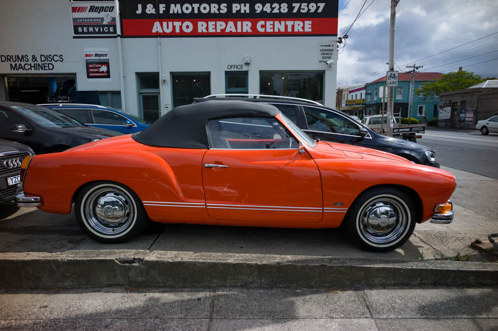
I have some odd problems with red from the M9, sometimes with subjects which caused similar trouble on Fuji Superia. Reds so intense that it bleeds beyond the subject.
I took this yesterday, a lovely burnt orange Karmann Ghia. Out of the camera, shooting DNG compressed, the car was far too red:

Here it is adjusted to the actual colour of the car by pushing the red slider to the right:
Anyone else had such problems?
I took this yesterday, a lovely burnt orange Karmann Ghia. Out of the camera, shooting DNG compressed, the car was far too red:
Here it is adjusted to the actual colour of the car by pushing the red slider to the right:
Anyone else had such problems?
jaapv
RFF Sponsoring Member.
That is the idea of post processing: adjust the image to your taste. If you have this all the time, reset your defaults.
CaptZoom
Established
I have some odd problems with red from the M9, sometimes with subjects which caused similar trouble on Fuji Superia. Reds so intense that it bleeds beyond the subject.
I took this yesterday, a lovely burnt orange Karmann Ghia. Out of the camera, shooting DNG compressed, the car was far too red:
Here it is adjusted to the actual colour of the car by pushing the red slider to the right:
Anyone else had such problems?
It's not just the M9. Red is a digital sensors kryptonite! When shooting a primarily red object, keep an on the red channel histogram.
jaapv
RFF Sponsoring Member.
Try to shoot lavender colored flowers like Jacaranda or indeed Lavender - nearly impossible, both on film and on sensor. Mixed colors are always a PITA.
Richard G
Mentor
Try to shoot lavender colored flowers like Jacaranda or indeed Lavender - nearly impossible, both on film and on sensor. Mixed colors are always a PITA.
Yes, Jacaranda is very disappointing, more on Ektar than the M9. My Coolpix 4500 rendered lavender beautifully.
Pickett Wilson
Mentor
I've had this problem with most digital cameras. Reds and lavenders are killer. Azaleas are difficult to get right. Then, I have to convert them to CMYK for printing. Try that and watch what happens to lavender!
I usually shoot RAW + jpeg, and I keep the jpeg style very flat to prevent over saturation. The RAW file always requires some tweaking.
I usually shoot RAW + jpeg, and I keep the jpeg style very flat to prevent over saturation. The RAW file always requires some tweaking.
Yes, I've had this issue too. I generally work on each seperately and at times have to live with it because I cannot remember the original scene. Do you guys use the same settings for red for each photo from that camera or do you PP each red object differently?
icebear
Mentor
I have some odd problems with red from the M9, sometimes with subjects which caused similar trouble on Fuji Superia. Reds so intense that it bleeds beyond the subject.
I took this yesterday, a lovely burnt orange Karmann Ghia. Out of the camera, shooting DNG compressed, the car was far too red:
Here it is adjusted to the actual colour of the car by pushing the red slider to the right:
Anyone else had such problems?
Hi there,
1. forget about compressed jpg's
2. shoot raw only
3. use a proper white balance method (e.g. Expodisc) and do not use AWB (auto white balance).
Otherwise you could also use a point and shoot camera.
Why shell out so much dough for a M9 and then not maximize the IQ you could squeeze out of it?
Ron (Netherlands)
Well-known
Although not meant to be for the M9, you might get better reds (less bright/less orange) when using the old IR cut filters
btw your two pics hardly show any difference on my screen....
btw your two pics hardly show any difference on my screen....
icebear
Mentor
...
btw your two pics hardly show any difference on my screen....
Have you ever heard about monitor calibration
 ??
??x-ray
Mentor
First of all you need to profile / calibrate your entire system. There are several products like the datacolor, xrite and lacie products. It is essential to do this and this is the time to start if you haven't done so. Second you should build a profile for your cameras under different lighting conditions. Here's the product to do this. http://captureintegration.com/x-rite/color-checker-passport/ The mcbeth chart fits into the pocket and comes with software to build a profile that you imbed in your photo in Lightroom or photoshop. The chart serves two purposes, one to build a very accurate profile and two to color balance back to.
Sensors are never 100% accurate and this tells the computer / system how to correct for those inaccuracies. The profile is imbedded and must not be stripped off when editing. It's assigned to that image forever. The software is very simple to use and just takes seconds. It truly make all the difference in the world with accuracy of color. You'll be stunned at how much difference it makes. I do a good bit of very color critical work and could not live without this. I build profiles for different lighting for all of my cameras. I thought my Hasselblad digital camera was accurate till I built and applied the profile on a job.
Without a calibrated system you're only guessing as to what you'll get in the end.
The Ghia is a fun little car. My dad bought a new 64 polo blue and white and I had a 71 convertible I restored to better than new. Metallic dark blue over metallic silver. Restore the factory AC, engine rebuilt to 60 horses, custom burgundy leather seats with gray and black leather interior trim and black carpet and top. Lovely cars.
Rob-F
Likes Leicas
Here's how the instructor in my college color photo course started the semester: "Good evening. The first thing you have to know about color photography is that getting accurate color is impossible."
With that in mind, Richard, I'm say you did a great job of getting the color right!
With that in mind, Richard, I'm say you did a great job of getting the color right!
sepiareverb
genius and moron
First of all you need to profile / calibrate your entire system. There are several products like the datacolor, xrite and lacie products. It is essential to do this and this is the time to start if you haven't done so. Second you should build a profile for your cameras under different lighting conditions. Here's the product to do this. http://captureintegration.com/x-rite/color-checker-passport/ The mcbeth chart fits into the pocket and comes with software to build a profile that you imbed in your photo in Lightroom or photoshop. The chart serves two purposes, one to build a very accurate profile and two to color balance back to.
Sensors are never 100% accurate and this tells the computer / system how to correct for those inaccuracies. The profile is imbedded and must not be stripped off when editing. It's assigned to that image forever. The software is very simple to use and just takes seconds. It truly make all the difference in the world with accuracy of color. You'll be stunned at how much difference it makes. I do a good bit of very color critical work and could not live without this. I build profiles for different lighting for all of my cameras. I thought my Hasselblad digital camera was accurate till I built and applied the profile on a job.
Without a calibrated system you're only guessing as to what you'll get in the end.
What he said. Really. And keep the screen calibrated. It's like cleaning the darkroom. A pita but necessary.
I always tweak white balance in post production, I don't have presets for many things.
V-12
Well-known
A problem is something you don't know how to fix. But you fixed it?
x-ray
Mentor
If your monitor isn't profiled you really don't know what color you have. Your assuming the screen is correct but that's only a guess. It might look good on screen but not print correctly and not look correct on a profiled monitor. This especially important if you print or use your photos for publication or professional use.
Richard G
Mentor
Thanks everyone. I am pleased to learn this is not an M9 issue per se. I shoot DNG not jpeg, except I do like the M9 jpegs in B and W which have some cleverness in them that I can't always emulate fiddling in LR. I haven't calibrated this laptop, but I have my desktop computer. I agree the difference here on my laptop looks a lot less than on my desktop.
I have used the WhiBal card for certain critical mixed lighting situations, but use it little otherwise. I hardly ever adjust white balance after shooting, and I am reasonably happy with the auto white balance, most of the time, but I don't have critical needs like some of you here. A Leica is more about a simple and familiar interface for using familiar lenses. I am getting better at the software side of things, and Lightroom has been a great thing to have needed to learn. I revisit Aperture occasionally for various reason, but I have never come to grips with it.
There is a garden near here with intensely red flowers and with Fuji Superia I got a similar overdoing of the reds which needed adjustment from the store scanned negatives. Something about red.
Thanks X-ray too for the info on your Karmann Ghia experience. It was the first car of one of my good friends from university. His was a very subtle colour, like a duck egg blue verging on grey (gray.) It is a beautiful shape.
Share:
-
This site uses cookies to help personalise content, tailor your experience and to keep you logged in if you register.
By continuing to use this site, you are consenting to our use of cookies.