
W
wlewisiii
Guest
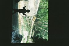
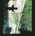
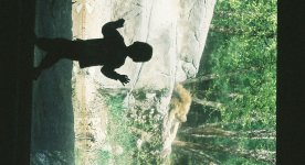
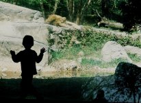
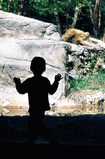
As a result of the critique threads, I've been working through a bit of my backlog of scans. This one I'd like to hear some thoughts from others. Attached is a silhouette shot of my son checking out the lions at our local zoo. There is way to much dark space on the top and bottom to begin with, so I tried crop one. This gives me a much better feel, but down in the corner is a reflection of Dad & CL that bugs me. To get that out while trying to keep the image balanced, I came up with crop two.
Anyone got preferences amung the three versions? Or suggestions?
Thanks!
William
Anyone got preferences amung the three versions? Or suggestions?
Thanks!
William
")