
moreammo
Established
Very nice set!
helen.HH
A smile & a wink…
Well Congrats on the Monochrom...
Like the Photos very much ... I simply ADORE #5 & #9 Kristian ...Sublime
But to my 'EYE' their is almost an ever so Slight 'HDR' quality to a few of them
Still quite Digi looking but very Cool in their own Way
Also an etch like & 3d quality To them which is Quite Special
Did you do alot of Post Processing ?
I am sure since the Camera is new
You are still developing a 'Look'
Cheers- H
hausen
Well-known
Us Kiwi's are everywhere. Lived in Melbourne myself in the late '80s. Love it and still miss the footie. These look even better now that I am looking at them on my MB air. The guy smoking is superb. As Paul said impressive how you/MM handled those shards of light. Didn't think I wanted one but this changes my mind. Well done.
furcafe
Mentor
The official Leica designation is M Monochrom, so no M9 in the name (see, e.g., http://us.leica-camera.com/photography/m_system/m_monochrom/).
Would you clear up one point for me? Is it a Leica M9M, or Leica MM? I see both being used here.
Turtle
Mentor
For all those old school wet film people out there who think there is a steep learning curve ahead, I disagree. Its a lot easier to figure out what to do when you already know what a good B&W print looks like.... I am convinced this is the main obstacle to some of those out there who have never made silver prints and seen very few top notch prints in galleries. It would be easy to think many of the poor quality conversions on websites are as good as it gets.
ricnak
Well-known
Kristian.
Thanks for sharing your first day with the Monochrome. Some great compositions there and good examples of what the camera can cope with. Very interesting.
Thanks for sharing your first day with the Monochrome. Some great compositions there and good examples of what the camera can cope with. Very interesting.
segedi
RFicianado
Have you printed any of these great shots? I'm very curious to see how these print up and if they retain all the dynamic range.
leicashot
Well-known
Hey Cal, honestly there are so much tonal range of grey that even with contrasty lenses it's still not easy to achieve deep blacks. An older lens would almost render the camera 'grey and white'.
It all depends on the look you're after. I have never seen such detail from such rich black and white pictures, so taking advantage of new modern lenses is a priority for me. But if you're after the old school look I'm sure the older lenses will deliver that.
The files look to me like medium format black and white film, especially if using the filters in Silver Efex Pro 2, basically adding grain and that old school film look to the files.
Kristian,
I think this pushes me over the edge. I want a M9M badly.
It seems the M9M likes the modern ASPH glass a lot. This is good for me as I have a 28 Cron and a 50 Lux ASPH.
I wonder how the M9M does with retro single coated glass? I would expect less contrast, but vast mids. Old glass could be very creamy.
Hmmm...
Cal
leicashot
Well-known
Superb. The photo quoted by f16sunshine is a masterpiece.
And I even think SilverEfex destroyed much information off the DNG files (I still can't get why such an idiotic software gather customers, those photographs are excellent enough to deserve a clean P&P in LR or PS and that's all, no need to mimic film grain whatsoever, especially when using a mOnO...
Respectfully said for the photographer of course. But reading "SilverEfex" always gives me a rash... :angel:
Ironically, this these pictures were 'NOT' put though SEP2. The original ones were but I over-processed them and re-edited them only in LR4, which are the ones here.
I think LR4 does a great job but the files look mighty clean and not so much film like, which I prefer to be honest. But for those seeking the film-look, SEP2 delivers that, brilliantly - yes, at the expense of detail to an extent, which to many is less important than feel.
leicashot
Well-known
Certainly a nice set. Is the only work in Lightroom or PS just the Silver Efex Pro Tri X preset? I really like them.
I initially did a bit of both LR4 and Tri-X in SEP2, but these pics are the re-edited ones with no SEP2.
leicashot
Well-known
Wow! It would make me want to shoot everything at tiny apertures just to see how much detail I could preserve.
Well two mistakes photographers often make with aperture choice are:
1. Wide open too often, shooting for bokeh instead of content., and
2. Shooting stopped down too often for sharpness instead of feel.
leicashot
Well-known
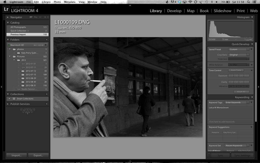
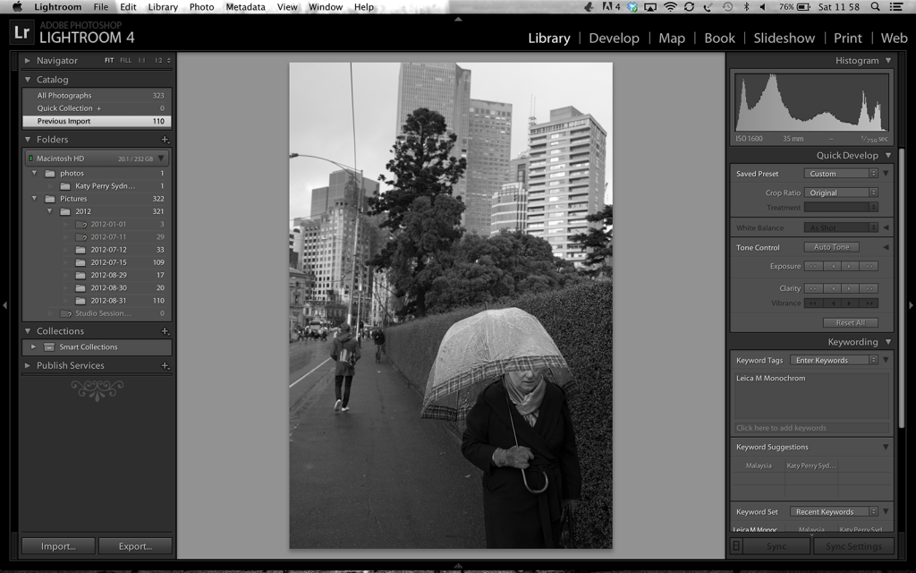
Hi Helen here are the originals without processing...very very grey, lots of tonal range.
Well Congrats on the Monochrom...
Like the Photos very much ... I simply ADORE #5 & #9 Kristian ...Sublime
But to my 'EYE' their is almost an ever so Slight 'HDR' quality to a few of them
Still quite Digi looking but very Cool in their own Way
Also an etch like & 3d quality To them which is Quite Special
Did you do alot of Post Processing ?
I am sure since the Camera is new
You are still developing a 'Look'
Cheers- H
leicashot
Well-known
Have you printed any of these great shots? I'm very curious to see how these print up and if they retain all the dynamic range.
No, I haven't. None of these IMHO are worth printing. Quite honestly I haven't printed any of my work in 8 years. When I have work worth printing I will. I'm hoping I'll achieve that before the end of the year with this camera
tightsqueez
Well-known
Very interesting.
I like the untouched versions a lot better than the adjusted. This is good news. Thanks for posting both.
I like the untouched versions a lot better than the adjusted. This is good news. Thanks for posting both.
leicashot
Well-known
Very interesting.
I like the untouched versions a lot better than the adjusted. This is good news. Thanks for posting both.
You're welcome. I think the Monochrom offers something for all b+w photographers. For me, I need to do more work than I'd like, compared to shooting a color sensor. The reason is that the tonal range of greys is immense and without being able to choose a type of film for contrasty results, I am left with a very flexible canvas to process. It's really quite amazing.
Keith
The best camera is one that still works!
Very interesting.
I like the untouched versions a lot better than the adjusted. This is good news. Thanks for posting both.
I actually find the processing a liitle extreme for my tastes but you have your particular style and own tastes obviously so I have no valid criticism here in reality!
As pricey as it is it's an intriguing camera and you're using it brilliantly!
Particular
a.k.a. CNNY, disassembler
Very nice set Kristian. Especially considering you only took it out for a couple of hours. I think the MM is a really interesting camera, and a powerful tool in the right hands.
Cal, you don't know what a headache you are saving yourself by skipping over all the color stuff. Stick to b+w, and you will be fine.
Thanks for the response. This is very helpful because I'm an old B&W only film guy. I have a very-very steep learning curve ahead. Anyways something new and totally different to obsess about. LOL.
Cal
Cal, you don't know what a headache you are saving yourself by skipping over all the color stuff. Stick to b+w, and you will be fine.
tightsqueez
Well-known
In all reality - processing is a matter of taste. Contrast and sharpness, whether it be harsh, flat or subdued depends on what fits the subject. More importantly is how the subject is approached by the photographer.
A long tonal scale is very important and I think the Monochrom is providing this. If you are adding texture and grain then I'd recommend (which I do b/c a preference against digital smoothness) to add the filter "Film Grain" in Photoshop. As a bonus it forces some grain into blown highlights, just like you'd see in film. After that I'll adjust the curves accordingly and despeckle to clump the fine pixel grit. The final adjustment after saving in Photoshop is is to open the image in Mac's Preview. I'll reduce the image sharpness and then save again. An odd step but it works for me. Ha ha.
The striking resemblance to a film scanned image is scary. I cannot tell the difference and it usually takes less than a few minutes. Printing however will be the ultimate test!
While some will not like such treatment, for me black and white will always have that film edge. After a French photographer posted a side by side comparison with the Monochrom and Tri-X a few months ago, I downloaded both versions and then slowly figured out how to match them. What I found was that M9 files did not convert as well, which again shows the difference between the two models. Consider me a very happy camper that I have figured out how to adjust a MM file before owning one (hopefully soon).
leicashot
Well-known
Thanks very much for the PP advice, something we can all try. Cheers
In all reality - processing is a matter of taste. Contrast and sharpness, whether it be harsh, flat or subdued depends on what fits the subject. More importantly is how the subject is approached by the photographer.
A long tonal scale is very important and I think the Monochrom is providing this. If you are adding texture and grain then I'd recommend (which I do b/c a preference against digital smoothness) to add the filter "Film Grain" in Photoshop. As a bonus it forces some grain into blown highlights, just like you'd see in film. After that I'll adjust the curves accordingly and despeckle to clump the fine pixel grit. The final adjustment after saving in Photoshop is is to open the image in Mac's Preview. I'll reduce the image sharpness and then save again. An odd step but it works for me. Ha ha.
The striking resemblance to a film scanned image is scary. I cannot tell the difference and it usually takes less than a few minutes. Printing however will be the ultimate test!
While some will not like such treatment, for me black and white will always have that film edge. After a French photographer posted a side by side comparison with the Monochrom and Tri-X a few months ago, I downloaded both versions and then slowly figured out how to match them. What I found was that M9 files did not convert as well, which again shows the difference between the two models. Consider me a very happy camper that I have figured out how to adjust a MM file before owning one (hopefully soon).
Richard G
Mentor
A long tonal scale is very important and I think the Monochrom is providing this. If you are adding texture and grain then I'd recommend (which I do b/c a preference against digital smoothness) to add the filter "Film Grain" in Photoshop. As a bonus it forces some grain into blown highlights, just like you'd see in film. After that I'll adjust the curves accordingly and despeckle to clump the fine pixel grit. The final adjustment after saving in Photoshop is is to open the image in Mac's Preview.
Amazing. I have a file scanned from a black and white negative of my daughter which looks fantastic when opened in Preview on the Mac, and much less so in other programs. I must look at this again.
Share:
-
This site uses cookies to help personalise content, tailor your experience and to keep you logged in if you register.
By continuing to use this site, you are consenting to our use of cookies.