Godfrey
somewhat colored
retinax
Well-known
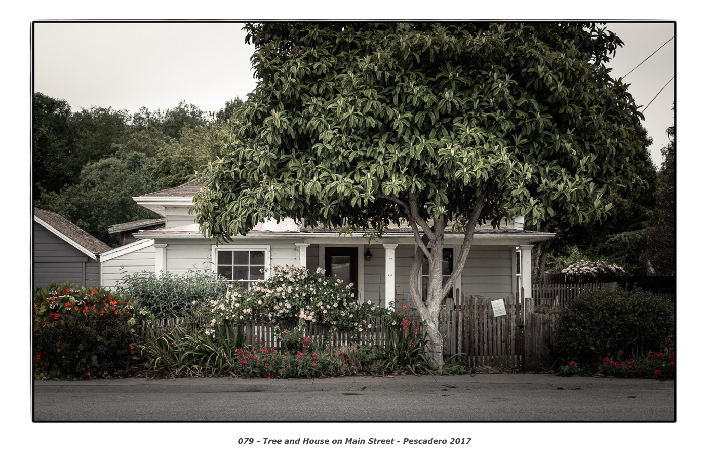
I like this one a lot. Great light on the leaves of the tree, great colors, nicely balanced with grey areas at bottom, top left and right, how the foreground tree joins with the background canopy messing a bit with my perception of depth when looking at that area, and the place looks so inviting and romantic. I wouldn't want it on my wall though because it's too sweet-looking though for me to handle.
vytasn
Established
Not on main street, and more tree than house.


Godfrey
somewhat colored
Not on main street, and more tree than house.
http://www.rangefinderforum.com/rffgallery/gallery/51033/med_U51033I1498927802.SEQ.0.jpg
An interesting photograph, but why is it relevant to the photo I posted?
I like this one a lot. Great light on the leaves of the tree, great colors, nicely balanced with grey areas at bottom, top left and right, how the foreground tree joins with the background canopy messing a bit with my perception of depth when looking at that area, and the place looks so inviting and romantic. I wouldn't want it on my wall though because it's too sweet-looking though for me to handle.
Thank you! I like your description of what you see.
G
A.S.
Member
The content and composition is right up my alley; I'm curious about the color choices. Would you expand on your post-processing decisions? They're unreal, but quite nice.
Godfrey
somewhat colored
The content and composition is right up my alley; I'm curious about the color choices. Would you expand on your post-processing decisions? They're unreal, but quite nice.
Thank you!
I'm doing this small group of Pescadero photos as a decorative set to make some cards with, not necessarily as a documentarian rendering, so*color accuracy isn't a priority. I like to work with monochrome and duotone images for this kind of thing, but here the color detail is so nice I didn't want to completely obliterate it. So I chose a 'reduced palette' flattening of the color to abstract the photos out of the 'real' and into a more 'archetypal fantasy' notion.
I have a number of interesting starting points for this kind of color rendering that I've used over the past decade. Once I come up with a palette that I think works for most of the photos in a group, I then apply it to all and tweak in small ways to allow each photo its own voice while staying consistent within the set.
The mechanics of what I am doing are quite simple: I have a starting point preset that smashes out all color saturation using the HSL panel in Lightroom and also applies a somewhat pathological set of Luminance values and a rather extreme tone curve. I then look at the image and adjust the color saturation upwards on a channel by channel basis depending on the overall tone I'm looking for and the original colors in the scene.
Because I have presets for all of this, it really goes quite fast. I rarely spend more than about thirty seconds doing the actual manipulations on a given image. A lot more time goes into looking at the exposures I made and determining whether I think they're worthy of posting... or not!
G
A.S.
Member
The gray/green dynamic works so well. I was shooting Portra 160 on my last summer trip trip to Bellingham, WA. The scenes were sort of comparable, but the warmth of the film's reproduction somehow compromised their look. My compliments regardless.
Moto-Uno
Moto-Uno
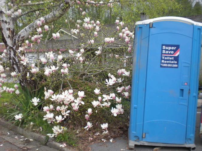
Possibly this might be more relevant ?


Keith
The best camera is one that still works!
Not on main street, and more tree than house.

Now there's someone who likes their privacy! lol
I remember seeing a house very similar to this somewhere on a drive to North Queensland a long time ago ... and possibly even more grown in from memory.
And nice colours in that pic Godfrey.
Dan Daniel
Well-known
Nice shot and rendering. Although I find the darkness along the right side and the flatness (not softness, but flatness) of the distant trees on the left side to be areas that don't work very well for me. I know, monitor, print, etc. might be the real issues here.
Yes, monitor
Yes, monitor
Godfrey
somewhat colored
Thank you, Keith, Dan, and Helen!
No, you're right about the darkness on the lower right and again on the lower left. Before printing, I looked at it again and decided just a little touch lighter in those places would make a nicer print. It's barely noticeable on screen but quite noticeable on the print.
G
Nice shot and rendering. Although I find the darkness along the right side and the flatness (not softness, but flatness) of the distant trees on the left side to be areas that don't work very well for me. I know, monitor, print, etc. might be the real issues here.
Yes, monitor
No, you're right about the darkness on the lower right and again on the lower left. Before printing, I looked at it again and decided just a little touch lighter in those places would make a nicer print. It's barely noticeable on screen but quite noticeable on the print.
G
dmr
Registered Abuser
Godfrey? I'm a bit curious about the color of this one. Care to discuss it? 
Godfrey
somewhat colored
Godfrey? I'm a bit curious about the color of this one. Care to discuss it?
Thank you! See post #6 above for a discussion of the rendering: Post #6 - rendering.
G
Share:
-
This site uses cookies to help personalise content, tailor your experience and to keep you logged in if you register.
By continuing to use this site, you are consenting to our use of cookies.


