
Sparrow
Mentor
Composition, or I know what I like ...
I find most of the stuff that's about on the web and in books purporting to explain composition in photography a waste of time in practice. When I'm taking photos I've always got too much to think about anyway and adding another set of complexity certainly isn't a priority for me.
However some of the stuff I learned over the years has helped me predict more accurately what other people would like, after the event that is, explain why some images worked and some didn't, and give a little help sometimes when actually taking photos.
This is my own personal hypothesis with some basis in established theory but mainly my own observation and a keen interest in the sales figures at the end of each month (I'm a designer by trade), feel free to challenge anything you don't agree with they are only opinions.
part 1) What's the point
It turns out what I like is what the majority like, it seems odd but we all tend to see things the same way and because of that tendency it is possible to predict what will hold the viewers attention and manipulate it to some extent.
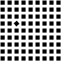
I'm sure everyone has seen this type of simple optical illusion, the lower shape looks longer even when you know full well the lines are the same length
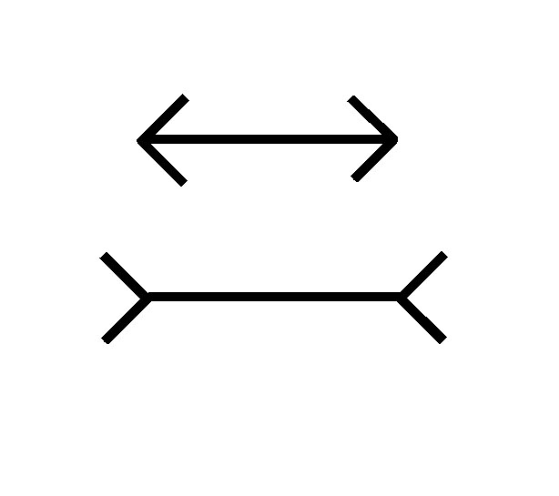
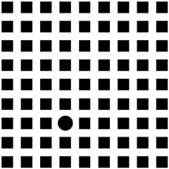
Well it turns out the same thing happens with more complex shapes

The eye and brain persist in completing the missing parts of shapes, and even complete shapes that are outside the frame. This is know as the law of completion in gestalt theory, but it’s best thought of as just a tendency for the eye to follow a line even if that line is broken or incomplete, and its that tendency that makes any composition possible, and it happens in the vast majority of people in exactly the same way
to be continued ...
I find most of the stuff that's about on the web and in books purporting to explain composition in photography a waste of time in practice. When I'm taking photos I've always got too much to think about anyway and adding another set of complexity certainly isn't a priority for me.
However some of the stuff I learned over the years has helped me predict more accurately what other people would like, after the event that is, explain why some images worked and some didn't, and give a little help sometimes when actually taking photos.
This is my own personal hypothesis with some basis in established theory but mainly my own observation and a keen interest in the sales figures at the end of each month (I'm a designer by trade), feel free to challenge anything you don't agree with they are only opinions.
part 1) What's the point
It turns out what I like is what the majority like, it seems odd but we all tend to see things the same way and because of that tendency it is possible to predict what will hold the viewers attention and manipulate it to some extent.
I'm sure everyone has seen this type of simple optical illusion, the lower shape looks longer even when you know full well the lines are the same length
Well it turns out the same thing happens with more complex shapes
The eye and brain persist in completing the missing parts of shapes, and even complete shapes that are outside the frame. This is know as the law of completion in gestalt theory, but it’s best thought of as just a tendency for the eye to follow a line even if that line is broken or incomplete, and its that tendency that makes any composition possible, and it happens in the vast majority of people in exactly the same way
to be continued ...
Sparrow
Mentor
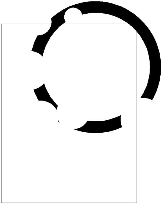
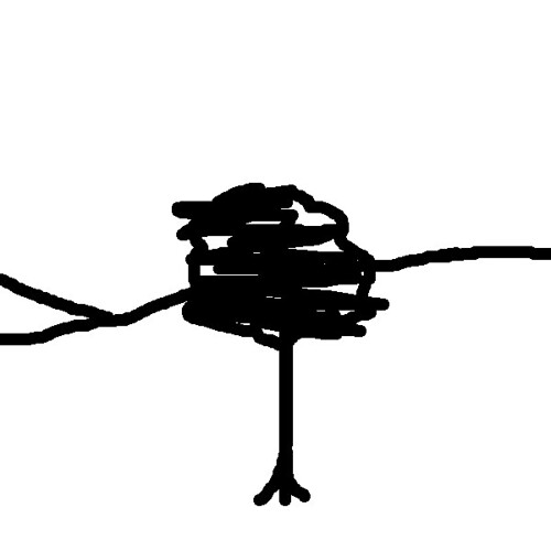
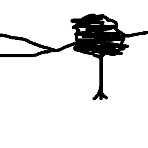
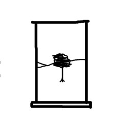
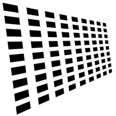
The effect persists even when everything is abstracted, subtle and highly textured, one can’t help but find the some sort of line and the eye can't help but follow it, it would seem
and it's predictable, I would expect this one to be viewed anti-clockwise
all a bit academic, but it shows how quite minor elements in a image can maintain the viewers attention in one area.
I think this is probably why odd frames on a contact sheet or a thumbnail image can stand out so strongly
to be continued
Roger Hicks
Mentor
Dear Stewart,
I've always found that one of the great uses of compositional 'theory' is that if you have no other ideas, you can try the 'rules' and when they don't work, as often they don't, you are pushed into seeing something better. Your investigations in this thread may have a similar effect, encouraging people to think about how we see and what we notice. There is (inevitably) a composition module on the site: http://www.rogerandfrances.com/subscription/ps quality composition i.html
Cheers,
R.
Sparrow
Mentor
Part 2) The rule of thirds
Very useful as a starting point for creative artists and designers, and handy to know there is lots of articles all over the place. It’s useful simply because it allows one to have some idea which images will engage the viewer and which will not. In the field it can help inform framing and in a studio give a starting point for setting up a shot.
It simply says that if a image is split into thirds vertically and horizontally the centre “third” and it’s four nodes will be of more interest to the viewer; stating the obvious really.
I’ll try and keep this abstract to keep things simple
So in theory any arrangement of elements that approximates to those points, people will tend to be intrested in and keep their attention.
and anything contained within that area will get similar attention.
however anything outside will distract the attention and lead the eye off to the edge of the frame and out of the picture, so it could almost be called the Rule of “Don’t Put Stuff Close to the Edges” from a practical POV
(just out of interest; if one watches someone looking through artworks the amount of time they devote to each image varies enormously, and it tends to be the same ones that get the most attention whoever is viewing)
Last edited:
Sparrow
Mentor
So (again in theory) this should look clunky and take the eye out of the frame;
and this one should tend to keep it in
you may need to switch to a darker theme to see the edge of the frames clearly
to be con...
and this one should tend to keep it in
you may need to switch to a darker theme to see the edge of the frames clearly
to be con...
Sparrow
Mentor
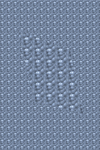
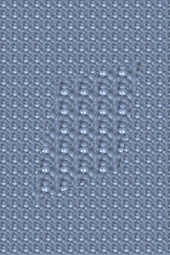
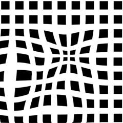
the effect is also maintained with tones of light and dark and amorphous figures.

and when the ground is replaced by the figure, that's another of the gestalt laws; Figure/Ground Relationships

and when the ground is replaced by the figure, that's another of the gestalt laws; Figure/Ground Relationships
Sparrow
Mentor
Now all this seems pointlessly esoteric until one starts noticing how the rule fits over and over on so many of the classic images, and that shot of some bland desert shot through a broken window that caught and held ones attention longer than it warranted has an explanation of sorts.
To get an idea try photographing the view from your window, then step back into the room until the window frame sits on the third lines and take a second shot, then show them round and see which gets the most attention

To get an idea try photographing the view from your window, then step back into the room until the window frame sits on the third lines and take a second shot, then show them round and see which gets the most attention
JoeV
Thin Air, Bright Sun
Very interesting, Stewart. Perhaps I'm getting ahead of the curricula for this class, but I've also noticed strong visual attractions to shapes and lines that intersect with the edge of the frame, to the extent that I'll often compose just for this effect in-camera, as a method of balancing the composition.
I also think the rule of thirds is more about avoiding the rule of halves (that is, the rule of thirds is not mathematical; it works just as well if the object is placed, say, 2/5ths from the edge, rather than exactly 1/3rd).
I think too that there's a bit of old Heisenberg at work here, culturally. As our culture becomes more and more visually literate, and images proliferate exponentially throughout media, we become culturally self-aware that certain exceptions to these generally assumed rules can also work. Hence I've seen more and more square-format images that seem to violate the rule of halves, having a strong visual dividing line straight down the middle (either horizontally or vertically) and yet the image still "works" because we are getting more and more used to seeing images that violate the rules. Hence our visual language, just like our oral language, is in constant flux and evolution.
Great thread, hope to see more.
~Joe
Sparrow
Mentor
3) Significant Horizontals
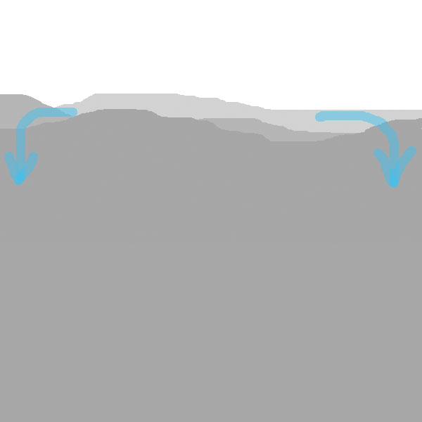
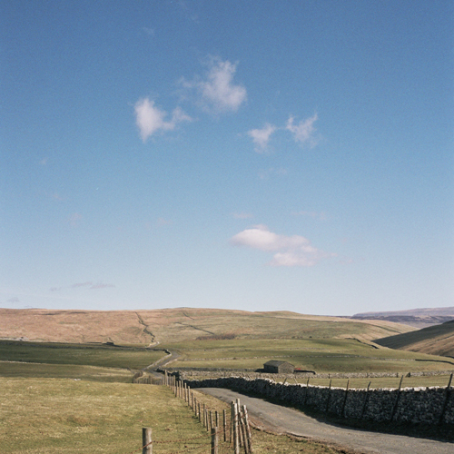
I've been plagued by horizontals all the time I've been taking photos, as an artist or designer it isn't a problem, one simply doesn't include them. Unfortunately the real world is full of unreasonable horizons, walls, buildings roadways and the like, all waiting to drag ones eyes off to the edge of the frame. I've taken lots like this, I got the curved fence line and the dark line of the wall to pull the eye right to the middle of the frame ... only to have it run off to the left or right along the horizon line
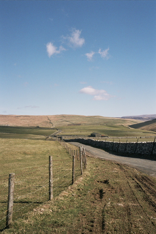

any horizontal feature in the centre tends to bounce the eye from left to right, and stops it exploring round the rest of the frame
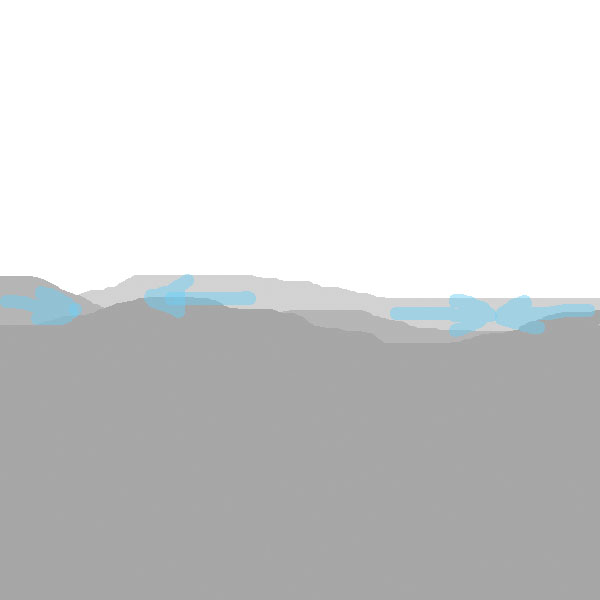
however, if one moves it down the scene the eye will explore the larger space and give more attention to the sky
moved up the opposite happens
I've been plagued by horizontals all the time I've been taking photos, as an artist or designer it isn't a problem, one simply doesn't include them. Unfortunately the real world is full of unreasonable horizons, walls, buildings roadways and the like, all waiting to drag ones eyes off to the edge of the frame. I've taken lots like this, I got the curved fence line and the dark line of the wall to pull the eye right to the middle of the frame ... only to have it run off to the left or right along the horizon line
any horizontal feature in the centre tends to bounce the eye from left to right, and stops it exploring round the rest of the frame
however, if one moves it down the scene the eye will explore the larger space and give more attention to the sky
moved up the opposite happens
Sparrow
Mentor
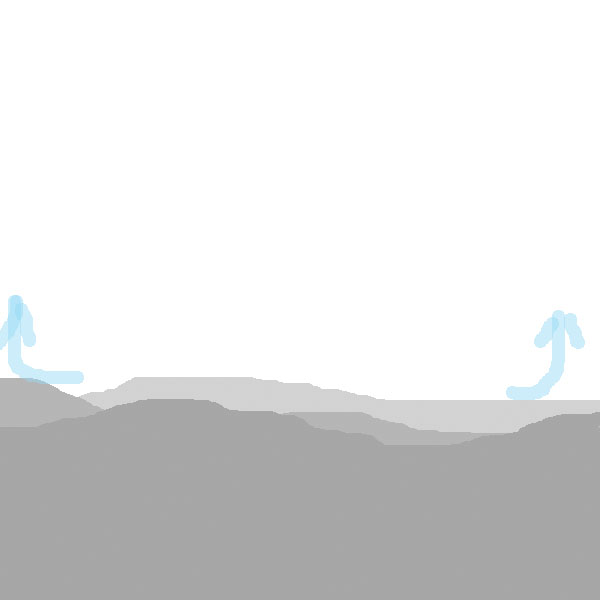
So knowing what you want to say can effect framing, or cropping if one gets it wrong, and produce quite different results with fairly minor changes in framing, allowing one to control what the viewer will find most interesting in the print
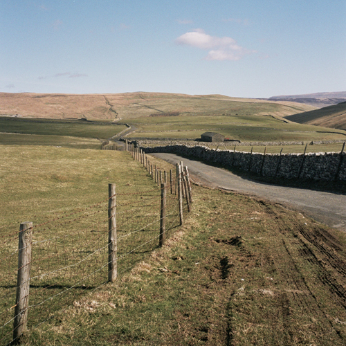
the same effect seems not to occur vertically to the same extent

A similar feature vertically while looking quirky doesn’t stop the eye exploring both sides of the image.
to be continued
the same effect seems not to occur vertically to the same extent
A similar feature vertically while looking quirky doesn’t stop the eye exploring both sides of the image.
to be continued
T
Todd.Hanz
Guest
Very good, keep it coming!
Todd
Todd
Sparrow
Mentor
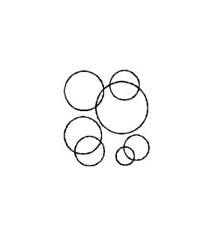
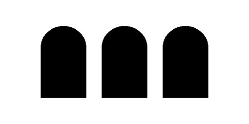
4) Patterns (the Gestalt principles of Proximity, Similarity, Continuation and Common Fate all rolled together)
Or the rule of "any group of three or more similar objects in the same place is worth blowing a few frames on"
Humans love to find symmetry and patterns, the brain will organise them be attracted by them gets satisfaction looking at them, from ancient Greeks organising stars into groups to William Morris wallpaper still selling well in B&Q after more than a century we love patterns it seems.
Now; pattern, and 2D surface design is my specialist field; but I'll spare you that, so;
Any objects in a regular repeat will form a strong visual bond, this pattern is so strong if one relaxes the eyes a little a set of phantom tiles are visible as the brain tries to see a check rather than a straight repeat, of little use but demonstrates how strong the effect can be.
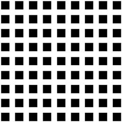
Any deviation in either repeat
or form is also immediately seized on by the eye as being more significant
Or the rule of "any group of three or more similar objects in the same place is worth blowing a few frames on"
Humans love to find symmetry and patterns, the brain will organise them be attracted by them gets satisfaction looking at them, from ancient Greeks organising stars into groups to William Morris wallpaper still selling well in B&Q after more than a century we love patterns it seems.
Now; pattern, and 2D surface design is my specialist field; but I'll spare you that, so;
Any objects in a regular repeat will form a strong visual bond, this pattern is so strong if one relaxes the eyes a little a set of phantom tiles are visible as the brain tries to see a check rather than a straight repeat, of little use but demonstrates how strong the effect can be.
Any deviation in either repeat
or form is also immediately seized on by the eye as being more significant
Sparrow
Mentor
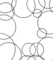
Even with large sections removed, it retains its integrity as a single unit, in fact

If it is distorted the brain would rather add in another dimension, depth, than not see the regularity
even when that distortion isn't the normal perspectives projection
the effect starts with as few as three objects
and most of the effects still work

the practical upshot of all this bunk is that anywhere where there are patterns or repetition, from aqueducts on the outskirts of Rome to a picket fence round ones garden is worth a second look because there is always an audience ready to be tricked into thinking you’re good when it is in fact just their perception that’s bloody clever.
If it is distorted the brain would rather add in another dimension, depth, than not see the regularity
even when that distortion isn't the normal perspectives projection
the effect starts with as few as three objects
and most of the effects still work
the practical upshot of all this bunk is that anywhere where there are patterns or repetition, from aqueducts on the outskirts of Rome to a picket fence round ones garden is worth a second look because there is always an audience ready to be tricked into thinking you’re good when it is in fact just their perception that’s bloody clever.
morback
Martin N. Hinze
Best thread on RFF since I joined...I'm glad to get a refresher course in composition (even though being a graphic designer too I should know these things) and now I know why I always have either huge amount of sky or ground in my 6x6 shots...
more to come?
more to come?
Sparrow
Mentor
Coming soon; I can’t believe it’s not Bokeh; 
Sparrow
Mentor
A couple of related topics
The eastern aesthetic
In the east the aesthetic ideal has a much more ancient tradition , going back in Japan over a thousand years as opposed to the few hundred here since the renaissance. While I know a lot of it having had a keen interest in both woodcuts and bonsai for many years a lot of the concepts are as much spiritual as visual so not as useful in this context, I don’t pretend to have any deep understanding but one thing seems to hold up to inspection.
The Japanese aesthetic ideal or Iki, has a concept of Fukinsei and is like beauty through irregularity or asymmetry, a bit like those paintings of blossom or bamboo one sees and one way this manifests itself in all their visual arts is by an aversion to even numbers, 2 is tolerated but one will more likely find 1 3 5 7 or 9 trunks in bonsai, or stones in suiseki, and stems in Ikebana. (lots of pretentious Japanese words there and not a bokeh in sight).
I find I share the odd number aesthetic but I’m unsure now if I’ve learned it or if it’s actually a human trait and is a widespread shared value. There certainly is a beauty through asymmetry that the western philosophy doesn’t explain properly for me
Sparrow
Mentor
The modern western tradition has it's roots in Greco-Roman classicism rediscovered in the renaissance where it was controlled by the church and codified by the Victorians who removed any remaining sensuality that the Greeks admired so much. So in contrast the western aesthetic only becoming decimated generally about 150 years ago by a few seminal works like Racinet`s "designs from historic ornament" or whatever that is in French, and only really became generally available to even to the middle-class at the start of the 20th century and the beginnings of industrial design.
The Greeks being big on maths and geometry passed their tastes to the giants of the Renaissance who imposed a bunch of rules on it, then the Vatican removed the sensuality and passed it to the Victorian Arts and Crafts chaps who took out any remaining knob jokes and cast it in iron.
Since then, in the west, there has been some artistic backlash in the 20th century but still the ascetics of the west remains a concern for the middle and upper class, the common man is still happy with William Morris pastiche and Laura Ashley, nothing like the Shinto aesthetic rooted in the common place taste of the common man, that applies as easily to a work of art as to the artist who made it and which was for centuries a movement of the masses.
which brings me to the Golden Ratio ...
antiquark
Derek Ross
But, rules are the antithesis to creativity!
Sparrow
Mentor
As an aside;
I have a friend in Corfu who has a "comfortably appointed" home and contemporary Ionian taste is like super-bling popped in a cut-crystal case and sat on a lace doyley. One can trace that stylistic tendency back through Byzantium and Rome almost 2/3rds of the way to Hellenic times.
I think it's reasonable to assume the Classical Greek on the 49 omnibus shared that "bling" type of taste, not the acres of pristine white marble one sees in the national gallery but his culture would however have been more earthy, there are an awful lot of art containing ladies with there bits out and Greeks with large fallacies that the Victorians either didn't loot or hid when they came back from the grand tour.
Last edited:
Sparrow
Mentor
But, rules are the antithesis to creativity!
Really ... I must have missed that class; sorry
Share:
-
This site uses cookies to help personalise content, tailor your experience and to keep you logged in if you register.
By continuing to use this site, you are consenting to our use of cookies.