
Al Kaplan
Mentor
Usually a a blob of home made cookie dough is dropped on the cookie sheet and allowed to flatten itself into a more or less round cookie. Even when using a cookie cutter the trimmings are kneaded again, rolled flat, and more cookies punched out.
Oval framed portraits were popular circa 1900. In the late 1960's round fish-eye photos were a craze for awhile.
Oval framed portraits were popular circa 1900. In the late 1960's round fish-eye photos were a craze for awhile.
MickH
Well-known
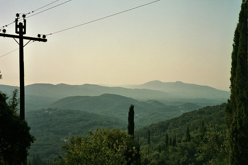
Has there ever been photography that wasn't rectangular ( or square ) ?
I'm pretty sure that the first Kodak cameras used to produce circular photographs.
MickH
Well-known
Yeah, I thought so: http://www.camerapedia.org/wiki/Kodak_No._1
There's a set on Flickr and probably loads more elsewhere.
http://www.flickr.com/photos/nationalmediamuseum/sets/72157606845434332/
That would be an interesting compositional challenge
There's a set on Flickr and probably loads more elsewhere.
http://www.flickr.com/photos/nationalmediamuseum/sets/72157606845434332/
That would be an interesting compositional challenge
Sparrow
Mentor
Hey Al!!! Thanks for the explanation re color!
You've really condensed it--
Happy Thanksgiving to you, too...
Paul
Even when I was a child I can remember looking at that water lily painting that Claud Monte did and wondering if he had seen those colours in some different way to the way I did. I had no thought or concept of colour theory or perception and philosophy wasn't in my dictionary back then, but over the years as facts presented themselves or the Beeb broadcast some relevant Horizon program I cobbled together a vague understanding of how and why we see colour as we do and how I can make use of that understanding.
600 million years ago when the first multi cellular organisms appeared those that were more sensitive to light ate those that were less. Then later those that were more sensitive to changes in the light ate those that were less sensitive to changes in the light. That went on for a bit until everything moved about had eyes of some sort and our ancestors were up a tree in Mozambique looking for berries.
Where those that saw the world like this prospered;
http://farm3.static.flickr.com/2587/3739310065_710e25c2ba.jpg
more than those that saw it like this,
http://farm3.static.flickr.com/2421/3740104310_e06c748fd9.jpg
So by the time modern man came along he had an eye that had a sensor that had four components. A set of cells (the so called rods) to detect light and dark with something like a 24 stop range, well mine have anyway. And for colour a set cells (cone cells) that are divided into three different types each sensitive to the three Rood primary colours (more of Rood later) all a bit like my Canon printer's ink-set.
Sparrow
Mentor
I should more properly say modern woman, modern man isn't that well adapted around 10% being colour-blind, perhaps the men did less gathering and more hunting (or chatting about German flint)
Now the eye has a few limitations, it is specialised in a narrow frequency band; it de-saturates in low light and the massive 160'ish degree FOV reduces the refresh rate down to around 15 frames per second, (a domestic cat is around 80 fps which explains how they catch flies and why they don't watch telly). However it has one huge advantage in that our brains uses a very advanced version of Photoshop so most of the time so we hardly notice our own limitations.
Mankind then bumbled along using natural pigments to decorate themselves and their surroundings' until well into the renaissance, with colour being used symbolically as likely as not. The Virgin Mary is almost always painted in blue clothing in the middle-ages simply because the pigment, ultramarine (literally over-the-sea) blue, was made from Lapis lazuli from Afghanistan and was hideously expensive at the time, so was a simply representation of her status not a figurative representation.
In the 16 century, having made rules for almost everything else, attempts were starting to bring reason to colour, Newton was the about the first to make some sense, although attempts were made earlier. From observations of light refracted by prisms Newton came up with a circular diagram with 7 segments and 3 elemental colours, and then it all starts getting rather complicated, ever more complex models being constructed to represent perceived colour, in turn Maxwell, Rood and Munsell were among many who had a go, one was even called Boring which they all are, really.
Last edited:
Dave Wilkinson
Mentor
Ah!.....the 'Magnum Opus' rumbles on! 
Sparrow
Mentor
Ah!.....the 'Magnum Opus' rumbles on!
Should I get a mention in "Hitchers Guide" I imagine it will say ... "mostly bollocks"
Paulbe
Well-known
It will say "please continue!"
Thanks!
Paul
Thanks!
Paul
Sparrow
Mentor
Rood at the time was a bit of a darling for the impressionists, and Pointillism was based almost completely on his model, but to my eye non really describe what I actually see.
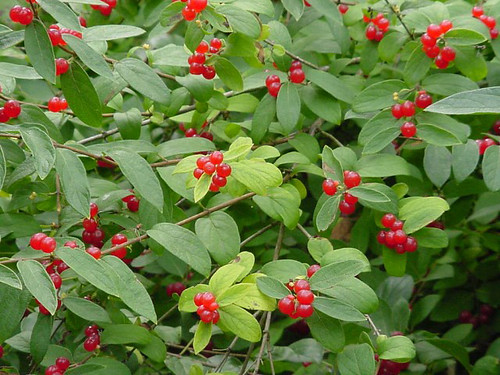
What he, and they, were up against was this; look at the bag, chances are you can tell what colour it is ...

http://farm4.static.flickr.com/3484/3740107254_28f34935d2.jpg
... despite the strong cyan filter
What he, and they, were up against was this; look at the bag, chances are you can tell what colour it is ...
http://farm4.static.flickr.com/3484/3740107254_28f34935d2.jpg
... despite the strong cyan filter
Sparrow
Mentor
.
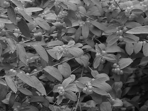
so this doesn't come as much of a surprise
http://farm3.static.flickr.com/2595/3739309869_02ee65f11b.jpg
until you see the two bags side by side, that is
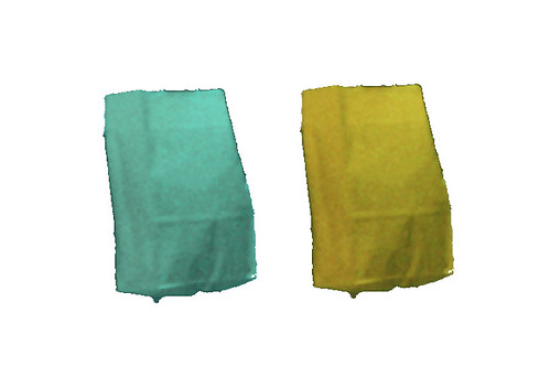
http://farm3.static.flickr.com/2527/3740107460_a1f284ec6e.jpg
The green bag in reality is clearly yellow. Which is why one doesn't see the red colour cast under tungsten, or green under fluorescent, lights until the prints come back from the chemist
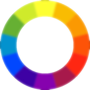
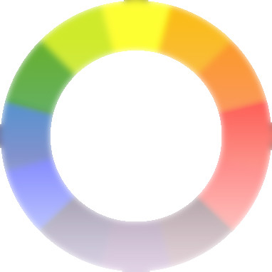
So after all that the rational scientists came up with; the colour wheel, bit of a disappointment that
Oh, and those colour modes in photoshop that no one quite sure what to do with.
so this doesn't come as much of a surprise
http://farm3.static.flickr.com/2595/3739309869_02ee65f11b.jpg
until you see the two bags side by side, that is
http://farm3.static.flickr.com/2527/3740107460_a1f284ec6e.jpg
The green bag in reality is clearly yellow. Which is why one doesn't see the red colour cast under tungsten, or green under fluorescent, lights until the prints come back from the chemist
So after all that the rational scientists came up with; the colour wheel, bit of a disappointment that
Oh, and those colour modes in photoshop that no one quite sure what to do with.
Sparrow
Mentor
This is what Rood came up with, Rood was an American physicist who took up painting and started to a apply his scientific knowledge to his art, he published a book on the subject towards the end of 19th century. It looks a bit archaic and unscientific today with all those pigment names but one has to remember there were almost no synthetic pigments at the time.

http://farm3.static.flickr.com/2542/3742309410_d47a54bfef.jpg
A chap called Perkin stumbled on Mauveine, a synthetic mauve while looking for a cure for malaria, became filthy rich and spawned a whole generation of wanabe organic chemists that went on to develop the modern pigments and dyes, without which colour film would have been almost impossible
The pictorial arts at the time were, for the first time, undergoing quite revolutionary change, previous generations of artists had usually looked to build on what already existed, but all that changed with the Pre-Raphaelites who while not strictly speaking Avant-garde they were definitely revolutionary. The world had already been confused by the abstractions of Turner’s later work, there is now some doubt about John Ruskin claim that he burned Turner’s porno stuff, but eather way one can see how inspiring what little of Turner’s one could see was.
Last edited:
Chris101
summicronia
Actually I quite like seeing the pigments placed on the color "wheel", er, triangle.
Sparrow
Mentor
So in the finale years of the 19th c it wasn’t surprising when the impressionists came along and gave the world the other barrel, armed with photography, some newly developed colours in tubes! And these new fangled colour “theories” they were the first truly Avant-garde group.
When I first joined the wonderful world of work I spent the first few months grinding pigments with a knife and marble pallet, so I can see how liberating the tube of paint would be.
A few minutes in Photoshop makes Rood’s triangle more understandable

Better?
http://farm3.static.flickr.com/2487/3764823277_69b1be4167.jpg
and that begat this type of thing, which is starting to look almost modern
http://farm4.static.flickr.com/3443/3765983046_f4a02ed1b2.jpg
Their big idea, the impressionists that is, was an understanding or belief that what they were seeing was not the object they were looking at but the light reflected off it, they got out into natural light, tended to work as quickly as they could using colours in combination rather than mixing them. Sounds a lot like photography doesn’t it?
A quick search for Edgar Degas on Google will reveal a set of paintings that could have been copied from photos, an interesting exercise is to contrast the classical composition of Monet’s work with that of Degas the latter’s has a real vibrant, snapshot feel. All new and revolutionary stuff. However they sadly condemned every subsequent generation of artists to do the same to do “Modern Art” simply being new was the new good.
When I first joined the wonderful world of work I spent the first few months grinding pigments with a knife and marble pallet, so I can see how liberating the tube of paint would be.
A few minutes in Photoshop makes Rood’s triangle more understandable
Better?
http://farm3.static.flickr.com/2487/3764823277_69b1be4167.jpg
and that begat this type of thing, which is starting to look almost modern
http://farm4.static.flickr.com/3443/3765983046_f4a02ed1b2.jpg
Their big idea, the impressionists that is, was an understanding or belief that what they were seeing was not the object they were looking at but the light reflected off it, they got out into natural light, tended to work as quickly as they could using colours in combination rather than mixing them. Sounds a lot like photography doesn’t it?
A quick search for Edgar Degas on Google will reveal a set of paintings that could have been copied from photos, an interesting exercise is to contrast the classical composition of Monet’s work with that of Degas the latter’s has a real vibrant, snapshot feel. All new and revolutionary stuff. However they sadly condemned every subsequent generation of artists to do the same to do “Modern Art” simply being new was the new good.
Last edited:
Sparrow
Mentor
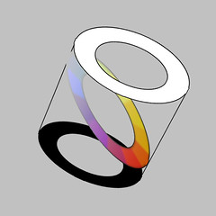
What Rood envisioned was a cylinder with that wheel in the centre and black and white at either end
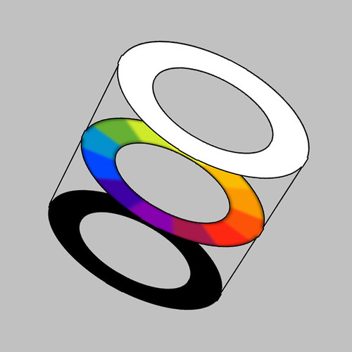 http://farm3.static.flickr.com/2648/3766163228_c43177fc50.jpg
in such a way that a diagonal section rthrough it would look like this
 http://farm4.static.flickr.com/3499/3766223270_32ecd1640d.jpg
Whenever I have anything to do with Colour Spaces it’s that image that comes to mind, Rood sadly predated Photoshop by over a century so never got the full credit for making an already complex system even more headache inducing
in such a way that a diagonal section rthrough it would look like this
Whenever I have anything to do with Colour Spaces it’s that image that comes to mind, Rood sadly predated Photoshop by over a century so never got the full credit for making an already complex system even more headache inducing
Sparrow
Mentor
All these perception things are very subjective so none of them are strictly speaking theories or rules, simply tendencies but having said that there are some handy bits and bobs
The Natural Order of Colours ... or how to accessorise and colour coordinate soft furnishings (in a manly way)
A bit of jargon first, so one can sound knowledgeable at exhibitions, coordinate and complementary colour, that’s complementary as in “balanced or opposite” as opposed to complimentary as in “that pink really suit you, would you like to go for a drink later on?” and coordinated as in Laura Ashley’s. I’m actually going to use Harmony and Dissonance for the sake of simplicity.
So here’s how it works, in any horizontal section through the colour space I proposed, colours in any adjacent portions are in harmony, match or coordinate. Those combinations tend to be relaxing and calming.

http://farm4.static.flickr.com/3426/3768906598_8804477d45_o.jpg
like this
or this
The Natural Order of Colours ... or how to accessorise and colour coordinate soft furnishings (in a manly way)
A bit of jargon first, so one can sound knowledgeable at exhibitions, coordinate and complementary colour, that’s complementary as in “balanced or opposite” as opposed to complimentary as in “that pink really suit you, would you like to go for a drink later on?” and coordinated as in Laura Ashley’s. I’m actually going to use Harmony and Dissonance for the sake of simplicity.
So here’s how it works, in any horizontal section through the colour space I proposed, colours in any adjacent portions are in harmony, match or coordinate. Those combinations tend to be relaxing and calming.
http://farm4.static.flickr.com/3426/3768906598_8804477d45_o.jpg
like this
or this
Sparrow
Mentor
On the other hand colours that are opposite each other are dissonant (complementary) and those colours in combination tend to be exciting and vibrant.

http://farm3.static.flickr.com/2505/3768107105_b9c863f250_o.jpg
like this
or this
that last one I saw coming a mile off, and could set it up and just wait, confident it would work simply because I knew the yellow and blue to be dissonant
http://farm3.static.flickr.com/2505/3768107105_b9c863f250_o.jpg
like this
or this
that last one I saw coming a mile off, and could set it up and just wait, confident it would work simply because I knew the yellow and blue to be dissonant
Sparrow
Mentor
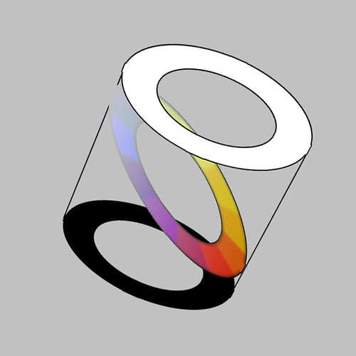
and not only that, but if we go back to this model …
http://farm4.static.flickr.com/3499/3766223270_32ecd1640d_m.jpg
… and produce a colour wheel where yellow is less saturated and purple is more saturated the effect is reduced (the colours are said to be “In natural order”) and all become less dissonant

http://farm4.static.flickr.com/3487/3765983174_c647054737_o.jpg
Whereas the reverse is true of .. well, the reverse
http://farm4.static.flickr.com/3570/3765983242_57dc81c205.jpg
http://farm4.static.flickr.com/3499/3766223270_32ecd1640d_m.jpg
… and produce a colour wheel where yellow is less saturated and purple is more saturated the effect is reduced (the colours are said to be “In natural order”) and all become less dissonant
http://farm4.static.flickr.com/3487/3765983174_c647054737_o.jpg
Whereas the reverse is true of .. well, the reverse
http://farm4.static.flickr.com/3570/3765983242_57dc81c205.jpg
Sparrow
Mentor
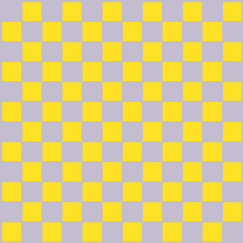
So if you feel like tiling your bathroom in the worst possible colour combination, say a yellow and purple equal check, then the natural order predicts this will look OK

http://farm3.static.flickr.com/2452/3769853026_403b6a900a.jpg
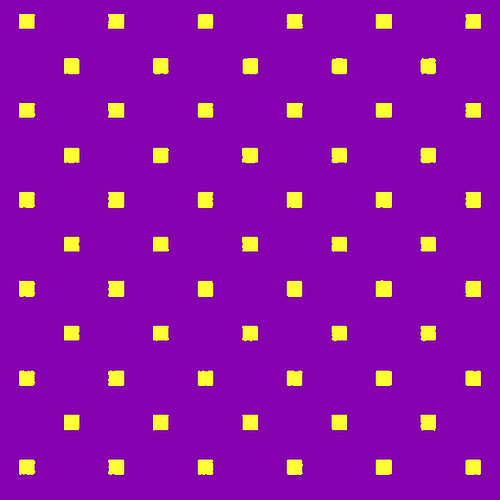
and this will make your eyes bleed
http://farm4.static.flickr.com/3594/3769051503_720e067396.jpg
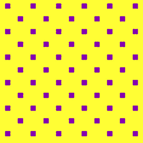
or if you must use colours of an equal value then you must alter the design so that one shade or the other becomes dominant and the other becomes a highlight, like this
http://farm3.static.flickr.com/2669/3769110989_6d1ca25ba4.jpg
http://farm3.static.flickr.com/2643/3769910372_0aa35764ef.jpg
… which helps explain why redheads look so good in green.
http://farm3.static.flickr.com/2452/3769853026_403b6a900a.jpg
and this will make your eyes bleed
http://farm4.static.flickr.com/3594/3769051503_720e067396.jpg
or if you must use colours of an equal value then you must alter the design so that one shade or the other becomes dominant and the other becomes a highlight, like this
http://farm3.static.flickr.com/2669/3769110989_6d1ca25ba4.jpg
http://farm3.static.flickr.com/2643/3769910372_0aa35764ef.jpg
… which helps explain why redheads look so good in green.
Sparrow
Mentor
So the next time your significant other buys a new dress astound her with a few well chosen accessories.
Whatever colour the dress is any small items, earrings, bracelets and maybe shoes should be chosen from the dissonant shade.
e.g. navy blue with orange/red, or a red dress with lime green earrings.
Larger accessories, scarves, handbags and the like, should be chosen from the harmonic shades (those either side) or from the dissonant shade modified by the natural order
eg so that same navy coat would need dark-green or pale-apricot scarf, or a British Racing Bentley turbo must have red or the tan leather seats or a navy overcoat with a cerise lining
The same applies to all colour-combinations, fashion, interior design, whatever
only a starting point and remember you must see the shades must be side by side, tiny differences really matter the human eye can differentiate about 5 million green shades, and it's impossible to remember colour.
Coming back to photos; knowing this is one thing using it is different again. The figurative artist gets to choose colour-combinations and composition, starting with a blank sheet he can combine colour and line in any way he pleases.
In contrast the photographer is stuck with a world crammed full of stuff and he must choose as much what to miss out as what to include.
So in essence, whereas a painter can lead the viewers’ eye around, in most cases a photographer has to make do with giving them a gentle shove in the right direction. As with composition, when one knows to lookout for a certain type of colour-combination you get more of them cropping up in your contact sheets.
...THE END...
Share:
-
This site uses cookies to help personalise content, tailor your experience and to keep you logged in if you register.
By continuing to use this site, you are consenting to our use of cookies.