RayPA
Ignore It (It'll go away)
Welcome to this critique thread. Please read the purpose statement and the guidelines/ground rules regarding participation.
Purpose
The primary purpose of this thread is to provide a forum where photographers can give and receive constructive criticism on one another's photographs. By setting up some basic guidelines we hope that this thread will provide a forum where the give and take of honest constructive criticism can help us become better photographers.
Guidelines/Ground Rules
The thread has very specific rules regarding participation. The one basic rule is that you cannot provide criticism on an image or comment in a critique thread unless you also have an image posted. To post an image to this thread you must be a participant. Participation in this thread is limited. Here are the guidelines and ground rules for participation:
• Participation in this thread is limited to 5 photographers
• Participants join the thread by posting their intention. You can simply reply with your intent to join by posting something like: "I'm joining," "I'm in," or just state your name
• Joining is on a "first come, first served" basis. The first 5 to reply become the participants.
• Please, only join this thread if you are able post an image within 24 hours of joining.
• Once the thread has 5 participants, no other photographers can join or participate in the thread
• Once the thread is full of participants all photographers will upload their image(s)
• Please abide by any thematic requirement (e.g., landscape, portrait, etc.)
•The number of photos for each participant is limited to one
• Photographers attach photos as thumbnails (no inline images or links)
• Photos should be standard screen resolution (72~90) and the longest side of the image approximately 10 inches in length.
• Photographers post their images supplying titles (if any) and other pertinent information (the amount of information should be minimal)
• Photographers can only comment on their own images and reply to comments only when everyone else in the thread has posted their comments on the image
• Every participant must comment on every photo (except their own—initially)
• Every participant must make at least two comments, one positive comment, and one constructive criticism (which is actually two positive comments)
• Once every photographer has commented then a free flowing discussion begins. It is at this point that every photographer can comment on their own work and reply to comments, ask questions, etc.
• The participants decide when the thread closes.
What's a Guest?
A guest is a participating member of the thread who does not need to post a picture. The guest is an exception to the guideline that states all participants must post an image. Guests provide criticism just as the other participants do. Guests are also encouraged to act as moderators, to encourage elaboration, to guide discussion and examine latent concepts brought about as a result of the discussion.
Note: Not all threads will have a guest. See the title/subject line for the '+Guest' designation.
If you'd like to participate in a critique thread and need some ideas about how to proceed with viewing images critically, you may find this thread helpful:
How do you look at photos
You can also provide feedback on critique threads here:
Critique Feedback Thread
Remember: Please do not provide criticism on an image or comment in a critique thread unless you also have an image posted.
This thread is now active, please follow the guidelines if you'd like to participate! Have Fun!
.
mrtoml
Mancunian
I would like to join again.
sf
Mentor
me too, for sure.
raid
Dad Photographer
I would like to join here.
Raid
Raid
Wayne R. Scott
Half fast Leica User
I need some motivation to shoot some film, so I'll go in on this one.
Wayne
Wayne
I'd like in on this one
sf
Mentor

raid
Dad Photographer


mrtoml
Mancunian

Wayne R. Scott
Half fast Leica User
Sorry guys, I'll try to post mine tonight.
Wayne
Wayne
sf
Mentor
Don't forget!
Wayne R. Scott
Half fast Leica User
Ok, finally here is my crappy scan:
Wayne
Wayne
Hey guys,
I think thats all five of us? Are we up and running, I dont want to prematurely start commenting!
Bryan
I think thats all five of us? Are we up and running, I dont want to prematurely start commenting!
Bryan
Wayne R. Scott
Half fast Leica User
Have at it Bryan")
Wayne
Wayne
sf
Mentor
Wayne. R. Scott:
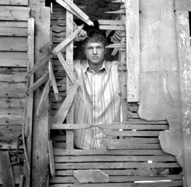
This image is captivating, but I am not sure if it's his expression, or the context of that expression. Only thing that I question is the flat tones (very fast film?) that leave the subject on the same plane as his setting - but then again, that sort of works. It actually underlines the environment's play as context for that expression. I think the only thing I would do if I were editing this image, would be to trim the right side (get rid of the unfinished black shape at his head level) because it is too slight to really have a place in he composition. Maybe if you had another quarter inch of it, then it would work great to accentuate the rickety nature of the building. There is something haunting about his expression, it seems attached to that building. But his body language has him detached. Interesting. Is it the scan or the film/dev that has the shadows blocking up?
Mrtoml: this is a very nice portrait. Very classic child shot. Perfectly frame and executed. I really have no critical comments. Wait...yes I do. Just one. Her fingers are cut off. Generally, when you have a portion of the hand in the composition, in a classically executed portrait, you want to leave the rest also in there. But, looking at it, I don't see why they say that. This looks great to me.
Nostalgie: First thing that I see in this shot is the striking tonal range, and how she is sinking into the black background like she's reclining into black ink. The whiteness of the cigarette, how it is so buoyant relative to the other tones and forms, really catches the eye. Nothing perfect white but the cig, and she's so gray. Her expression and posture is so natural, too. I mean, you could have asked her to "take a puff" for the picture, but it isn't obviously so. Nice one.
Raid: What makes this image is her eyes, how she's touching her hair, and her half smile. A very child-like expression, sort of dreamy and care-free. It does feel somewhat cramped, as both her arms are chopped by the crop - I might have liked to see a window or something to the right, maybe another 30% onto the right side of the composition. Tonally, seeing some perfect black and maybe brightening the white highlight in her eye would be a nice detail. Really, I guess it's just the tonal adjustments and the eye highlight that would finish this shot.
George
I love this shot, it's got a dreamy kind of aesthetic, I don't think it would've been the same if it were in color! Did you crop this one? If so, I like how you pulled it off, in the end, its the moment you captured in her expression, a thoughtfulness that comes through. I guess a little more contrast is the only thing I can say I might want to see.
Raid
Her expression is a once in lifetime, you said this was a "shoot" with your daughter,
if so, wow, this doesn't look like pre determined shot. Its simply a great shot, the only thing that stands out are a few highlights in her sweater, if I had to haggle, thats what Id say, little less exposed.
Mark
This is a great shot! The eyes are amazing! I think you can only get these expressions from kids, just straight happiness! I dig it, Id like to see more in focus, around her face and the wood she's gripping, I don't know if that would take away from the face, but I really like it, what film was this? Lots of grain.
Wayne,
This composition is killer, I wish I had some places like that around here! Im liking the tone of this one a lot as well! I opened in "Preview" and zoomed out a little, so I could see the whole thing without scrolling, and I liked it more. Im not sure if it was your scan, or just the shot, but there some spots, particularly around the face, that looks out of focus? With more grain than Im guessing it should? Maybe a rescan would fix it, if that area around your subject was clear, I think it would bring this shot out a helluva lot! Regardless, its an awesome grab!
Hope my comments were ok, its my first forum critique, just wanted to be helpful as possible! Thanks guys!
Bryan
ampguy
Mentor
damn, that was fast. Getting in one of these is getting trickier than finding an RD1 refurb at the Epson site!!
Maybe RFFQuest should take out some more features
Maybe RFFQuest should take out some more features
mrtoml
Mancunian
My comments
My comments
Shutterflower
Like this a lot. It has a tranquil kind of mood that is well captured. Nice contrast between the black shadows of the left and the nicely exposed face side of the shot. Hard to say what could improve it. Maybe a square crop would be nice with the face more central? Maybe without the stray hair across the face? Hard to say. I think a little more contrast would help, but that might be my monitor.
Raid
I like shots of kids and this is great. Nicely capturing one of those numerous moments of happiness inherent in a child's life. Nice contrast and composition. I like the position of the right hand in the frame, but the left hand is maybe a little distracting with the fingers protruding a little past the face. A minor niggle.
Nostalgie
Lovely shot. It has great contrast and added interest with the cigarette. Looks very fine and detailed. The close framing is great. I wouldn't change a thing here so it is hard to say what would improve it. Maybe a little crop to remove some of the top of the frame?
Wayne
Hard to say much about this with the blurry scan, but it looks like a nice interesting composition. The man in the shot looks trapped and it is a disturbing image in some ways so if that was the intention it works for me. The face is nicely framed by the shards of splintered wood. Again hard to give a constructive criticism. Maybe move in a little closer, but still retain a fair amount of the wall?
Regards
Mark
raid
Dad Photographer
Wayne: This image is very interesting. I wish you had uploaded it as a thumbnail so that I can switch back and forth between my commenting and the image. The fuzziness adds to the mystery. The man's face shows stress or weariness. It is as if he is breaking a hole in the wall and escapes to the outside.
I am taking the risk of annoying you by playing with the image a little. I added contrast and added some Sepia toning which not everybody likes.
Bryan: Your image is well composed, and I may be too picky here, but having a little bit more of her hand from below would look better. You always have to be careful with ankles and knees and arms ... etc. This image is powerful. There are strong expressions, and the nearly closed eyes along with the cigarette smoke and part of her hair at her neck add to this powerful image. Choice of B&W certainly has not hurt either. It is an image that is alive; her cheeks are drawn in from inhaling the cigarette smoke. I can nearly feel the smoke being sucked in. The details in her forehead's skin comlpexion are well caught. The blackness around her adds to the mystery. Leave it as it is.
Mark: You have focused on the eyes and let the mouth area go soft; that was a good choice of focus point. The background is very soft out of focus which makes the child's face stand out nicely. Her happiness shows through. Her hair locks look beautifully painted by water color and not like a photo. Now I am being picky again; her knuckles and hands could have been included completely.
This image is alive.
George: What a feminine image this is. I sense softness and youth and calmness in this image. It makes me think of a horse stable at a farm and having the young woman look out to the fields. Exposure will well chosen. My picky point: low contrast in the woman's image. Maybe it was intended to add softness to the image. Maybe it ismy monitor. Who knows. I also would have recommended to "move" the woman slightly to the left since a centered person is not always the most powerful position. What a beautiful image this is. Ask yourself this question: would this image hold its strength with a less beautiful person [like me]?
Raid
Attachments

Last edited:
Share:
-
This site uses cookies to help personalise content, tailor your experience and to keep you logged in if you register.
By continuing to use this site, you are consenting to our use of cookies.