
Richard G
Mentor
Thanks BobYIL. It's not so much you misspelling Kristian's name, it's more that we already know that this advice of yours is not welcome to him. I am not sure you will be seeing more of his pictures. And Marek, you might have just held off too.
BobYIL
Well-known
Thank you for the HU, corrected.
Koolzakukumba
Real men use B+W
I no longer shoot digital and only looked in at this thread to see if the new
Leica was anything special. I'm sorry for being critical of some "over-structured" photos, wrongly, as it turned out, thinking the authors were inviting some comment. I'll bow out now but I'd just like to say to whoever was equating the "structure filter" look to Tri X that there is no valid comparison to be made. There is no way of using any film to replicate the look of the structure filter or vice versa. Digital is digital and film is film and amen to that!
Leica was anything special. I'm sorry for being critical of some "over-structured" photos, wrongly, as it turned out, thinking the authors were inviting some comment. I'll bow out now but I'd just like to say to whoever was equating the "structure filter" look to Tri X that there is no valid comparison to be made. There is no way of using any film to replicate the look of the structure filter or vice versa. Digital is digital and film is film and amen to that!
ChrisN
Striving
When did this turn into a critique thread? The OP invited people to post their best MM shots, and has stated that he's not looking for critique. If people don't like what they see, why not just move on? Kristian's preferred "look" is just that - his preference. Does anyone doubt that his RAW files could be processed to give a wide range of "looks", from soft low contrast through to sharp high contrast?
Could the critics please just hold off, and perhaps the other MM users will share a few more pics to show what the MM can do in other hands? Thanks.
Could the critics please just hold off, and perhaps the other MM users will share a few more pics to show what the MM can do in other hands? Thanks.
BobYIL
Well-known
The title says " Leica M Monochrom: best pics"... What's wrong for suggesting a couple of things to make the pictures look better, to exhibit the Monochromes capabilities better?
No critics about his way of seeing, just the contrary I praised it. No critics the way he uses his camera... Just a few suggestions for post processing only with the hope to help him with the way how his results seem in some eyes.
This forum pays special attention to B&W photography, is there anything wrong for suggesting something to a capable hand to try for? We all are interested in seeing the results of some top cameras, whether we intend to buy them or not.
And the way he presented the pictures was not the optimum in my opinion and what I suggested I suggested politely; no need to feel offended...
photo_fred
photo_fred
Wow some serious results of self harming on that girl's arm!
Now we're going to critique her decision of getting a tattoo?
Richard G
Mentor
photo-fred, I am very sorry to tell you that young women cut their forearms with sharp implements as a cathartic response to psychic turmoil. That is evident in the right edge of the photo. You'll see it in restaurants and shops and on the street.
Nigel Meaby
Well-known
Now we're going to critique her decision of getting a tattoo?
Oh my goodness!! What is this!! So much misinterpretation and misunderstanding in this thread. My friend please look at the picture carefully. No it's not a critique of the tattoo.
Look at the girls forearm she has cut it repeatedly. In the UK that is referred to as self harming. I'm not criticising. In fact when I look at that picture I'm wondering sympathetically what happened in that girl's life that led her to do that to herself. I hope that answers your question.
")
wintoid
Back to film
Kristian's processing reminds me of LJ on Flickr http://www.flickr.com/photos/16536699@N07
I wouldn't choose it myself, but I enjoy it in other people's work. And yes, the MM looks good to me.
I wouldn't choose it myself, but I enjoy it in other people's work. And yes, the MM looks good to me.
helen.HH
A smile & a wink…
Wow, woke up this Morning 'Happy' because Kristian pm'd me to say he would be back posting on this Thread...
then I open the thread to view
And BAM back to INSANITY again:bang:
As For Nigel's Remark, there is nothing wrong with what he posted.
he noticed in the photo the knife marks and casually remarked about them
Unfortunately someone thought he was talking about tattoos and
Nigel then had to Explain himself only to be bombasted by 'Moriturii'
Sheesh, can We ALL just please be Pleasantly Civil
Even if we Disagree
Oh yeah Kristian
I like your new set of photos...I"m diggin the edginess & 'look'
And it's obvious how You treat those street photos in Comparison to your more Subdued processing in the 'Fashion' set
then I open the thread to view
And BAM back to INSANITY again
:bang:As For Nigel's Remark, there is nothing wrong with what he posted.
he noticed in the photo the knife marks and casually remarked about them
Unfortunately someone thought he was talking about tattoos and
Nigel then had to Explain himself only to be bombasted by 'Moriturii'
Sheesh, can We ALL just please be Pleasantly Civil
Even if we Disagree
Oh yeah Kristian
I like your new set of photos...I"m diggin the edginess & 'look'
And it's obvious how You treat those street photos in Comparison to your more Subdued processing in the 'Fashion' set
Richard G
Mentor
The Monochrom lives on. One of my frustrations with this thread is that I don't have the entry criterion to post a picture! But Kristian and Jeff and Peter and others have set the bar so high so it's just as well.
MORE PICTURES PLEASE.
MORE PICTURES PLEASE.
Jager
Established
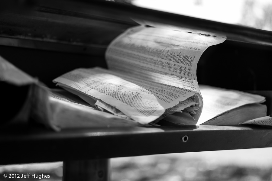
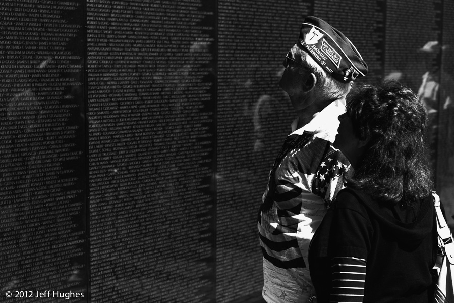
"The Numbers of the Dead"
Jager
Established
The title says " Leica M Monochrom: best pics"... What's wrong for suggesting a couple of things to make the pictures look better, to exhibit the Monochromes capabilities better?
Perhaps thats the issue...it's not showing off the monochrome's base charectoristics, it is showing off people's work from the camera. People's take on using the camera in their style. Just like all or photography, you'll like some of it and not like the rest.
Teuthida
-
Kristian,
It's obvious you have a good eye and I appreciate your efforts to contribute to this forum. However I believe if you pay a little more attention to your processing then your contribution to us to appreciate the merits of the Monochrome would be better. (Hopefully you would not feel offended.)
He is "paying attention to his processing." He's processing it so that it conforms to how he sees the scene.
This sort of "critique" certainly isnt going to help him become a better photographer. IMO, he's already better than 99.9% of most of the people here. I'm certain he knows it too. He has a vision and style particular him himself. I suspect as well that he is intimately knowledgable re: tones, tonal relationships etc. You're not telling him something he doesnt already know.
Nothing as well against the poster who posted the picture of the woman's back to suggest how he might do something, but the contrast between what Kristian is posting and what others are is so obvious as to need no mention.
There are two steps to the maturation of any visual artist: 1. Learning the aesthetic "rules." 2. Learning how to surmount the "rules" in service to ones' aesthetic vision. With all due respect, most folks remain stuck on 1, while Kristian is way past that.
Last edited by a moderator:
jamato8
Corroding tank M9 35 ASPH
Interesting thread and oh, interesting images. :^)
I do find the images by various artists here enjoyable to view. I have always been more a fan of contrast, having used 3 paper a lot, in years past and agitating during film processing, a little more. All in the balance though but that balance is within each one of us to decide. What is fun, is to see how each one of us views that balance and I am so glad we all view it a little differently. I took an Ansel Adams shop years ago but for the most part, I find his images rather static. I could have purchased some of his images for around 20 dollars. I wish I had gotten a few but they just didn't click with me.
So goes each of our preferences and yet our ability enjoy, or not, our different view of this life.
Sorry that actions some times are necessary, and glad to see the thread moving forward. I deleted some ridiculous posts.
D&A
Well-known
As a long time B&W shooter with film, (but strictly digital these days), I'm of the opinion that the look and appeal of many B&W images (especially those from using film and going through the complete wet process from start to print), is extremely subjective. Even if 10 B&W shooters are given the same negative shot on a given film stock and then told to print it up....you'd end up with 10 very different looking prints. Sometimes the differences would be extreme. Throw in this mix, the same image shot on 10 diffferent kinds of film stock and have each of those 10 photographers print up each of the images, you's have 100 different looking interpretations...some similar, some different and some as extremely different as one can imagine.
Same thing with taking a color digital file and handing it out for conversion to B&W and then printed (or shown on the web). With color, generally there is more of a narrow range for interpretation. Yes, there are some differences, but a red car will always be interpreted as some hue of red. Same as the blue sky. Hues, contrast as such may be adjusted differently but all the images generally will have more in common than "said" B&W images I cited as an example and outlined above. It may be B&W, but I've seen the same image printed so differently, that some tones of a given piece of the image ran the gamut from deep deep gray, to very light grey and everything in-between. Color filters on the lens enhanced these differences even greater.
I think what is a bit lost with looking at files from the MM vs. say the M9 or other color digital cameras, is the advanatges of the MM files as related to a wide variety of B&W looks when compared to these other color digital cameras. Kristian outlined in words, some of the differences he has found. Since the MM, like any color digital camera files converted to B&W, it generally has to have its output worked on in post processing to achieve some sort of reasonable "look", so looking at files directly out of the MM, really doesn't indicate much with regards to a final product. Additionally, I beleive a more true comparison of MM files vs. M9, would have to be where very similar images of a subject, is taken with both cameras at the same time and then this pair of files given to a number of photographers, instructed to adjust, so the output of the pair of files from a given photographer is as simlar as possible but at the same time adjusted to their own particular interpretation.
This is where the photographer comes in...no different than the choice film based photographers have to make, not only with paper stocks and chemicals for the print, but their choice in film. All I can think of is "subjectivity" comes to mind and if an image is successful to most peoples "eyes", aside from the actual subject matter, people will let it be known and graviate towards it. Again this is not dogma, just my own personal belief.
Dave (D&A)
CK Dexter Haven
Well-known
I don't know if this is funny or sad. This, below, and Fogiel's comment and 'example' photo....
Is the purpose of this thread to glorify a piece of hardware, or to demonstrate actual photography that might be done with it? The pictures are "overly contrasty?" Forgive Kristian for bringing something to the conversation. It's called Character. And thank the gods we don't all share ONE of them.
As for the comment that we should be employing the full dynamic range of this sensor — well, then, just photograph grayscale test charts. I've never seen a photograph that i liked where i commented to myself about how marvelously all 12 steps are reproduced. If that's the voice in your head, you should be writing for dpreview (no disrespect to dpreview — that's what it's for), but not calling yourself a photographer.
Have you people heard, for example, of LITH PRINTING? Is that not a valid result? Do the subject's skins remind you of spent chewing gum? A fellow named Anton Corbijn, to name one, has made a greater career than any of us with just that style. Look at Ed Van der Elsken and tell me he 'maximized' the quantitative potential of Tri-X. Irving Penn. Steven Meisel. Josef Koudelka.... We can name names for ages.
The point is this: Kristian's photographs are about his vision of a scene. I'm delighted it doesn't match Bob or Marek's. Although i like some of Marek's photographs. That's a simple matter of my taste versus his. And, i respect that he has a Particular Viewpoint and way of seeing things. When you lose that, your images aren't really worth viewing.
Wow. Just re-read this: "with a more careful processing you would do more "justice" to your Monochrome."
I would hope it's not the intention of any photographer to "do 'justice'" to a piece of gear. It should always be quite the other way 'round. Who owns who in that scenario?
And, now a smiley face so i don't get censored/deleted.
Last edited by a moderator:
whitecat
Lone Range(find)er
If 6 of us took a negative and printed it, we would get different results. This is this photographer's interpretation.
Share:
-
This site uses cookies to help personalise content, tailor your experience and to keep you logged in if you register.
By continuing to use this site, you are consenting to our use of cookies.