
Erik van Straten
Mentor
Yes, that exactly is split grade printing.Oddly enough I might employ multiple grades to print that image. Trying to burn the sky with the current contrast grade would be problematic because there's really no good way to do it without also darkening the tops of the trees and making them look unnatural. So, I'd print the top half of the picture with a lower contrast filter to bring some tone back into the sky if there is any in the negative. Might try burning the water a tad with the same lower contrast filter. Bottom half of the photo looks ok although I might try dodging the dark areas of the bank and base of the trees on the left just a tad to salvage some detail. But retain some pure black in those areas for impact.
Or alternatively print the entire image with lower contrast for more mid range detail, which is kinda how these scenes look in real life -- a bit hazy and soft.
Erik.
x-ray
Mentor
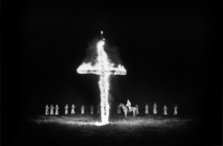
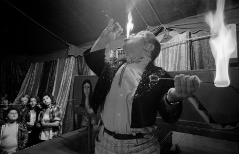
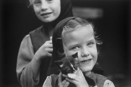
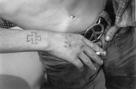
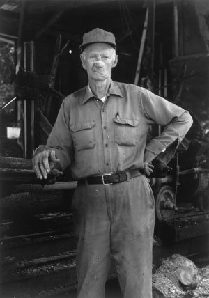
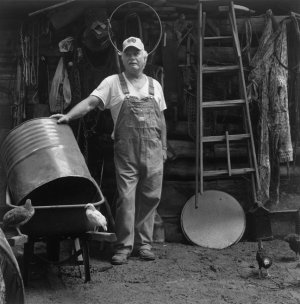
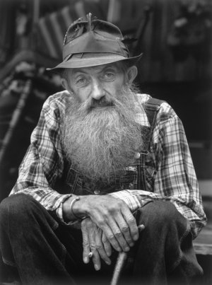
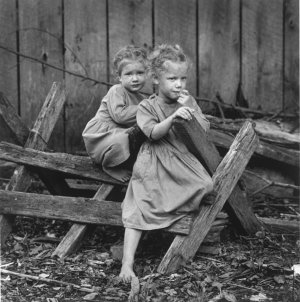
I often print using multiple filters. Here are two examples of prints from negs that are your worst nightmare. The fire in both cases had to be printed with a 0 filter at 7-8 times the base exposure. There’s a huge amount of dodging as well.
Attachments
brusby
Well-known
I have nothing whatsoever against split grade printing. In fact, I've used it ever since I started printing professionally. But it's just another tool, like dodging and burning, to pull the most out of negatives.Yes, that exactly is split grade printing.
Erik.
I object to it when it is used as a cure all to try to solve all printing problems, even in places where dodging and burning would be more appropriate, and when it is used in such a heavy handed manner that the highlights or lighter areas of the print become unnaturally dull and gray.
I have to admit, my real pet peeve is snow printed that way so that it looks like a smooth gray carpet where all the nice little highlights that are there naturally are obliterated.
Coldkennels
Barnack-toting Brit.
That's why I said I'd probably add a bit of pre-flashing.Oddly enough I might employ multiple grades to print that image. Trying to burn the sky with the current contrast grade would be problematic because there's really no good way to do it without also darkening the tops of the trees and making them look unnatural. So, I'd print the top half of the picture with a lower contrast filter to bring some tone back into the sky if there is any in the negative. Might try burning the water a tad with the same lower contrast filter. Bottom half of the photo looks ok although I might try dodging the dark areas of the bank and base of the trees on the left just a tad to salvage some detail. But retain some pure black in those areas for impact.
I rarely do it, but if you get it right, that adds a little extra tonality to the whitest areas, bringing out a bit of detail, without affecting the rest of the image. It's basically like a more delicate split-grade with much less faff.
But that said... I like some stark white on a print from time to time, and it really doesn't look as bad on the print in person as it does in the scan of the print.
brusby
Well-known
Sorry, I didn't mean to sound like I was criticizing your printing. I wasn't. In fact I like your print. And I'm really glad we don't all see things alike or print alike. I was just offering how I would have analyzed the scene if I were given it to print professionally. Doesn't mean my way is the right way. Just another take in case anyone might be interested.That's why I said I'd probably add a bit of pre-flashing.
I rarely do it, but if you get it right, that adds a little extra tonality to the whitest areas, bringing out a bit of detail, without affecting the rest of the image. It's basically like a more delicate split-grade with much less faff.
But that said... I like some stark white on a print from time to time, and it really doesn't look as bad on the print in person as it does in the scan of the print.
Coldkennels
Barnack-toting Brit.
Oh, don't worry mate, I'm not offended. Like I said: I know I'm far from a master printer, and I'm still learning. I really wish I did it more often to get more into the flow of things. Pre-flashing never seems to get mentioned though; it's a nice little trick I picked up from someone years ago that occasionally solves the odd problem with things up in Zones IX and X.
x-ray
Mentor
Flashing is a technique we used to have the lab do with our motion picture film to lift the shadows a little.That's why I said I'd probably add a bit of pre-flashing.
I rarely do it, but if you get it right, that adds a little extra tonality to the whitest areas, bringing out a bit of detail, without affecting the rest of the image. It's basically like a more delicate split-grade with much less faff.
But that said... I like some stark white on a print from time to time, and it really doesn't look as bad on the print in person as it does in the scan of the print.
Erik van Straten
Mentor
gelatin silver print (sonnar 50mm f1.5 v1 1934) contax 1 v4
Amsterdam, 2023
Erik.

Amsterdam, 2023
Erik.
Erik van Straten
Mentor
Thanks a lot, x-ray. Beautiful lady. I did not know that there are digital negatives. Are they printed like a digital print? Can they be used in an analogue enlarger? Can you show some results?For Erik, here’s a platinum print you might be interested in. The grandson of Edward Weston, Kim Weston made the image, Graham Nash ( Crosby, Stills & Nash) made a 4x5 digital negative from Kim’s 8x10 neg and I made the platinum print.
Digital negs are excellent and can incorporate all the dodging and burning to optimize the negative for a perfect print every time.
Please excuse the cell phone shot.
I love their album Déjà Vu.
The shots above I made only to see if the new lens hood was vignetting on the lens.
Erik.
Last edited:
x-ray
Mentor
They’re specifically for contact printing.Thanks a lot, x-ray. Beautiful lady. I did not know that there are digital negatives. Are they printed like a digital print? Can they be used in an analogue enlarger? Can you show some results?
I love their album Déjà Vu.
The shots above I made only to see if the new lens hood was vignetting on the lens.
Erik.
I’ve made a few digital negs but not recently. They’re printed on a film like Pictarico film. Pictarico film was originally for overhead projection transparencies but works very well for digital neg printing and is inexpensive. It’s just a clear base film like acetate that takes inks readily.
Here’s a link to Ron Reeders website. He’s the authority on the subject and has a very good book on the process. Digital negatives - AlternativePhotography.com
The beauty of a digital neg is the ability to retouch and make adjustments to your file in Photoshop then print it out and toss it if it’s damaged or when you’re fished printing. If you retain the file you can of course create as many negs as you’d like. You can create your original with a digital camera or digitize a negative, both produce excellent results.
Digital negs are so refined now I’m unable to see any difference in contact prints from an original camera negative or a digital negative. Just consider the economy and convenience of capturing your image digitally, making adjustments and retouching and creating a perfect digital negative at lower cost than large format film that prints with absolutely no dodging or burning or manipulation. Theoretically each will print with the same exposure too.
x-ray
Mentor
Erik take a look on YouTube. I’ve not watched any of the tutorials but some look like they have some good info. I’ll probably look at some and see if there are any new tips.
I did quite a bit of platinum palladium printing and would like to get back into some other alternative processes.
I did quite a bit of platinum palladium printing and would like to get back into some other alternative processes.
ooze
Established
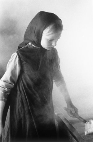
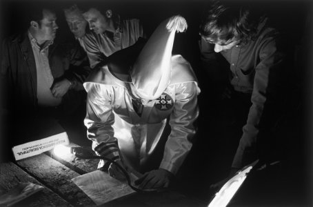
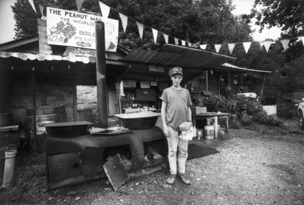
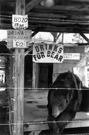
Not only are these great prints, but also amazing photographs!I often print using multiple filters. Here are two examples of prints from negs that are your worst nightmare. The fire in both cases had to be printed with a 0 filter at 7-8 times the base exposure. There’s a huge amount of dodging as well.
x-ray
Mentor
There’s no shortcut to bringing life to a print. Give a negative to ten good printers and you’ll have ten different interpretations. You might be able to straight print a negative and get a technically good print but it’s the dodging and burning where the brilliance of the print is brought out. How a negative is printed has a lot to do with the mood of that image.Not only are these great prints, but also amazing photographs!
Every one of these images has extensive dodging and burning that brings the subject forward and helps create a mood.
Thanks!
Attachments
-
 7643A53A-886A-4E36-B6C1-58DDEFE32D5E.jpeg60 KB · Views: 12
 -
 4C4FB842-6F12-4A3A-9F14-C1F4C609C30E.jpeg82.6 KB · Views: 15
 -
 1B38DBB9-6774-4A57-9453-E66626090969.jpeg209.4 KB · Views: 15
 -
 CE2A31BA-8D75-4D17-A0FC-9DDFBF82E4E1.jpeg137.1 KB · Views: 15
 -
 7B5460D9-E5B8-4B37-B271-6BF5D18C8B3B.jpeg113.1 KB · Views: 14
 -
 56713126-F5F9-4F62-9CE2-3DC0DA6148F3.jpeg152.2 KB · Views: 15
 -
 9CF6799A-EB05-4F67-9C85-BC2C80CA3ECA.jpeg89.5 KB · Views: 16
 -
 48D16B6C-8072-4E56-9DBF-DDD816E9BE94.jpeg77.3 KB · Views: 15
 -
 4724571F-9B4F-408B-AAF4-FED50CAA9827.jpeg141.6 KB · Views: 14
 -
 4A115DC1-16F2-4FB5-A9A5-6F6F9F76CDB9.jpeg126.1 KB · Views: 13
x-ray
Mentor
Other than subject, one of the differences between Erik’s prints and mine is, Erik prints are printed for tone in the highest value which brings them just below white and tone just above black in the lowest. He lets all the other values fall where they may. Those values become the most important things in the print.
I print for the subject and adjust my high and low values around my subject. I use dodging and burning to do that because it’s rare that that occurs naturally.
Go back in the samples posted in this thread and notice how a window in the shot overpowers the real subject or the subject is buried in deep shadow. Erik doesn’t dodge and burn. That’s Erik’s interpretation but I think he’s doing an injustice to his images.
Erik van Straten
Mentor
Well, I was talking about printing the negative, not about changing the image. With split grade printing there are of course enough ways to dodge and burn if one likes to do that. You must not interpret my words in the wrong way.Other than subject, one of the differences between Erik’s prints and mine is, Erik prints are printed for tone in the highest value which brings them just below white and tone just above black in the lowest. He lets all the other values fall where they may. Those values become the most important things in the print.
I print for the subject and adjust my high and low values around my subject. I use dodging and burning to do that because it’s rare that that occurs naturally.
Go back in the samples posted in this thread and notice how a window in the shot overpowers the real subject or the subject is buried in deep shadow. Erik doesn’t dodge and burn. That’s Erik’s interpretation but I think he’s doing an injustice to his images.
Erik.
Last edited:
x-ray
Mentor
You keep promoting you don’t need to dodge and burn when split grade printing.Well, I was talking about printing the negative, not about changing the image. With split grade printing there are of course enough ways to dodge and burn if one likes to do that. You must not interpret my words in the wrong way.
Erik.
x-ray
Mentor
You’ve said this repeatedly, use a 00 & 4 or 5 filter, add developer and magically you get perfect prints. 1 to 1,000 prints or more all alike.In analog printing "split grade" means that the exposure of the print goes in two (or more) steps with different gradation filters, usually the grades 00 and 5. The effect resembles duotone in offset-printing. If you want to make small prints this method is handier than all the dodging and burning in the world. Nobody has hands that are small enough to dodge and burn on small prints. Saves paper too.
Erik.
I guess it really comes down to how one interprets their negatives and what they consider perfect.
x-ray
Mentor
Erik, the conversation is about to go in circles so I’m jumping ship. No point in wasting time with an endless discussion. I’m too old and set in my ways to accept that split grade no dodging printing yields anything more than a gray mass of mud.
There are plenty of good examples in this thread to help any new printer decide which is best in interpreting their vision.
There are plenty of good examples in this thread to help any new printer decide which is best in interpreting their vision.
PRJ
Another Day in Paradise
I've split printed for 30 years now. Thinking that a print can be just exposed for the two grades and it is magically good is wishful thinking. Nearly every print needs a little help here or there.
I've never said it but I concur with Don. Eric, your prints tend to be dull gray. I am not saying that to be negative but maybe step back and take a look for yourself. Don't drink the split printing dogma. Maybe it is time to rethink your process.
I've never said it but I concur with Don. Eric, your prints tend to be dull gray. I am not saying that to be negative but maybe step back and take a look for yourself. Don't drink the split printing dogma. Maybe it is time to rethink your process.
PRJ
Another Day in Paradise
I've been playing with lumen prints lately. I find them fascinating. I can put a few out in the morning and fix them at night without having to set up the darkroom or spend any time at all with them. Super easy. I already had a ton of digital negs for alt processes laying around so I didn't even have to make any new negs for them, although I probably will if I continue to do them. And while the results are definitely different, they can be rather beautiful. Here is an example-

Share:
-
This site uses cookies to help personalise content, tailor your experience and to keep you logged in if you register.
By continuing to use this site, you are consenting to our use of cookies.