
brusby
Well-known
The only way split grade printing is exactly repeatable without dodging and burning is if one is willing to accept gray highlights. I'm not.In the past there was no VC paper, so printers used their burn and dodge abilities. Now there is split grade printing wich is much more economical and much more effective. Moreover, in split grade printing one can burn and dodge as much as one wants. The problem, of course, is that burning and dodging is never exactly repeatable.
Erik.
Erik van Straten
Mentor
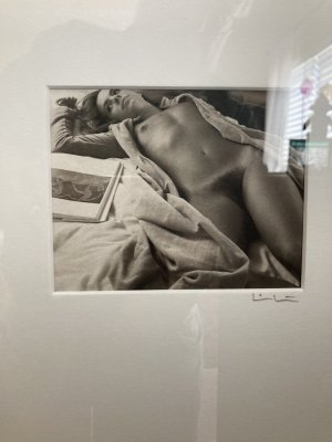
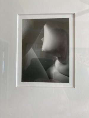
gelatin silver print (sonnar 50mm f1.5 nickel/black band uncoated) contax 1 v4
Jan Vroegopsingel Amsterdam 2023
Erik.

Jan Vroegopsingel Amsterdam 2023
Erik.
brusby
Well-known
I feel bad contradicting so much of what you're saying, but you keep making statements that are just not true. The results from dodging and burning can be very repeatable -- that's one of the main reasons so many professional printers use it.The problem, of course, is that burning and dodging is never exactly repeatable.
But if you don't know how to do it correctly, of course the results would not be optimal.
Deardorff38
Mentor
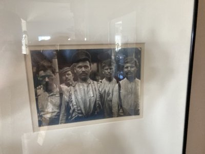
The analog contact print was made from an enlarged negative made from a digital file. I was shooting with a 6x9 that day and had used all my film. Flying home past Howser Towers, (all rimed uo)....all i had was a digital point and shoot i used to take snapshots of heli-ski clients. It was either digital or nothing. Yet i liked the image and wanted a black & white print from my darkroom.....not an inkjet print from a photolab.How is the image you posted related to the conversation?
11x14" contact print on Oriental Seagull FB, developed in Ansco 130.
Bob Carnie (Toronto) made the enlarged negative for me.
x-ray
Mentor
Erik I’m quite familiar with split grade printing. My professional photo career spans almost 55 years and I’ve been printing as professional since 1968 and for myself since 1958.I never dodge and burn, but I make split grade prints and then dodging and burning is not necessary. But this discussion was here before. Most people don't know what split grade printing is, btw.
The big advantage of split grade printing is that you can easily make several exactly equal prints. Dodging and burning is fine, but but costs a lot of time and paper and therefore money. The photo paper has become almost unaffordable.
Erik.
Not a personal attack at all on you but your prints are flat and lifeless. I know you take great pride in your images and prints but they would not meet my or my clients standards. I would never show muddy looking prints like yours. In my opinion split grade printing is a lazy way to put an image on paper, not a good one.
As to producing consistent prints when dodging and burning, you’re very wrong. I can take negatives, dodge & burn and produce a stack of prints exactly the same. I was taught that any printer can make 1 good print but few can make 100 identical from the same neg. I have done it many many times. If I’d shown prints like yours I’d been sent back to the darkroom until I got it right.
Again not trying to attack you personally. If you like your prints that’s great.
brusby
Well-known
X-ray, my pro photo career was not nearly as long as yours but I started in the mid 70s and spent a couple of years in the darkroom doing nothing but printing almost all the b&w stuff that came out of our studio. I share some of the same experiences and opinions regarding printing, particularly regarding being able to produce identical prints in large numbers using dodging and burning. I recall one of my first tasks when I'd only been working a week or so was to produce 100 8x10 (might have been only 50 it was so long ago) of Edwin Edwards, our then Governor. The other factor which had to be considered and adjusted for was exhaustion of the developer during the process.
Like you, I don't want to attack Erik, but he's so defensive about his split printing technique that he can't seem to mention it without denigrating dodging and burning. I feel the need to speak up to set the record straight for those with less experience.
Like you, I don't want to attack Erik, but he's so defensive about his split printing technique that he can't seem to mention it without denigrating dodging and burning. I feel the need to speak up to set the record straight for those with less experience.
Last edited:
Dralowid
Michael
For information Oliver typewriters look a bit like some mad mechanical butterfly or bird. Each piece of type is on a hoop that swoops down from one side or the other and hits the paper with a satisfying clunk. A long time ago when word processors were just arriving I collected typewriters and then threw them all away when I ran out of space!He collected all type of typewriters, but mostly old ones. I do not know anything about typewriters. I also don't know what became of his collection.
Erik.

Refurbished & Working OLIVER No.5 British WWI Typewriter, 1914 with Cork Platen | eBay
Find many great new & used options and get the best deals for Refurbished & Working OLIVER No.5 British WWI Typewriter, 1914 with Cork Platen at the best online prices at eBay! Free delivery for many products.
www.ebay.co.uk
x-ray
Mentor
What I’d suggest to anyone wanting to learn what a fine print is, go to a good museum when there’s an exhibition of one of the masters. Look at their work and you’ll see the brilliance of a fine print. A fine print is luminous as though the light comes from the print itself. Whites are clean with rich deep blacks. A fine print radiates light. You most likely won’t notice good dodging and burning but done properly it can be used to focus a viewers eyes to the point of interest. You’ll see how important manipulation o the image is in conveying the mood.
A print is much more than just laying an image on a piece of paper, it’s bringing life to that image.
A print is much more than just laying an image on a piece of paper, it’s bringing life to that image.
Erik van Straten
Mentor
Since I learned that H. Cartier-Bresson didn't print his own pictures, but that left to Picto, I have come to the conclusion that in general a good printer often makes better prints than a good photographer. Taking photographs and making prints are two completely different things. Printing photographs is a highly specialized activity that often does not go hand in hand with taking photographs. That is why most top photographers - specialists - leave printing to other specialists: printers. Unfortunately, as an amateur, I cannot afford to hire a professional printer.What I’d suggest to anyone wanting to learn what a fine print is, go to a good museum when there’s an exhibition of one of the masters. Look at their work and you’ll see the brilliance of a fine print. A fine print is luminous as though the light comes from the print itself. Whites are clean with rich deep blacks. A fine print radiates light. You most likely won’t notice good dodging and burning but done properly it can be used to focus a viewers eyes to the point of interest. You’ll see how important manipulation o the image is in conveying the mood.
A print is much more than just laying an image on a piece of paper, it’s bringing life to that image.
Moreover, the quality of prints cannot be judged on the basis of reproductions on a computer screen. No two computer screens are alike.
Erik.
Last edited:
hap
Well-known
I have a lot of unprinted negatives. I don't have the time or the resources to print. Several decades ago I sent some of my negatives to a master printer in Sacramento. He was a great communicator and he sent me samples of his "interpretations" of my negatives, which helped me understand the art. The prints hanging in my house are his as much as mine, in a way. For 5-6 years now I am trying to remember his name and not able to find contact information in my files. If anybody tuned to my weak signal can figure out who this was and can provide contact information, I would really like to have him print. I realize that this is a Hail Mary, but sometimes it's the only strategy left.
x-ray
Mentor
HCB wasn’t a very good printer. I saw a couple of his own prints in a show at the Frist Center in Nashville a few years ago. They were pretty bad prints. Actually he was a pretty bad camera technician as well making his negs very difficult to print. In the Frist show it was noted that his negatives were often poorly exposed as well. He just had the eye for composition and timing.
Most really fine photographers that I’ve known or admired their work have done their own printing. There are exceptions as noted but many are excellent as photographers and at interpreting their own negatives.
One of the now retired photo professors at the university here was a printer for Walker Evans. He said Evans negatives were often terrible and difficult to print. He said Evans cropped by taking a pair of scissors to his negatives cutting out what he didn’t want printed.
Hans Berkhout
Well-known
By any chance Lenny Eiger? He was/is pretty good.
x-ray
Mentor
I unfortunately don’t remember the name of HCB’s printer. The name of Evans is Baldwin Lee.
x-ray
Mentor
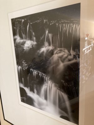
For Erik, here’s a platinum print you might be interested in. The grandson of Edward Weston, Kim Weston made the image, Graham Nash ( Crosby, Stills & Nash) made a 4x5 digital negative from Kim’s 8x10 neg and I made the platinum print.
Digital negs are excellent and can incorporate all the dodging and burning to optimize the negative for a perfect print every time.
Please excuse the cell phone shot.
Digital negs are excellent and can incorporate all the dodging and burning to optimize the negative for a perfect print every time.
Please excuse the cell phone shot.
Attachments
Hans Berkhout
Well-known
Re: whites printed as grey -and a bit more.
Some possibilities:
-Good negative; print was exposed too long. Shorten exposure time-and then you will need to increase the contrast setting somewhat.
-Lousy negative; related to improper film exposure an/or film development, with resulting negative way too dense @ higher end.
Some odds and ends:
Devment exhaustion: monitor with stepwedge dev'd at same time, have a bunch handy @ beginning of printing session.
Prints not identical; one may need to change bulb if enlarger has halogen light source. They "peter out", get inconsistent as age progresses.
Professional printers have to work with negs as presented to them. Awful negs from top shooters who don't always have time or interest concerning the tech aspects. Working with these dreads may require darkroom acrobatics.
Don't ask me about digital, film no prob.
Coldkennels
Barnack-toting Brit.
Now, I'm the first to admit I'm far from a good printer. I don't do it enough, and when I do, I'm lazy as hell. I use VC RC papers exclusively (although only Satin finish - gloss is awful, IMO), only dodge and burn when I really have to, and quite often rely on a printing meter to get a quick straight print purely to see what something looks like.
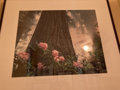
However, after Erik's last example of a split grade print, I'd like to present this print of a similar subject that I made last week:

This was literally just a case of slapping a +4 filter in the carrier (prints from XP2 tend to be quite flat), doing a test strip, and doing a straight print at that. Job done.
Is it the best print ever? No. If it was for exhibition or giving to someone else, I'd have put a lot more care into it. But it's got life, depth, and a rich range of tonal values - far more than the presented example of split grade printing. Also, the white sky does have the smallest hint of tonality in the print that hasn't transferred well to the scan; if I was to print it again (which I probably should), I'd probably pre-flash the paper a tiny bit, as I tend to find that gives better results for me than split grade printing does.
Ultimately it's all subjective, but I've always been happier with the prints I've made with single exposures and a touch of dodging, burning and occasional pre-flashing than anything Erik's presented as an example of the wonderful, perfect technique that is split-grade. Your milage may vary, I guess.
However, after Erik's last example of a split grade print, I'd like to present this print of a similar subject that I made last week:
This was literally just a case of slapping a +4 filter in the carrier (prints from XP2 tend to be quite flat), doing a test strip, and doing a straight print at that. Job done.
Is it the best print ever? No. If it was for exhibition or giving to someone else, I'd have put a lot more care into it. But it's got life, depth, and a rich range of tonal values - far more than the presented example of split grade printing. Also, the white sky does have the smallest hint of tonality in the print that hasn't transferred well to the scan; if I was to print it again (which I probably should), I'd probably pre-flash the paper a tiny bit, as I tend to find that gives better results for me than split grade printing does.
Ultimately it's all subjective, but I've always been happier with the prints I've made with single exposures and a touch of dodging, burning and occasional pre-flashing than anything Erik's presented as an example of the wonderful, perfect technique that is split-grade. Your milage may vary, I guess.
x-ray
Mentor
I started collecting photography before photography became popular as an art otherwise I could never have afforded the images I have. I bought prints when they were at giveaway prices. In the 60’s a friend and I called Brett Weston out of boredom one Sunday afternoon. We chatted a half hour and Brett said Edwards prints were $50 at that time. I’m fortunate when I want to see what a fine print is all I have to do is look around my home.
These are all vintage images made from the original negatives. One is a Jock Sturgis, Imogen Cunningham, Lewis Hine, Ansel Adam’s and Edward Weston platinum. The color is David Munch. I think I have 6 signed Adam’s prints plus a number of other artists.
In the mid 70’s I spent a week at a workshop taught by Adam’s at his Yosemite home and darkroom. I spent one day in the darkroom watching him print. Trust me he didn’t do split grade printing. Anyway I learned a lot that week.
On Ansel’s recommendation I went to San Francisco and spent most of a day with Imogen Cunningham looking at her negatives, portfolios, Weston’s and Adam’s prints and discussing them. What a great experience and the knowledge I gained has been invaluable.
Excuse the down and dirty pix. The reflections this time of day are bad.
Attachments
-
 35B6FE2E-D130-43D1-8CD9-7CA75BC6C396.jpeg202.9 KB · Views: 13
 -
 BF89AC3B-F21E-4018-8482-8C9B39491D9E.jpeg162.7 KB · Views: 13
 -
 91F78717-4084-4BFA-8F4F-D1DCAAB939A4.jpeg164.6 KB · Views: 14
 -
 FE970E94-2396-470C-AA43-E0EF48556F0C.jpeg153.8 KB · Views: 13
 -
 A3D876AE-FCDA-4E1A-90A4-0519FFA92613.jpeg233.6 KB · Views: 13
 -
 E07F10DF-33D9-4C9D-9576-9C49E09F4E13.jpeg174.3 KB · Views: 11
Erik van Straten
Mentor
Pierre Gassmann, the founder of Picto, the inventor of split grade printing. Before the war he and Cartier-Bresson knew each other; then already he made Cartier-Bressons prints.I unfortunately don’t remember the name of HCB’s printer. The name of Evans is Baldwin Lee.
Erik.
Last edited:
Erik van Straten
Mentor
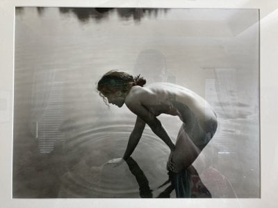
Bravo! You did it! Congrats. However, the sky is too white, therefore the print has no atmosphere; also the white in the water is too white. Some burning may help, but split grade printing would help much more.Now, I'm the first to admit I'm far from a good printer. I don't do it enough, and when I do, I'm lazy as hell. I use VC RC papers exclusively (although only Satin finish - gloss is awful, IMO), only dodge and burn when I really have to, and quite often rely on a printing meter to get a quick straight print purely to see what something looks like.
However, after Erik's last example of a split grade print, I'd like to present this print of a similar subject that I made last week:
View attachment 4819102
This was literally just a case of slapping a +4 filter in the carrier (prints from XP2 tend to be quite flat), doing a test strip, and doing a straight print at that. Job done.
Is it the best print ever? No. If it was for exhibition or giving to someone else, I'd have put a lot more care into it. But it's got life, depth, and a rich range of tonal values - far more than the presented example of split grade printing. Also, the white sky does have the smallest hint of tonality in the print that hasn't transferred well to the scan; if I was to print it again (which I probably should), I'd probably pre-flash the paper a tiny bit, as I tend to find that gives better results for me than split grade printing does.
Ultimately it's all subjective, but I've always been happier with the prints I've made with single exposures and a touch of dodging, burning and occasional pre-flashing than anything Erik's presented as an example of the wonderful, perfect technique that is split-grade. Your milage may vary, I guess.
I'm joking, of course, I like the picture, Coldkennels, but does it really have life, depth, and a rich range of tonal values - far more than the presented example of split grade printing? You must be joking too.
Erik.
Last edited:
brusby
Well-known
Oddly enough I might employ multiple grades to print that image. Trying to burn the sky with the current contrast grade would be problematic because there's really no good way to do it without also darkening the tops of the trees and making them look unnatural. So, I'd print the top half of the picture with a lower contrast filter to bring some tone back into the sky if there is any in the negative. Might try burning the water a tad with the same lower contrast filter. Bottom half of the photo looks ok although I might try dodging the dark areas of the bank and base of the trees on the left just a tad to salvage some detail. But retain some pure black in those areas for impact.Bravo! You did it! Congrats. However, the sky is too white, therefore the print has no atmosphere; also the white in the water is too white. Some burning may help, but split grade printing would help much more.
I'm joking, of course, I really like the picture, Coldkennels.
Erik.
Or alternatively print the entire image with lower contrast for more mid range detail, which is kinda how these scenes look in real life -- a bit hazy and soft.
Share:
-
This site uses cookies to help personalise content, tailor your experience and to keep you logged in if you register.
By continuing to use this site, you are consenting to our use of cookies.