Erik van Straten
Mentor
gelatin silver print (elmar 50mm f3.5) leica l (1930)
Erik.

Erik.

Evergreen States
Pierre Saget (they/them)
Mike Johnston at The Online Photographer has written some informative articles over the years on trends in digital black and white. His theory is that - while reminding us that this is his just opinion - the linear response of digital ends up depressing the midtones compared to film. Here are a couple great articles illustrating his observations.
How to Cure the Digital B&W Nasties
https://theonlinephotographer.typep...17/07/how-to-cure-the-digital-bw-nasties.html
Look at Tone as Light
https://theonlinephotographer.typepad.com/the_online_photographer/2017/07/look-at-tone-as-light.html
How to Cure the Digital B&W Nasties
https://theonlinephotographer.typep...17/07/how-to-cure-the-digital-bw-nasties.html
Look at Tone as Light
https://theonlinephotographer.typepad.com/the_online_photographer/2017/07/look-at-tone-as-light.html
Bill Clark
Mentor
I like black and white photography. I started my photography journey back in the 1950’s using only black and white film. Aside from the aesthetics, I like processing black and white with my analog darkroom. I have a big waste basket!
With color, when I was film based, I liked to use color slide film. I have quite a few kodak carousel trays! The ones that hold 80 work, for me, better than the trays that hold 144.
I like my Barnack IIIa. Works great!
Digital, I capture 100% RAW. I have just a few prints made each year. No black and white.
One of the photographers that worked for me, when I was in business, could make very nice black and white prints. She used an Epson printer. I don’t own a photo printer. Always used a lab, WHCC. I was way too busy. I could get more business with the time some spend making one print. Didn’t make sense to me.
At any rate, think I’ll exercise one of my Barnacks tomorrow.
Evergreen States
Pierre Saget (they/them)
Film often had a way of compressing the hues to create a rather complementary palette, in a way that digital definitely does not do natively. The analogue means of obtaining a complementary color palette was entirely down to the dyes chosen and their limitations (as I understand color film chemistry, in other words dimly). Digital just renders colors, as accurately and mercilessly as possible.
Maybe the hardest part of digital photography is that post-processing offers so much mind-boggling choice in the way your colors end up. Would anyone be interested in a color sensor that rendered slightly faded, complementary color palette along the lines of Saul Leiter? I would... even with how impractical that would be. Taking a little bit of the choice away from color photography without taking away ALL the color might be nice.
I agree with this diagnosis. Color film can look so pleasing because the colors are focused. I think this is why presets are so popular: with digital, creating distinctive and pleasing color takes work. When I was in Portland in 2019 I took note of the color palette in the weather and architecture (slate blues, desaturated army greens, creamy whites and yellows, earth tones) and made a few presets when I came back home based on that. I wanted to combine my impression of the colors with my impression of colors from cheap consumer 35mm film (skin tones that are somehow have too much red but it's also desaturated). Additionally, I used the Fuji 23mm ƒ/2 lens, which vignettes strongly like some rangefinder lenses designed for film do. These are my two favorite shots from the trip:
http://
 Right 2 Survive by Pierre Saget, on Flickr
http://
 Untitled by Pierre Saget, on Flickr
boojum
Mentor
Mike Johnston at The Online Photographer has written some informative articles over the years on trends in digital black and white. His theory is that - while reminding us that this is his just opinion - the linear response of digital ends up depressing the midtones compared to film. Here are a couple great articles illustrating his observations.
How to Cure the Digital B&W Nasties
https://theonlinephotographer.typep...17/07/how-to-cure-the-digital-bw-nasties.html
Look at Tone as Light
https://theonlinephotographer.typepad.com/the_online_photographer/2017/07/look-at-tone-as-light.html
I remember similar arguments about analog vs digital in recording. The romance of LP's. However the digital signal in audio can be manipulated immensely. It has been proven that solid state is indistinguishable from the very finest analog amps through demonstration. (https://www.stereophile.com/content/carver-challenge) It is demonstrated fact, and demonstrated before skeptics. I have no doubt this can be repeated in the visual world as it has been in the aural world. All we need is a motivated guru. There is a lot of software out there to manipulate raw files. There are a few who can make Leica CMOS look just like Leica CCD. As the Leica CCD is quite Kodak film-like and the Leica CMOS is not as much so I have no doubt that this "depressing the midtones" can be easily corrected to reveal a less accurate, more pleasing image. As a group we are getting more technically proficient. And some cameras have this ability as a built-in feature. It's 2021.
Evergreen States
Pierre Saget (they/them)
...I have no doubt that this "depressing the midtones" can be easily corrected to reveal a less accurate, more pleasing image.
If you click through to read the articles, each with its own example, Mike recommends two curve adjustments: a midtone lift and an inverted S-curve, respectively. However, this advice is not intended as some formula one can blindly apply to every picture to make digital look like film. Rather, they are there to illuminate a problem that you may not have even known existed. From there, you can use that information to make better judgement calls to make your pictures better reflect your intent. Johnston's guiding approach is to make the light look like real light and he therefore does not render his pictures with heavy contrast. That's just one approach, however.
boojum
Mentor
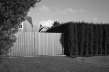
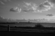
Being not quite as bright as the average bear I shoot JPEG and leave it to the camera to sort out. Here are two B&W's from a Leica M8.2 with, IIRC, a Canon LTM 28mm f/2.8 @f/5.6. These are both out-of-the-camera with no manipulation other than to shrink the gate photo to 4608 pixels on its longest side. I do not post these as great photos but as examples of what can be pulled from the camera in B&W quality without manipulation. They look OK to me, and of course YMMV.
boojum
Mentor
If you click through to read the articles, each with its own example, Mike recommends two curve adjustments: a midtone lift and an inverted S-curve, respectively. However, this advice is not intended as some formula one can blindly apply to every picture to make digital look like film. Rather, they are there to illuminate a problem that you may not have even known existed. From there, you can use that information to make better judgement calls to make your pictures better reflect your intent. Johnston's guiding approach is to make the light look like real light and he therefore does not render his pictures with heavy contrast. That's just one approach, however.
Agreed. The same holds true in audio. My point is that a wholesale dismissal of digital is as unwarranted as is a wholesale championing of film. And it is theoretically, at least, possible to emulate film if that is your aim. The same holds true with lenses. I have old ones and new ones. Each has its place.
As in audio, however, there can be a tendency to overthink the problem to the point of mental masturbation, present company excepted of course.
Evergreen States
Pierre Saget (they/them)
I do want to say, as an addendum to my previous comment, that I don't shoot for color often because I find it more difficult than black and white. Making color look good with digital photography has always been intimidating and overwhelming. But since moving to Capture One and working with a combination of my own presets and Ted Forbes's presets, I am very happy with some of my color work but I have not put in nearly enough practice to make a consistent body of work out of it (though to be frank my black and white work ain't exactly consistent either). Occasionally, I would just use color JPEGs from my X-Pro1 when they had rich, nuanced colors. I haven't played around enough with the JPEG settings on my X-Pro3 yet to see if I can do the same.
agentlossing
Well-known
IIRC this "compression" was more common in Fuji than in Kodak. I. E., Kodak had a larger color palette. Some camera sensors today allow for "older," "slightly faded" color palettes. Leica does and IIRC so does Sony.
I think the problem for me is that so many cameras offer these tweaked JPEG styles, not to mention all of the presets out there - I feel stifled by the overabundance of choices, it makes it hard to decide on a color look. I think that's why I have adhered so closely to Ricoh's Positive Film JPEG style. It's the only color mode on the GR cameras that I really like, and I am essentially willing myself to put blinders on regarding all of the other choices. But... when I go to edit RAWs, I lose the colors of the JPEG and have to try and emulate them. If the entire tone curve and H/S/L structure in the camera was designed around something like the GR's positive film, such that RAWs defaulted to this style, I think I'd be in hog heaven.
boojum
Mentor
I do want to say, as an addendum to my previous comment, that I don't shoot for color often because I find it more difficult than black and white. Making color look good with digital photography has always been intimidating and overwhelming. But since moving to Capture One and working with a combination of my own presets and Ted Forbes's presets, I am very happy with some of my color work but I have not put in nearly enough practice to make a consistent body of work out of it (though to be frank my black and white work ain't exactly consistent either). Occasionally, I would just use color JPEGs from my X-Pro1 when they had rich, nuanced colors. I haven't played around enough with the JPEG settings on my X-Pro3 yet to see if I can do the same.
I am just not bright enough to screw around with settings. On the Sony I use out-of-the-box settings with a - 1/3 exposure compensation. Likewise on the others. I just try to find something interesting to photograph. And like fishing, "it is fishing not catching." As for color, about all I know is, "if it is red, photograph it." LOL JPEG works fine for me. I know lots of folks like to fuss with RAW. I'd rather be taking pictures but that's me. Others love the digital darkroom work. We can't all love the same woman.
Godfrey
somewhat colored
Film often had a way of compressing the hues to create a rather complementary palette, in a way that digital definitely does not do natively. ...
There is no such thing as 'digital does something natively'. Digital image capture simply records a bunch of light values, numbers, and it is *completely* up to how those numbers are transformed into picture elements as to how the palette looks. There is nothing "native" about it, ever ... It's entirely the work of some engineer and stylist to design what palette, and everything else, is defined as an output.
Film and chemistry can have a 'native' look because they are physical chemicals interacting with one another, and then with light and your eye. Utterly, completely different from a digital capture.
I prefer a more subdued, sometimes compressed, look to my photographs' palette, usually, so my raw conversion and rendering process is pointed in that direction ... defaults that I have established and set. It's all in the numbers and has nothing to do with native anything..
G
boojum
Mentor
Yes, digital images are the result of a project involving a team with project goals, meetings, testing and lines and lines of code. We do not see any of this, of course. We see the finished image. To learn of the pain it takes to turn all those ones and zeros into gorgeous color images talk to sonnar_brian. This is not done in Visual Basic by any means. It is real bit twiddling, the realm of the true propeller heads. "Abandon all hope ye who enter here . . . " ;o)
Erik van Straten
Mentor
gelatin silver print (elmar 50mm f3.5 fixed) leica l (1930)
Erik.

Erik.

boojum
Mentor
boojum
Mentor
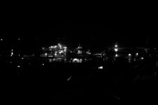
Tonight. A night shot test on the M240 with the CV 40mm f/1.2 @ f/1.2, reduced with Photopea to posting size. Quick, easy photo editor and free. I love free. ;o)
Leica M240, Voigtlaender Nokton 40mm f/1.2 Aspherical Lens, @f/1.2, ISO 640. Just a test of definition and resolution in B&W. In-camera B&W JPG.
Leica M240, Voigtlaender Nokton 40mm f/1.2 Aspherical Lens, @f/1.2, ISO 640. Just a test of definition and resolution in B&W. In-camera B&W JPG.
peterm1
Mentor
I do struggle somewhat with digital black and white.
My preferred approach is to shoot in RAW then convert though sometimes I will shoot in RAW and in JPG simultaneously with the image style set to black and white in the off chance that I will be happy with the result from the JPG files. I occasionally am, but especially where the scene is contrasty in a way that is likely to promote blown highlights, I inevitably will not happy with the results I get from JPG files and there is not much depth to them to allow much adjustment afterwards. Too bad, one day I may have to invest in a Leica monochrome.
Converting my RAW files to black and white in post is a different story up to a point. The files have a lot of information in them so they can be converted without ending up looking too "thin" and "stretched" no matter how much I mess about with them. But even so, it can still be a battle to get the final outcome looking as I would wish it to look. Sometimes I will do the conversion in Lightroom as this at least has sliders to adjust the monochrome affect of several different color ranges and this can make a big difference to the end result. But on the whole, I still prefer the results gained with Nik Silver Efex, possibly because I am more familiar with it. But it can still take considerable fiddling and experimentation to get a given image just as I wish it to be. In particular I have found that even with identical settings (as might be obtained by a "preset", no too files render the same and fair bit of experimentation is needed to get a result that works with a specific image.
The following are examples of ones made using Nik running under Lightroom more or less as a plugin. In all of these I have toned them a fair bit as I felt it suited the mood of each. I find I tend to prefer a somewhat warmish final toning in a lot of my shots where I am going for a less harsh result.
 Enigmatic Portrait by Life in Shadows, on Flickr
 Outside, looking in. by Life in Shadows, on Flickr
 Silver sea, Jimbaran Bay, Bali by Life in Shadows, on Flickr
My preferred approach is to shoot in RAW then convert though sometimes I will shoot in RAW and in JPG simultaneously with the image style set to black and white in the off chance that I will be happy with the result from the JPG files. I occasionally am, but especially where the scene is contrasty in a way that is likely to promote blown highlights, I inevitably will not happy with the results I get from JPG files and there is not much depth to them to allow much adjustment afterwards. Too bad, one day I may have to invest in a Leica monochrome.
Converting my RAW files to black and white in post is a different story up to a point. The files have a lot of information in them so they can be converted without ending up looking too "thin" and "stretched" no matter how much I mess about with them. But even so, it can still be a battle to get the final outcome looking as I would wish it to look. Sometimes I will do the conversion in Lightroom as this at least has sliders to adjust the monochrome affect of several different color ranges and this can make a big difference to the end result. But on the whole, I still prefer the results gained with Nik Silver Efex, possibly because I am more familiar with it. But it can still take considerable fiddling and experimentation to get a given image just as I wish it to be. In particular I have found that even with identical settings (as might be obtained by a "preset", no too files render the same and fair bit of experimentation is needed to get a result that works with a specific image.
The following are examples of ones made using Nik running under Lightroom more or less as a plugin. In all of these I have toned them a fair bit as I felt it suited the mood of each. I find I tend to prefer a somewhat warmish final toning in a lot of my shots where I am going for a less harsh result.
 Enigmatic Portrait by Life in Shadows, on Flickr
 Outside, looking in. by Life in Shadows, on Flickr
 Silver sea, Jimbaran Bay, Bali by Life in Shadows, on Flickr
Dogman
Mentor
My philosophy is to keep everything as simple as possible and let the machines and programming do the drudge work. I don't try to emulate film, that's a look unto itself. Virtually everything I shoot is B&W JPEGs with limited processing in camera and a lot of post processing to get it to look the way I like. Same way I worked when I shot Raw but without the conversion. Lenses have a lot to do with the look as well. I like imperfection so I have to work to uncorrect the look of modern "perfect" lenses. I like Fuji X-Pro cameras but their lenses are often overly sharp for my taste. I also like older digital Nikon cameras with lower resolution sensors and older Nikkor lenses. The new crop of Chinese manual focus lenses are often excellent for my use. I like a look that's sharp but with a sweet softness. Anything goes.
Putting up the Christmas decorations. Nikon D700, Nikkor AF 20/2.8D lens.

Angus with a big smile. Fuji X-Pro2, TTArtisans 50/1.2 lens.

Putting up the Christmas decorations. Nikon D700, Nikkor AF 20/2.8D lens.

Angus with a big smile. Fuji X-Pro2, TTArtisans 50/1.2 lens.

RichC
Well-known
Surely in the days of film the majority of photographers – then as now, whether taking colour or b&w photos – simply pressed the shutter and gave the film to a lab to make prints? That is, no attempt to manipulate the image?Has digital ruined black-and-white photography? In a sense - yes. When film was dominant, a majority of serious photographers worked in black-and-white because they could relatively easily and inexpensively control the image by developing film and making prints in their own darkroom. And those who did not have a darkroom had access to skilled printers who would work with them to produce “their look.”..
Today the digital photographer can easily exercise creative controls in either black-and-white or color. He can easily excercise color controls that were never available in film work and that make even rather routine images attention grabbing at least in the short term.
Perhaps it was the curves of film and paper or the fact that it was difficult to blow out the highlights that gave silver prints from film their special look. More likely, it was because the film negative didn’t look like anything until you printed it. When that first test print came up in the developer and you said, “too light” or “not contrasty enough” you were talking about what you felt it should be. In today’s digital world, when that image makes its first appearance on the computer screen, it’s all too easy to say, “That’s OK.” Take away the color and that may not be true...
Your thoughts - and certainly any thought about the many methods of rendering a digital image or color scan in black-and-white.
More serious photographers – again both in the past and present – controlled how their prints appeared, such as choice of paper and dodging and burning (granted the look of b&w film photos is way easier to modify than that of colour film). And photographers seriously into b&w learn to see the world around them in monochrome – for example, they know that two different adjacent colours of particular hues will be the same shade of grey in b&w – and once more that applies both to film and digital photography.
I mostly take colour photos, but what was a game changer for me was dumping optical viewfinder cameras for one with an electronic viewfinder. At a press of a button I can now do what would have taken years: see the world in monochrome! I can now take photographs that I know work in b&w because I can actually see them, including visualising what I want to do later in postproduction (e.g. dodging and burning).
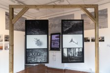
Below: My first ever b&w photos to go in an exhibition – in 2020. The triptychs are about Finland's forests: the two upper photos are mine, the lower ones are scans of photos from an old 1940s album I found on the Winter War fought between the Finns and Soviets.

boojum
Mentor
The Finns made the Soviets wet their pants during the Winter War. Sisu.
Readily available color images have broadened our pallet.
Readily available color images have broadened our pallet.
Share:
-
This site uses cookies to help personalise content, tailor your experience and to keep you logged in if you register.
By continuing to use this site, you are consenting to our use of cookies.


