
Deardorff38
Mentor
brothernature
"Now I shoot one type of film, always at the same speed, always developed in the same developer for the same amount of time."
the amount of time you choose to develop would depend on the contrast ratio of your scene.....otherwise you won't consistently get easily printable negatives.
"Now I shoot one type of film, always at the same speed, always developed in the same developer for the same amount of time."
the amount of time you choose to develop would depend on the contrast ratio of your scene.....otherwise you won't consistently get easily printable negatives.
Erik van Straten
Mentor
I'm not sure that's correct. I do not find any one filter to have the same effect as the split-grade method.
But perhaps I'm wrong on that. I'm new to darkroom printing and there are many variables, which makes direct comparisons between methods difficult.")
No, you are right, that isn't correct. Don't forget there are two different exposure times, one for filter 00 (usually very long) and the other for filter 5 (usually very short). How can a situation like that be the same with a situation in wich only one filter and only one exposure are used?
The point is that the paper has two layers, a hard one and a soft one. Through de use of the filters 00 and 5 these layers can be hit separately (but not at the same time): filter 00 hits the soft layer and filter 5 hits the hard layer.
Erik.
brothernature
Established
the amount of time you choose to develop would depend on the contrast ratio of your scene.....otherwise you won't consistently get easily printable negatives.
Not really possible with roll film and how I shoot. Sure, some scenes will be harder to print than others, but for me eliminating these other variables has helped me improve.
Corran
Well-known
All I want to say is that with split grade printing there is no need for burning and/or dodging to get all parts of the picture drawn - but it is most cases possible to make a "correct" print without burning and dodging when going the split grade way.
This just isn't true. S/F printing is not magic. As I said, a S/F print still will have the effective grade of one single filter. It is just another way to arrive there. The need for d&b in a given situation is a different issue altogether - and you will absolutely need to d&b if the dynamic range exceeds the medium (paper) but is still on the film, at least if you want "detail" in those areas. Anyway, the filters simply manipulate the ratio of light hitting the two layers of paper - just like S/F does with the most extreme filters.
Of course this is subjective - I'm not arguing that. But there's only so much a paper can show in terms of black-to-white. If you tend to shoot in situations that lend themselves to a specific dynamic range and have your film/paper dialed in, it's certainly possible to get a good straight print with all the range included, as long as you never deviate from that norm.
As someone who shoots mostly landscape, there are many times where a straight print would include blown-out areas or muddy blacks, regardless of film/development. D&b is necessary. There is no S/F printing out of that issue, even using N +/- development.
Deardorff38
Mentor
Not really possible with roll film and how I shoot. Sure, some scenes will be harder to print than others, but for me eliminating these other variables has helped me improve.
We each have our biases and ways of working. But i process different rolls of film for different amount of times depending on the light.... not just sheet film, helps me get consistent negatives...but whatever works for you.
BTW if you're looking for a timer that has multiple memory... check out RH. https://rhdesigns.co.uk/
I don't know if any others are still being produced.
Erik van Straten
Mentor
As someone who shoots mostly landscape, there are many times where a straight print would include blown-out areas or muddy blacks, regardless of film/development. D&b is necessary. There is no S/F printing out of that issue, even using N +/- development.
The 00-filter is soft enough to draw the darkest and the brightest parts. The 5-filter just pops the deepest blacks into the image. If the exposure is correct, there will be no blown out areas or muddy blacks.
split grade printed:

Corran
Well-known
Erik, almost all of the pics you post are of low-contrast scenes. Others have blown highlights where one would expect. Again, S/F printing is not magic. Your negative would still print fine with a #3 filter or something around that most likely. But of course it's fine to use the S/F technique...but don't ascribe it powers it does not have.
Personally I think encouraging new printers to use S/F techniques is a very bad idea. They don't even know how to get to proper print contrast to begin with, but they are trying to use advanced techniques. Learn addition before algebra.
Personally I think encouraging new printers to use S/F techniques is a very bad idea. They don't even know how to get to proper print contrast to begin with, but they are trying to use advanced techniques. Learn addition before algebra.
retinax
Well-known
I see nothing wrong with beginners using split grade printing, it's not hard and you don't need a full set of filters, nor a programmable timer. But I concur any split grade result can be matched with a single exposure, except for split dodging and burning (which is where split grade printing comes into its own). With an intermediate filter grade, you are exposing the soft and hard layers simultaneously. With split grade, one after the other. Makes no difference for the result in a straight print, just different workflows. This has been explained numerous times, in numerous ways, by numerous people...
brusby
Well-known
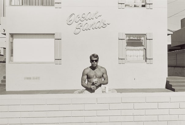
Split printing can produce lovely results in certain cases. But, using it as Erik does means that every print is essentially made with the lowest contrast grade available, 00. The second filter affects mostly, if not exclusively the very darkest tones. It has almost no effect on middle and lighter tones.
So, you end up with prints where all tones from midrange to the lightest values are rendered at the lowest contrast. That's what gives me the impression of muddiness.
If you look at the image immediately above this post, there are no true whites. Look at the border of the print to get an idea of true white, then look at the body of the print. The whitest areas of the spectrum are missing because the image was done on such low contrast paper.
I'm not condemning the practice if that's your personal preference, Just offering my analysis of what's happening.
Erik van Straten
Mentor
Erik, almost all of the pics you post are of low-contrast scenes.
No, this is absolutely not true.
Maybe the negatives of the people who have problems with printing (normal or split grade) are not correctly developed. When a film is not correcly developed the highlights can be blown out. The rule is that even the darkest parts of a negative should be so bright that you should be able to see through it completely. If a film is developed too long or too warm, it will be difficult to make good prints from the negatives. Expose Tmax400 as 200 ISO and develop for ten minutes in 1 + 2 diluted Perceptol at 20 degrees C.
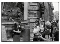
This is a very high contrast scene that can only be printed correctly with the split grade method. The street and the sky on the right were extremely bright. No details could be seen. Now you can see in the sky two electricity cables that were completely blown away in the normal prints I've made from this shot. Evening sun. No burning or dodging. One of the electricity cables is just onder the picture frame and the other just above the rooftops.
Leica MP/Summicron 50mm collapsible/Tmax400
Erik.

retinax
Well-known
Well I just wish there was another developing solution out there that worked at higher temperatures. I live in Georgia USA and it’s only during the winter that I can print. It’s simply too hot down here between March and November. A number around 75 would be adequate but 68 is simply too cool, when it’s around 95 outside.
What happens when you develop at higher temperature? Isn't it just done more quickly? Do you get adverse effects?
Corran
Well-known
You've posted yet another very low-contrast image that happens to have a bright spot in the corner. It's literally shadow every where else. And as mentioned above you've got no white in the image. Pushing down the bright right corner to almost Zone 8 by burning it in instead and letting the rest of the image breath a little with more contrast would be nice, in my opinion of course. The bulk of the image barely hits above Zone V.
Scans of prints are hardly a good way to see prints, but I would guess in person your print would look, to me, a bit flat and lifeless. If you like how your prints look though, keep on keepin' on.
As an example, I pushed the contrast and burned in the corner here:
Scans of prints are hardly a good way to see prints, but I would guess in person your print would look, to me, a bit flat and lifeless. If you like how your prints look though, keep on keepin' on.
As an example, I pushed the contrast and burned in the corner here:
Attachments
Erik van Straten
Mentor
So, you end up with prints where all tones from midrange to the lightest values are rendered at the lowest contrast. That's what gives me the impression of muddiness.
Well, yes, but that muddiness is a personal thing. I like that. It is done on purpose. It gives a certain mood to the pictures. The world isn't a paradise.
That muddiness can be avoided easily. If you want to.
Erik.
Erik van Straten
Mentor
As an example, I pushed the contrast and burned in the corner here:
No, not for me. As I explained to Brusby, the mood of a print is a personal thing.
For instance, the pictures of Cartier-Bresson and the pictures of Josef Koudelka are all split grade printed, but what a difference between the two.
Erik.
brothernature
Established
Henry Wessel is who I consider the gold standard, I always go back to his images after making my own prints. It's a pet peeve when people describe his images as "low contrast". I don't see them that way at all, they just describe that bright California light perfectly.
His highlights seem to have the lightest touch, and blacks are deep but still have detail, without the "muddy" look that tends to happen when others attempt to do this.
Erik van Straten
Mentor
I love the muddy look.
Erik.

Erik.
brusby
Well-known
I love the muddy look.
Erik.
Perfect for photos of mud. Just kidding, 'couldn't resist.
I think it's great you have a style that you like. And I really enjoy seeing your photos. Very nice images. Just because I would print them a little differently doesn't mean you should. I chimed in here only to offer a counterpoint when you suggested or implied that things are better without dodging and burning.
Something usually has to be done to control highlights and shadows. Dodging and burning is one method which allows the printer to pick whatever contrast grade he/she feels is best for the greater part of the image.
Your method of split printing is another which achieves the goal by lowering the global contrast of the whole image so that those extremes are within the dynamic range of the paper.
Neither approach is perfect. But it's good to know the advantages and limitations of both.
Erik van Straten
Mentor
Thank you, Brusby! You understand what I wanted to say.
It is very difficult to photograph a certain mood.
Erik.
It is very difficult to photograph a certain mood.
Erik.
brusby
Well-known
It is very difficult to photograph a certain mood.
Yes, very true. And as you've obviously discovered, using the right tools really helps. That's why I enjoy discussing the technical aspects of those things we have at our disposal, like different printing styles and options. Hopefully, a fuller understanding might increase our chances of success and make things a bit easier. Or maybe just help to decide which tool is best to use for any particular image.
Erik van Straten
Mentor
Yes, great, I enjoyed the discussions very much.
Erik.
Erik.
Share:
-
This site uses cookies to help personalise content, tailor your experience and to keep you logged in if you register.
By continuing to use this site, you are consenting to our use of cookies.