
Ko.Fe.
Lenses 35/21 Gears 46/20
Question for our Mentor and RFF members.
How to take good street pictures in color?
I could barely handle it in b/w") , but want to try it with color film, while I'm still capable to afford and handle it.
, but want to try it with color film, while I'm still capable to afford and handle it.
And is reversed slide film something too crazy for street photography?
How to take good street pictures in color?
I could barely handle it in b/w
, but want to try it with color film, while I'm still capable to afford and handle it.And is reversed slide film something too crazy for street photography?
edge100
-
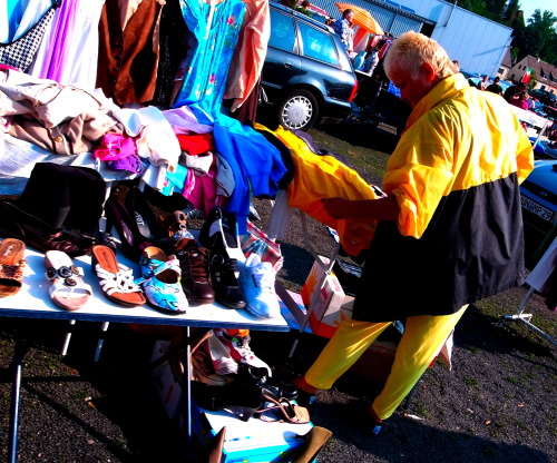
Like this?
 1024) {this.width=1024;this.alt='Click here to see a large version';}" onmouseover="if(this.alt) this.style.cursor='pointer';" onclick="if(this.alt) window.open('https://farm8.staticflickr.com/7622/16806083291_9b70636bf6_c.jpg');" border="0">
Open by Michael Fraser Photography, on Flickr
 1024) {this.width=1024;this.alt='Click here to see a large version';}" onmouseover="if(this.alt) this.style.cursor='pointer';" onclick="if(this.alt) window.open('https://farm9.staticflickr.com/8589/16058099953_d21988fb91_c.jpg');" border="0">
Anguish by Michael Fraser Photography, on Flickr
 1024) {this.width=1024;this.alt='Click here to see a large version';}" onmouseover="if(this.alt) this.style.cursor='pointer';" onclick="if(this.alt) window.open('https://farm8.staticflickr.com/7512/15953720822_20a2fae631_c.jpg');" border="0">
Piccadilly Rain by Michael Fraser Photography, on Flickr
 1024) {this.width=1024;this.alt='Click here to see a large version';}" onmouseover="if(this.alt) this.style.cursor='pointer';" onclick="if(this.alt) window.open('https://farm8.staticflickr.com/7519/15647765332_22211b5216_c.jpg');" border="0">
Decisions by Michael Fraser Photography, on Flickr
 1024) {this.width=1024;this.alt='Click here to see a large version';}" onmouseover="if(this.alt) this.style.cursor='pointer';" onclick="if(this.alt) window.open('https://farm6.staticflickr.com/5564/14844613458_22eace21aa_c.jpg');" border="0">
Joy by Michael Fraser Photography, on Flickr
1024) {this.width=1024;this.alt='Click here to see a large version';}" onmouseover="if(this.alt) this.style.cursor='pointer';" onclick="if(this.alt) window.open('https://farm8.staticflickr.com/7622/16806083291_9b70636bf6_c.jpg');" border="0">Open by Michael Fraser Photography, on Flickr
1024) {this.width=1024;this.alt='Click here to see a large version';}" onmouseover="if(this.alt) this.style.cursor='pointer';" onclick="if(this.alt) window.open('https://farm9.staticflickr.com/8589/16058099953_d21988fb91_c.jpg');" border="0">Anguish by Michael Fraser Photography, on Flickr
1024) {this.width=1024;this.alt='Click here to see a large version';}" onmouseover="if(this.alt) this.style.cursor='pointer';" onclick="if(this.alt) window.open('https://farm8.staticflickr.com/7512/15953720822_20a2fae631_c.jpg');" border="0">Piccadilly Rain by Michael Fraser Photography, on Flickr
1024) {this.width=1024;this.alt='Click here to see a large version';}" onmouseover="if(this.alt) this.style.cursor='pointer';" onclick="if(this.alt) window.open('https://farm8.staticflickr.com/7519/15647765332_22211b5216_c.jpg');" border="0">Decisions by Michael Fraser Photography, on Flickr
1024) {this.width=1024;this.alt='Click here to see a large version';}" onmouseover="if(this.alt) this.style.cursor='pointer';" onclick="if(this.alt) window.open('https://farm6.staticflickr.com/5564/14844613458_22eace21aa_c.jpg');" border="0">Joy by Michael Fraser Photography, on Flickr
BLKRCAT
75% Film
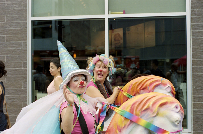
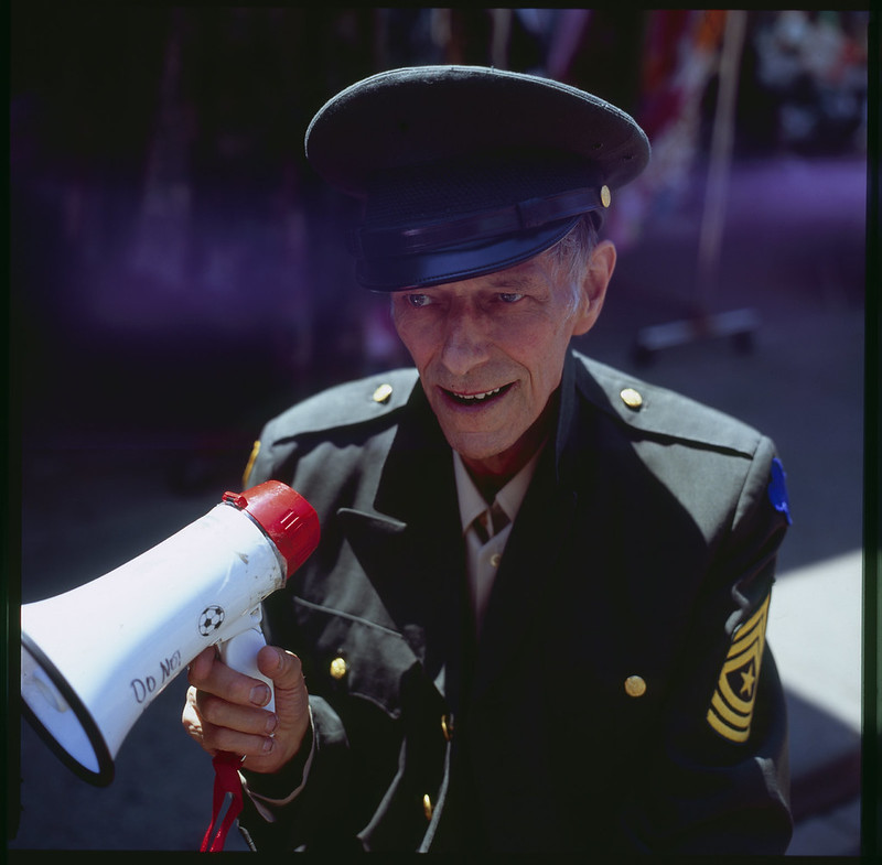
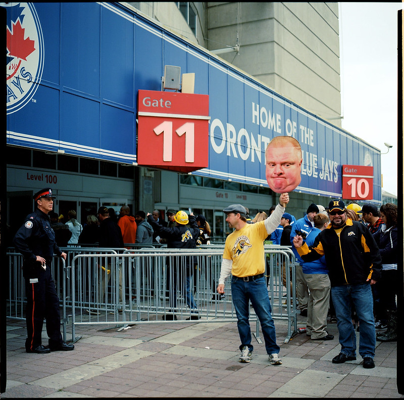
how about these?

Ko.Fe.
Lenses 35/21 Gears 46/20
I could understand how do I take flowers or antique car in color.
But pictures without explanations here brings more questions....
How do I use color in street photography?
They say "I have two cameras, one color film another b/w". How to decide which one is the right one?
Main subject is in main color?
Is it better to have less different colors?
Is it better to have more in focus less in bokeh?
x-ray
Mentor

x-ray
Mentor
lynnb
Mentor
Ko.Fe., I've always felt that the most important thing in a colour photograph is the colour.. so it becomes more of a challenge in street photography where there is usually colour everywhere and it's often moving as well.. moving coloured vehicles and people, a constantly-shifting colour canvas..
There are some light conditions where I think it's easier to compose in colour, but there's exceptions to every rule.. I like dusk and darkness where the high luminance colour is rich and shadow areas are more likely to be neutral and muted.. but photos like Alex Webb's and Ernst Haas, and the first picture by Edge100 above show that in bright high contrast light you can still find ways to isolate bright colour.
Golden hour colour is overlaid with warm tones which can give an overall attractive muted-colour look that can also be achieved in post processing.
Flat low-contrast days resemble a colour field so that colour composition can be abstracted, for example in the way of Mondrian, thinking about the arrangement of coloured shapes in space.. Stephen Shore's streetscapes are excellent examples of composing in colour.
Your photographic tools in the colour rendition and apparent acutance can influence the liveliness or recession of colour within an image - think of the difference between a Zeiss lens and a Summitar.. and also choice of film, you'd be very familiar with the difference between Ektar and Portra. So many choices.
So I guess what I'm saying is it depends what sort of look you want your colour street photography to have, and what sort of light and environment you are working in. Compare for instance Yanidel's distinctive Paris street colour look here, and Alex Webb, or Ernst Haas's colour photos of New York. Worlds apart (I prefer Webb and Haas).
As to transparency film, why not? If you nail the exposure it can be very rewarding. Deep shadows and rich colour.
Cheers,
lynnb
Mentor
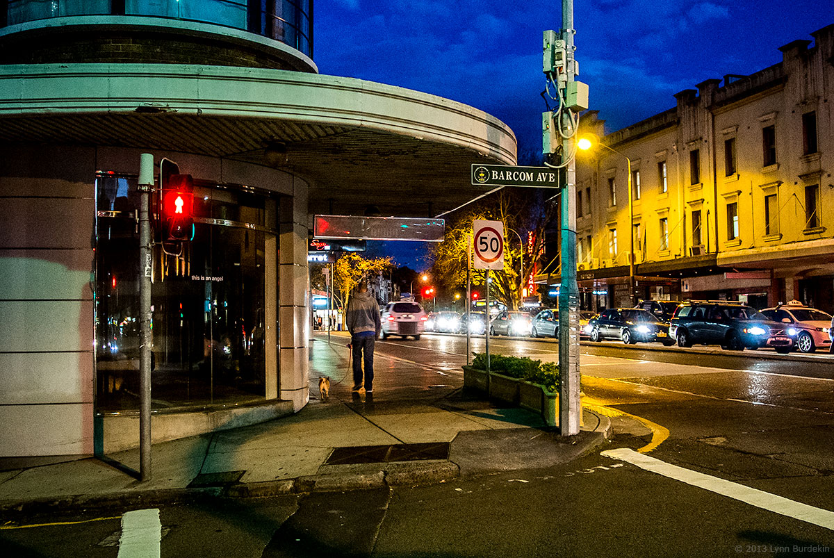
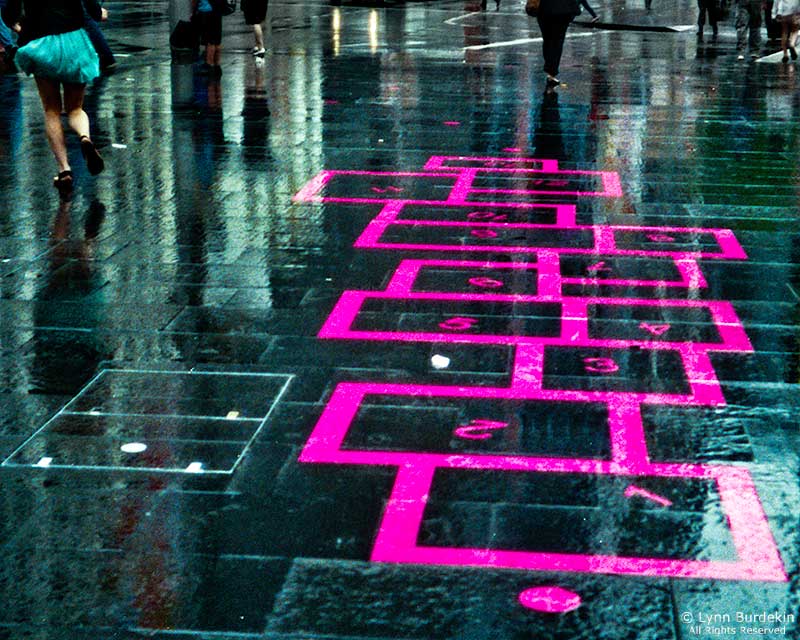
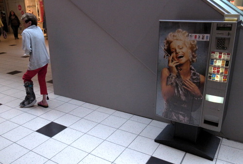
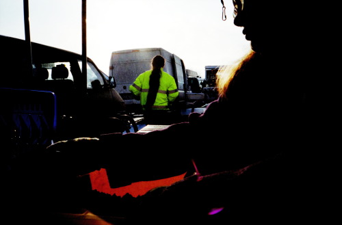
I will add that digital makes colour street work much easier in my experience, because of digital's high ISO capabilities and the huge flexibility of post processing. Some examples:
LX3 from a bus at my favourite time of day for colour

Nikon 1 V1, iso1800, OOC colour. The Nikon 1 and the Olympus cameras have an easily recognisable colour rendition. Being digital, it's easy to change in post if you don't like it
Rich night colour and a limited colour palette, digital

cheap colour film in an Olympus XA. Rainy days and nights allow colours to reflect and wash over a picture, here I saw the colour contrast and waited for something (the girl) to happen
another rainy day providing a "colour wash", which I find very nice. This is digital (I think it was 5D)

LX3 from a bus at my favourite time of day for colour
Nikon 1 V1, iso1800, OOC colour. The Nikon 1 and the Olympus cameras have an easily recognisable colour rendition. Being digital, it's easy to change in post if you don't like it
Rich night colour and a limited colour palette, digital
cheap colour film in an Olympus XA. Rainy days and nights allow colours to reflect and wash over a picture, here I saw the colour contrast and waited for something (the girl) to happen
another rainy day providing a "colour wash", which I find very nice. This is digital (I think it was 5D)
Dan Daniel
Well-known
Don't ignore Helen Levitt's color work.
http://www.americansuburbx.com/series-2/h/helen-levitt-color
http://www.americansuburbx.com/series-2/h/helen-levitt-color
lynnb
Mentor
^^ thanks for that link Dan I'd forgotten her! A great example for this thread.
Georgiy Romanov
stray cat
Kostya, just go out and shoot. In color. After batch of color film you will have your own opinion. I almost broke my brain when i try decide which film take with me and after that i decided what i want to shoot simply by the mood.
petronius
Mentor
I´d like to add the work of Franco Fontana (not a street photographer, but a master of color!) and of course Saul Leiter (slow film color street photography).
The book "Farb-Design" (Color-Design) was my favourite learning source about color theory.
My personal way of shooting street in color:
• I don´t carry cameras with color and B&W. Focus on one kind.
• I crop the pictures to get the wrong parts out
• I use Zoom lenses to get the right colors in
• I shoot much, I keep few
• In the end, its mostly luck to get all things right!
petronius
Mentor
zuikologist
.........................
Saul Leiter did street colour par excellence, as did Ernst Haas.
http://fadedandblurred.com/spotlight/saul-leiter/
http://www.ernst-haas.com/colorintro.html
http://fadedandblurred.com/spotlight/saul-leiter/
http://www.ernst-haas.com/colorintro.html
Maiku
Maiku
Kevin,
A little known Canadian, who took photos of Vancouver for 50-years in color.
Fred Herzog
http://fadedandblurred.com/spotlight/fred-herzog/
http://www.equinoxgallery.com/artists/portfolio/fred-herzog
There is a documentary on TVrg's Snapshot about him. I checked the website no repeat date is offered. I have seen it twice. Keep an eye open.
Maiku
A little known Canadian, who took photos of Vancouver for 50-years in color.
Fred Herzog
http://fadedandblurred.com/spotlight/fred-herzog/
http://www.equinoxgallery.com/artists/portfolio/fred-herzog
There is a documentary on TV
rg's Snapshot about him. I checked the website no repeat date is offered. I have seen it twice. Keep an eye open.Maiku
gnuyork
Well-known
Vivian Maier also did some work in color:
http://www.vivianmaier.com/gallery/color-1/
Jay Maisel is another one of my inspirations for color street photography. He used color very effectively.
http://www.vivianmaier.com/gallery/color-1/
Jay Maisel is another one of my inspirations for color street photography. He used color very effectively.
edge100
-
Honestly, I think that the better question is: why shoot B&W for street photography? To me, B&W is an artificial abstraction; the world is colour, after all. To paraphrase Joel Meyerowitz, colour simply describes more things. Why would I want to throw that away?
That said, sometimes I want 'abstraction', and I think my B&W work reflects that. My colour street photography, such that it is, is far more descriptive (whether intentionally or otherwise) while my B&W work is more abstract.
My advice is to simply go out and shoot colour.
That said, sometimes I want 'abstraction', and I think my B&W work reflects that. My colour street photography, such that it is, is far more descriptive (whether intentionally or otherwise) while my B&W work is more abstract.
My advice is to simply go out and shoot colour.
jbielikowski
Jan Bielikowski
I was about to answer you questions but I gave up... just go out with one camera, 35mm lens at f/8 or more, ISO 400 film and shoot, soon you gonna know it all. There is no question "how to use color?" but "what I want to show?" and then use color accordingly.
Oh, and remember “it's almost as though red is at war with all other colors”.
Oh, and remember “it's almost as though red is at war with all other colors”.
airfrogusmc
Mentor
Question for our Mentor and RFF members.
How to take good street pictures in color?
I could barely handle it in b/w
And is reversed slide film something too crazy for street photography?
There are no absolutes or one right or wrong way to do it. One thing to consider is that the color needs to be a used in a way as to support what you are trying to say visually.
B&W is not easier. In fact some would argue to do B&W really well is more difficult. With color either the color looks right or it doesn't so with color film you certainly don't have as much control as you have with B&W film. With B&W film you have a great deal of DR control trough processing times that you don't have with color. When you start changing development times and temps with color film you start getting uncorrectable color shifts.
So to the OP some folks see better in color. Some see better in B&W. The one that fits your vision is the one that is right for you.
And all photography is an abstract to our human experience. A photograph is two dimensional, it is a selected view of a scene and it is frozen moment in time.
Meyerowitz was mentioned earlier in this thread and I would recommend spending some time looking at his color street work and also spend some time with Davidson's Subway. That body of work was all shot with transparency film (Kodachrome)
https://www.magnumphotos.com/C.aspx?VP3=SearchResult&ALID=2K7O3RJSJ42A
peterm1
Mentor
I shoot digital and mainly in color. But I find "straight" color just from the camera does not work for me as it can be a little boring (IMHO). The beauty of black and white is that by eliminating color and focusing on tone it does somehow add to the image. I try to do something the same with my color images by manipulating the final result in post processing. My aim is to make it clear the image is not just a photo taken willy nilly of the subject but is an interpretation of it. In my case often this involves addition of some vignette, and both increasing contrast whilst decreasing color saturation a tad. That is just my preferred look. And I think that is important for a photographer - find a look that interprets the images in a way that speaks to you. If you are shooting film though thats a little harder to do. Examples of my way of intepreting can be found at my flickr page (linked below).
For me the genius of this type of work was Saul Leiter. Google him of you are not familiar with his work. He shot exclusively with film - often out of date slide film and the there is no doubt it gave his work a great look. Plus of course he had the true eye of a genius and an artist.Too many photographers forget that an image that works has to engage the interest of the viewer. Leiter was a master at taking shots with eye interest. Which could be interesting composition (he was brilliant at this specifically using lots of reflections and shots through foggy windows and partially captured images only hinted at the subject) or interesting people (which could be beautiful people or just people doing interesting things). Mostly he was wonderful at capturing images that were engaging to view and ponder. This is harder to pull off in my view when shooting in color than when shooting in black and white. I am still learning and will be till the day I die.
For me the genius of this type of work was Saul Leiter. Google him of you are not familiar with his work. He shot exclusively with film - often out of date slide film and the there is no doubt it gave his work a great look. Plus of course he had the true eye of a genius and an artist.Too many photographers forget that an image that works has to engage the interest of the viewer. Leiter was a master at taking shots with eye interest. Which could be interesting composition (he was brilliant at this specifically using lots of reflections and shots through foggy windows and partially captured images only hinted at the subject) or interesting people (which could be beautiful people or just people doing interesting things). Mostly he was wonderful at capturing images that were engaging to view and ponder. This is harder to pull off in my view when shooting in color than when shooting in black and white. I am still learning and will be till the day I die.
Share:
-
This site uses cookies to help personalise content, tailor your experience and to keep you logged in if you register.
By continuing to use this site, you are consenting to our use of cookies.