
Nando
Well-known
... root 2, that is 1:1.41 isn't of any real application other than it's the ratio of the A-size papers A4 being 210x297, A3 297x420 and so on ... phi, is the golden ratio at 1:1.62 both are irrational constants from the Classical Era ... that is Greece BC 500 to 300-ish
Both being close enough to 1:1.5 is missing the point it's like claiming 3 is close enough pi not to matter
Your third paragraph is a very pertinent observation ... although I suspect he would be looking for Gestalt rather than Classical composition
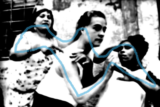
Hi Stewart,
Here is one of my favourite photos taken by Henri Cartier-Bresson. I believe that HC-B used his knowledge of the Root-2 rectangle to compose this image. I've overlaid the Root-2 rectangle in red and as you can see it doesn't cover the entire 1:1.5 rectangle. However, I think its pretty damn good!

SPAIN. Valencia Province. Alicante. 1933.
With all due respect, if the Root-2 was close enough for HC-B, it is close enough for me!
The Golden Rectangle also doesn't cover the entire 1:1.5 frame either. The short edges can get cut off with a Root-2 as in the above image. With the Golden Rectangle, the edges on the long side can get cut off.
To demonstrate, and also to show that I actually use this stuff, here is one of my humble photographs.

At Frida Café & Art, Sault Ste. Marie by ~ Nando ~, on Flickr
When I was looking through the viewfinder, I was actually trying to line things up on the whirling squares of the golden rectangle.

It took me perhaps 10 minutes or so to figure out how to set up the shot. However, I was very familiar with this place and I had a picture like this in my mind's eye for some time. After I waited a while, the barristas entered the frame and I started shooting. I took about 6-8 shots and this was the one that worked the best. Its not perfect, not exact but I don't think I could have done much better given the circumstance and my current skill-set.
Nando
Well-known
Nando;
I understand. This works well for the x, y axis. How is this applied to the z axis?
And, thanks for all the above work!
pkr
By Z-axis, are you asking how to use the root-system to enhance the illusion of the 3rd dimension on a photograph? If so, then I'm not sure. I don't use the root-system to create the illusion of the 3rd dimension. I'm not that advanced!
There are many methods to enhance the illusion of depth in a photograph.
Using light and shadow (see Adam's video above) to create order works well. An objected lighted from above at 45 degrees will look more 3-dimensional than one lighted from the side or from the front, for example.
One can overlap elements to indicate what is in front of what. Especially when combining this with light. The lightest element at the fore and each element in behind get darker and darker. If possible, one can also trigger a decrease in contrast from front-to-back to enhance this illusion - perhaps by opening the aperture a bit.
One can look for order - big-to-small. One can opt for a wide-angle lens that exaggerates perspective to give a photo more depth too.
To be honest, at this stage, I rarely take depth into consideration when I'm actually shooting unless I see variations in lighting that I can take advantage of. I normally leave this to when I'm looking at my contacts or when I'm printing.
charjohncarter
Mentor
Well, you are certainly way ahead of me. But keep it coming I'm learning with each post. I agree the 35mm frame isn't a 'fit' with any of the root # 'formats.' So just go with what is available, and I don't mean thrown everything about composition away. Just do your best to fit it with square, 2:3, or 6:7. I'm sorry, but I have to thank you again, it has been a long time since I have been involved in an important topic (here).
paulfish4570
Mentor
y'all be hurtin' my head. gotta go cry now ...
charjohncarter
Mentor
y'all be hurtin' my head. gotta go cry now ...
Like Einstein said, 'everything is not what it seems' or something like that.
Sparrow
Mentor
Hi Stewart,
Here is one of my favourite photos taken by Henri Cartier-Bresson. I believe that HC-B used his knowledge of the Root-2 rectangle to compose this image. I've overlaid the Root-2 rectangle in red and as you can see it doesn't cover the entire 1:1.5 rectangle. However, I think its pretty damn good!
SPAIN. Valencia Province. Alicante. 1933.
With all due respect, if the Root-2 was close enough for HC-B, it is close enough for me!
The Golden Rectangle also doesn't cover the entire 1:1.5 frame either. The short edges can get cut off with a Root-2 as in the above image. With the Golden Rectangle, the edges on the long side can get cut off.
To demonstrate, and also to show that I actually use this stuff, here is one of my humble photographs.
At Frida Café & Art, Sault Ste. Marie by ~ Nando ~, on Flickr
When I was looking through the viewfinder, I was actually trying to line things up on the whirling squares of the golden rectangle.
It took me perhaps 10 minutes or so to figure out how to set up the shot. However, I was very familiar with this place and I had a picture like this in my mind's eye for some time. After I waited a while, the barristas entered the frame and I started shooting. I took about 6-8 shots and this was the one that worked the best. Its not perfect, not exact but I don't think I could have done much better given the circumstance and my current skill-set.
Hi Nando ... with respect I think you may be reverse-engineering Henri's images and motivation ...
First a bit of historical context ... Henri as a young man was, has had already been mentioned, trained as an artist that the training would more than likely have covered Designs from Historic Ornament Classical, Greco-Roman and Renaissance proportion, however he choose not to work himself in that area but to adopt a more avant-garde outlook. He associated with surrealists and seems to have adopted a "Rebel Against Tradition" tenant of the genre.
He was attracted to photography in the 1920s when it first became possible to take small hand-held cameras off tripods and take, what he himself described as snapshot. If one reads his quotations both then and later he stresses the immediacy and fleeting nature of the medium, the very opposite to what you are suggesting.
By the time he found himself in the Spanish war with the rest of that first generation of photojournalists they had portable cameras film and lenses that were fast enough to do this type of photography for the first time, it was those photographers, and the plethora of pictorial newspapers and magazines that published their work that created our modern visual idiom. To suggest that Cartier-Bresson, Capa, Chim et al's successes was due to some latent classicism is missing the point ... they created modern photography in those years from the start of the Spanish to the end of the Vietnamese wars.
In the case of that particular photo I'm not sure I agree with your analysis ... if one looks at the chiaroscuro without your construction lines it tells a quite different story ... first thing I see is the image is fairly well framed within a dark border and has a vague depressive line top LH to bottom RH, which possibly accounts for the melancholy feel of the image

Abstracting the photo allows one to see a rather confused Ground-Figure relationship ...

... but it has a complex circular serpentine pattern that leads the eye around the frame it also contains and retains ones attention on the subjects. Also of note is the repetitive Matrix at the top left corner and the repartition in the hands and faces, always attractive in an image.
gho
Well-known
From Burk Uzzle:
(Henri’) Cartier-Bresson once told me to go study the Quattrocentro Painters (of the early Renaissance). It was wonderful advice and they inform most of my work.
Did any of the folks critiquing Cartier-Bresson's work think this had any value?
Sure, I read that sentence and had a brief look at quattrocento paintings on the web and thought that they may well be worth a thorough study. What I wondered myself recently when taking a portrait was, if there is a certain formal language or symbolism in painting that could be actively used to enhance the meaning of the photograph.
Another thing I am interested in is how to enhance the illusion of depth in a photograph. That thought mostly arose from me having a look at the zone system. More specifically I am wondering if (a richer) gradation could be a depth cue.
gho
Well-known
[...] but it has a complex circular serpentine pattern that leads the eye around the frame it also contains and retains ones attention on the subjects [...]
Yes, that serpentine line you pointed out is very eye catching. To me it is somehow like a circular dance, enhancing the feeling for the subjects. The positioning of the hands made me wonder if it was set up, but in the end, the final image is what matters. The whole image reminds me of the three muses or graces by the way. Very interesting thread!
Frontman
Well-known
I agree that this photo is a "snapshot", and it looks like it was taken while the subject was in motion (in the process of arriving or leaving). The objects in the background are irrelevant; the direction of the light was the deciding factor in the composition, not the geometry. Technically-speaking, the only thing notable in this photograph is the subject himself, and he makes what would be an ordinary a little more than ordinary.
paulfish4570
Mentor
actually, the cross in the background is beyond relevant; it is critical/foundational given the source/basis/inspiration of roualt's work: church stained glass windows.
MickH
Well-known
Looks a bit like the Batman logo to me.
George61d
Member
This isn't secret stuff. I think one problem is that many photo people look to the "great photographers" for compositional enlightenment. While those "great photographers" look(ed) to painters. I posted the link to the Burk Uzzle article on this thread twice, with a pointer to the paragraph of interest. No one commented on it. I don't know if it went unread, or if those who read it thought it was foolish advice.
Let me quote it here:
From Burk Uzzle:
(Henri’) Cartier-Bresson once told me to go study the Quattrocentro Painters (of the early Renaissance). It was wonderful advice and they inform most of my work.
Did any of the folks critiquing Cartier-Bresson's work think this had any value?
Hi PKR
I did not respond as I did not get to do any work on your reference.
robklurfield
eclipse
Holy cow, Sparrow, this may be the single most incisive observation I have ever read on RFF.
Looks a bit like the Batman logo to me.
George61d
Member
I agree that this photo is a "snapshot", and it looks like it was taken while the subject was in motion (in the process of arriving or leaving). The objects in the background are irrelevant; the direction of the light was the deciding factor in the composition, not the geometry. Technically-speaking, the only thing notable in this photograph is the subject himself, and he makes what would be an ordinary a little more than ordinary.
Clearly I would have to disagree with you on the cross, as I nailed myself to it in the blog
")
robklurfield
eclipse
Paul, no doubt this is true. One would expect, however, ample opportunity to have found Roualt standing around crosses or other religious symbols in his native habit.
Some photographers might have stage-managed the scene to put Roualt there, while others might have simply allowed him wander over to a spot where that was the background. Part of the game for this later group is having the patience to wait until everything lines up right and moving your own feet to help the process along.
Anyway, I think HCB gets too much credit for always having done everything at the decisive moment such that there were never any editing decisions from contact sheets and resulting outtakes. I suspect that he probably had multiple frames from this one and, in looking at what he'd recorded, said to himself, "well, of course, this one is the keeper." This is not downplay his skill, but I think some mythology has developed that suggests he never shot a frame that failed to meet his aim.
actually, the cross in the background is beyond relevant; it is critical/foundational given the source/basis/inspiration of roualt's work: church stained glass windows.
gho
Well-known
Looks a bit like the Batman logo to me.
An intriguing observation and I can clearly see what you mean! In fact we do not really know if Cartier-Bresson quoted the three graces in Botticelli's Primavera here. But given the hint by PKR that Cartier-Bresson seems to have been familiar with quattrocento painting and recommended the study of that subject matter, the idea seems to be at least intriguing.
What is interesting for the practitioner in my opinion is the idea of the possibility to use a probably culturally evolved language and grammar of form and symbols to express an idea more clearly in a visual way to those familiar with the language.
gho
Well-known
[...]
This is not downplay his skill, but I think some mythology has developed that suggests he never shot a frame that failed to meet his aim.
Rob, I tend to agree. There seems to be a lot of myth floating around Henri Cartier-Bresson. I am wondering how many people are out there in the street right know, thinking that a decisive moment is the epitome of photography while it may only be one ingredient of a meaningful photograph, a means that does not necessarily have to be employed all the time and for its own sake! Especially if the subject matter and the circumstances of the photograph are not interesting by themselves in a way.
I am wondering how many people are out there in the street right know, thinking that a decisive moment is the epitome of photography while it may only be one ingredient of a meaningful photograph, a means that does not necessarily have to be employed all the time and for its own sake!
Three are plenty out there that seem to think it's the only interesting way to photograph. Just have a look at any topic that tries to define what street photography is.
Sparrow
Mentor
An intriguing observation and I can clearly see what you mean! In fact we do not really know if Cartier-Bresson quoted the three graces in Botticelli's Primavera here. But given the hint by PKR that Cartier-Bresson seems to have been familiar with quattrocento painting and recommended the study of that subject matter, the idea seems to be at least intriguing.
What is interesting for the practitioner in my opinion is the idea of the possibility to use a probably culturally evolved language and grammar of form and symbols to express an idea more clearly in a visual way to those familiar with the language.
... well except it's a dead ringer for Matisse's La Danse ... and looks nothing like that Botticelli
gho
Well-known
... well except it's a dead ringer for Matisse's La Danse ... and looks nothing like that Botticelli
Well, you see, maybe it is not important, if that image was modeled after Matisse, Botticelli or Batman. However, my (of course highly subjective) reading of the image is like this: The image shows maybe three prostitutes in Alicante in 1933. By depicting them in a fashion similar to the motif of the three muses or graces in painting, he expresses his sense of their dignity and also seems to shows a certain - maybe slightly humorous - affection and sympathy.
Share:
-
This site uses cookies to help personalise content, tailor your experience and to keep you logged in if you register.
By continuing to use this site, you are consenting to our use of cookies.