
jojoman2
Well-known
Any feedback on layout, ease of use, content would be appreciated! I'm getting used to curating and sequencing my images, trying to show as diverse a body of work as I can from the greater number of images I have on instagram and tumblr. I'm using wix to host my site.
kingofkodak.com
kingofkodak.com
rybolt
Well-known
First- Strong work. That's first and foremost. The rest is just commentary.
I'd work on the home page. Smaller images and maybe not quite so 'clean'. It was a little too sterile based on the subject.
The frames on some of the pictures and not on others bothered me. I don't have a problem with edges but your work really doesn't need them, except for the Instant pictures, of course.
I've bookmarked the site and will look forward to seeing more work.
gb hill
Mentor
Can't help you on the functionality of the website, but as a viewer I love the simplicity. You allow the photographs to speak for themselves. Like that very much & like your work.
squirrel$$$bandit
Mentor
I think the site looks great, and I really like your photography. Where in New Jersey are you shooting?
Dunn
Well-known
I agree with this especially about the categories. For example, you have a black and white section but all the "medium format" and "personal" photos are also black and white. And just from viewing the "personal" photos I can't distinguish what makes them personal. They could just as well be in the rest of the mix.Congratulations, Jonathan. Nice seeing your work come together like this, isn't it?
The design shows your wonderful work very well. It's clean and easy to navigate. I can't think of anything to change on that account.
My only question is about your gallery categories? I suppose they make sense for a photographer audience. But I imagine most ordinary folks don't care about what camera or film was used. And the "Personal" group suggests that the other content is NOT personal. If not, what is it?
You'd got many potent images here, and I think your presentation might be stronger if structured around meaningful ideas, rather than technologies. But this is coming from a guy who is firmly in the gear-is-incidental camp.
Again, nice job. Viewing your work is a pleasure and inspiration.
John
Maybe add a simple caption to the images ie. Location and year.
Keep up the good work!
pepeguitarra
Well-known
Excellent
Excellent
I would love to see these photos in black and white.
Excellent
I would love to see these photos in black and white.
willie_901
Mentor
I very much enjoy your work. Keep it up!
I have a couple of comments about the web site.
I like the minimalistic design.
The asymmetrical black edges on some of the photos is distracting.
I think you could improve your taxonomy. In my view organizing photographs by camera or film type does not promote your creativity because it emphasizes the how and not the why. That is, most people interested in art/documentary work really don't care about how you made the photograph. They care about the work.
In my view it would serve you better to organize your work thematically at the top level. I suggest your second level of organization - by location - should be the top level. Personally I don't mind co-mingleing color and B&W or different aspect ratios. If the top level was location, you could just order the photographs by media and, or media format. Location is just a suggestion. Perhaps some other unifying themes that aren't related to 'how' would be better. Location as a second level is useful because people are generally curios about where you made the photographs.
finguanzo
Well-known
Very nice Jojo..
Ko.Fe.
Lenses 35/21 Gears 46/20
Looking like serious street photography site!
"Personal" and "About Me" get me strangled to find who is your daddy.
"Personal" and "About Me" get me strangled to find who is your daddy.
rfaspen
[insert pithy phrase here]
I would echo most of what has been said. Really nice images! Good simplicity and elegance. Captions would be effective. Organization based on themes (location suggested and I fully agree it should be included). But most important, its a rather nice body of work. A website won't be any good without that.
BTW, I looked at the site on my phone (mobile) as well. I think it looked good on that format as well.
BTW, I looked at the site on my phone (mobile) as well. I think it looked good on that format as well.
valdas
Mentor
I love your photos and the simplicity of the website. One thing though - I am looking at it on ipad and some images are too big to display in full on the screen (if ipad is in landscape orientation), I have to scroll down and up to see the full image or flip my ipad to portrait orientation. This is a bit distracting.
Steve M.
Mentor
Looks fine to me. My only quibble is that when I scrolled through the photos to look at them, I then had to click the back button through every photo to get back here. It might be better for your link to open up in a new tab rather than a new window.
Could you tell us which website builder you used for your website? I now find myself w/ a domain name for a project and one year of web hosting paid for, but I haven't picked out a DIY website builder yet. Did wix offer yours? I went w/ GoDaddy, and it was quite a bit more expensive than I had guessed it might be.
Could you tell us which website builder you used for your website? I now find myself w/ a domain name for a project and one year of web hosting paid for, but I haven't picked out a DIY website builder yet. Did wix offer yours? I went w/ GoDaddy, and it was quite a bit more expensive than I had guessed it might be.
jarski
Mentor
Liked many of the images, and no nonsense design website. Viewed with mobile and it worked great.
danielsterno
making soup from mud
personally I'd keep it as is, I'm a believer in the K.I.S.S approach to these things and go shoot.... you'll know when you need to tweak the site..... D.
jojoman2
Well-known
thanks for the feedback guys! I ended up changing how I group the photos to something more poetic than "color/b&w/medium format."
Let me know what you think!
Cheers,
J
Let me know what you think!
Cheers,
J
Michael I.
Well-known
Cool site, great pictures
SageNaumann
Member
Images speak for themselves, and you let them do that.
First of all, great work. From the woman on the beach to the bowtied sad man, I love it all. Please let us know as you update it.
One other thing, update your social links on the contact page. They go to the default Wix stuff.
First of all, great work. From the woman on the beach to the bowtied sad man, I love it all. Please let us know as you update it.
One other thing, update your social links on the contact page. They go to the default Wix stuff.
gnuyork
Well-known
Nice photography. Feedback for the site. I think the titles (New Jersey, etc. ) Are spaced too far away from the photos. I was confused as to which title went to which photograph until I had to scroll back up tot the top and see that the title was above the photo. I think if you put the title below the photo with less space in between, it might make it more clear. Just my thoughts.
How did you make the site? I'm curious because I want to make one soon too. Not sure if I want to use Wix, Squarespace, Zenfolio, etc.
How did you make the site? I'm curious because I want to make one soon too. Not sure if I want to use Wix, Squarespace, Zenfolio, etc.
Out to Lunch
Menteur
Accessible, clean and great photos!
Arbitrarium
Well-known
Nice, clean website. The collections work well as a format for your work and the simple list is more intuitive and useful than a weird gallery widget. Works perfectly as a portfolio/gallery site.
p.s. This is an incredible photo:
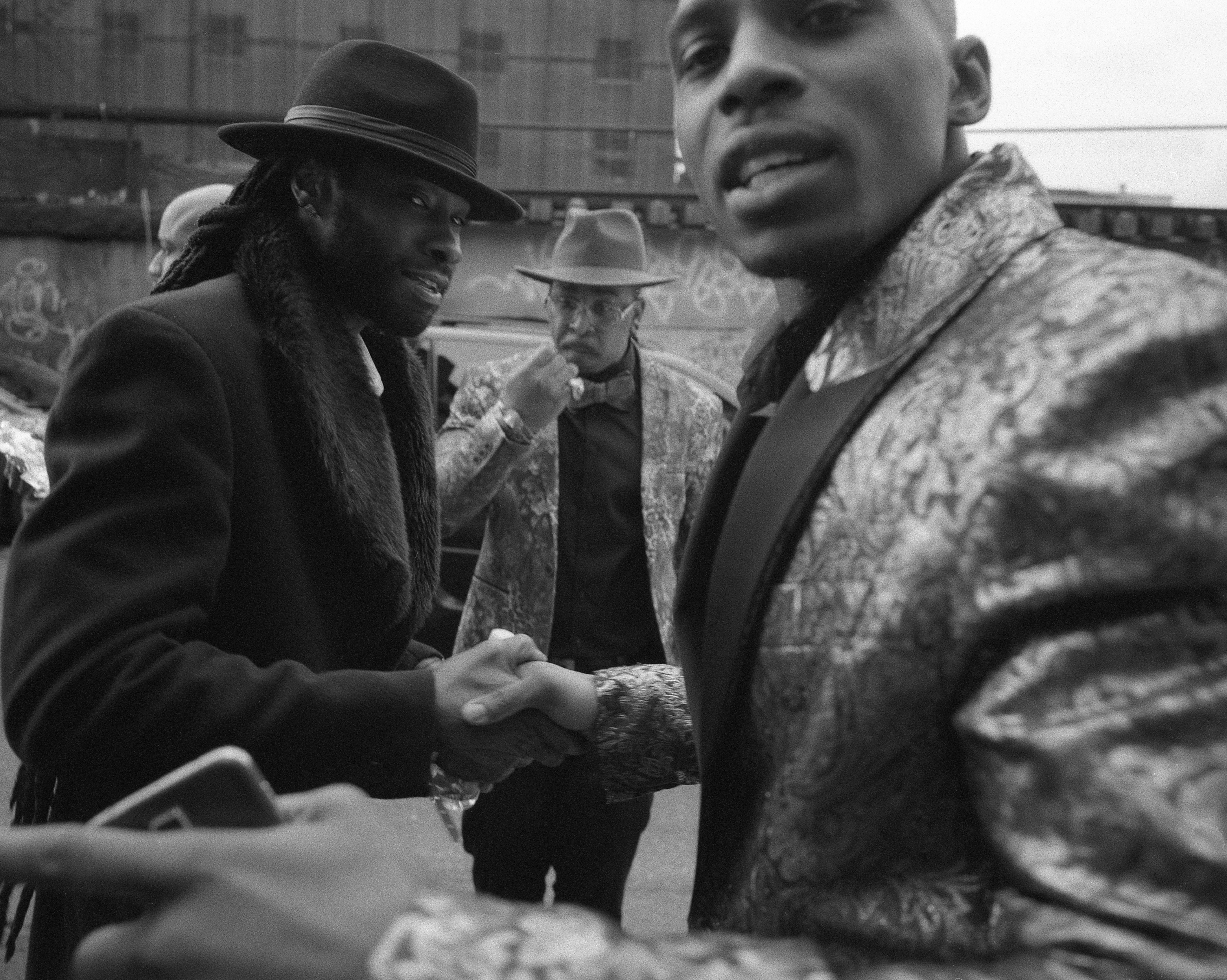
p.s. This is an incredible photo:
Share:
-
This site uses cookies to help personalise content, tailor your experience and to keep you logged in if you register.
By continuing to use this site, you are consenting to our use of cookies.