Bill Pierce
Well-known
In past threads there has been significant interest in black and white. Both here and on other websites you often hear that digital images can not be made to emulate silver images. As on official “old person” who has a lot of b&w images on film and a lot of digital images that look better in black-and-white, I have an interest in making b&w prints from digital files that can sit next to those from film images and look much the same. Here’s how I do it.
I create a low contrast file, usually in Lightroom and usually with the film and highlight sliders set to maximize shadow and highlight detail. Then I import it into Silver Efex Pro. But I don’t use one of the film emulations. Instead, I run it through one of the high structure presets and then make any necessary adjustments in the global adjustments panel. The match to a convention film to silver print is pretty good. When I’m showing people prints, I don’t normally ask if folks think the print is inkjet or silver. Most folks wouldn’t know what I was talking about. But I have asked some photographer friends, and one said the inkjet print looked like a very good silver print. That’s nice, but nicer is that all my black and white work has a consistent look.
Does anybody else have thoughts on making digital and film images look similar in b&w prints? Is that consistency really even important to most folk?
Kai-san
Filmwaster
My question is: Why should I go through all this software fiddling when I can get the look I want straight from the film?
robert blu
quiet photographer
For me consistency is important within a defined project. Different projects could have different look, grainy or smooth, high or low cotrast, etc. If for a project I think digital and film will be mixed I select a film which has somehow a "clean" look, like Ilford Delta.
Silver Efex Pro is for sure a good tool to achieve the visual result we desire. I use presets only as starting point but than I "develop" the file, the image as I was used to do in the wet darkroom so many years ago. A little dodging here, more burning on that side...
It work for me. LR or PS for this. Trying to keep it simple.
Timmyjoe
Mentor
Is that consistency really even important to most folk?
As a fellow "old person" I think this is an issue for folks who "grew up in the darkroom" as it were. When I think B&W prints I think of the silver ones we got from the darkroom and chemicals. My kids, and their friends, couldn't care less, to them a B&W print is one that doesn't have color in it. I use a process similar to yours Bill, but most folks I know, ("civilians", i.e. non-photographers) don't notice the difference and couldn't care less. So if I do make a B&W print, I'll go thru the trouble you described, if I'm making it for myself, otherwise, not so much.
Best,
-Tim
Dogman
Mentor
My original foundation for the look of B&W prints came from the darkroom. When we talk about monochrome photographs today I think most people are thinking of a wide tonal range from deep black to stark white with a full range of greys in between, held together by the silver grains of the film. But over the years (I'm officially old too) I saw a multitude of different looks people were coming up with--all out of the darkroom. I don't think there's a single silver print look. Weston vs Moriyama. Giacomelli vs Strand. Magic in all flavors.
How you arrive at the look you want is of no consequence to anyone except a handful of photographers and maybe some gallerists or curators, as Tim points out above. My personal way of getting the look I like is simple. Shoot JPEGs in B&W, let the camera do the drudge work of processing the image, take the file into Lightroom and work with each image individually. I don't use any presets, extra software or have any formulas. I just look at the picture and fiddle with it until it looks good to me. Then I print it on matte surface rag paper.
My pictures are simple too. My wife opening mail one day last week:


xayraa33
rangefinder user and fancier
Maybe just enjoy the results of all digital B&W prints for what they are and they don't have to look like analog film and bromide print paper prints...in time everything is accepted and becomes nostalgic. I don't think many wet collodion process photographers wanted to emulate the defunct daguerreotype image in their albumen prints in the 19th century.
Vince Lupo
Untitled
I had a show about 8 years ago in Annapolis, and as I was hanging up the framed work a photography instructor passed by and had a look. She did a lot of work for National Geographic and was an 'old timer' like me, so she'd certainly seen a lot of prints in her time. She pressed her nose against a few of the framed prints and asked if they were 'darkroom prints'. Nope, all inkjets -- and this was 2013, so the technology has moved along a bit since then.
Although I don't think I obsess over whether a given inkjet print of mine looks like a 'darkroom print', I think this one likely comes the closest. Taken in 2013, I still like it.

DC Gallery 2013-2b by Vince Lupo, on Flickr
The one thing I have learned when using any of the software programs (especially Silver Efex) is to not go crazy with the 'structure' slider. Actually if anything I go negative structure or I don't touch it at all. Too much structure hurts my eyes.
Although I don't think I obsess over whether a given inkjet print of mine looks like a 'darkroom print', I think this one likely comes the closest. Taken in 2013, I still like it.

DC Gallery 2013-2b by Vince Lupo, on Flickr
The one thing I have learned when using any of the software programs (especially Silver Efex) is to not go crazy with the 'structure' slider. Actually if anything I go negative structure or I don't touch it at all. Too much structure hurts my eyes.
Erik van Straten
Mentor
The most important factors of photo printing for me are its durability and the possibility of split grade printing.
The shelf life of silver/gelatin printing is the longest.
I've never heard of digital split grade printing - and I've never seen a digital split grade print - but it seems very likely to me that it exists.
Most digital prints I've seen damage very easily.
Many digital prints look dull, as if they came from a machine.
I think the silver/gelatin printing is dying.
Is it possible to make silver/gelatin prints from digital photos? It doesn't seem impossible to me, but you'll need a device that can project digital photos. I've never heard of such a device.
gelatin silver print (heliar classic 50mm f1.5) leica mp
Erik.

Vince Lupo
Untitled
The most important factors of photo printing for me are its durability and the possibility of split grade printing.
The shelf life of silver/gelatin printing is the longest.
I've never heard of digital split grade printing - and I've never seen a digital split grade print - but it seems very likely to me that it exists.
Erik - just confirm - when you refer to split grade printing, you’re referring to using multigrade paper and exposing various areas of a print using different filters correct? So if one area could use more contrast you’d stick a 4 or a 5 filter in the enlarger, then if another area needs less contrast then you switch to a 00 filter etc. Or start with a 00 for the overall print and to control highlight detail, then switch to a higher-contrast filter to punch up the blacks etc. You can certainly do that in Adobe Camera RAW, and if you need to adjust the contrast of a specific area of an image, you can simply ‘lasso’ that area in PhotoShop, feather it, then take it back into Adobe Camera RAW and make the necessary adjustments. Or you can make two separate copies of the same image (one higher contrast, one lower), then through layers and even the ‘erase’ tool you can get it to the way you want it to look. Lots of options, I think. Not sure about other programs besides PhotoShop and Adobe Camera RAW.
I don’t know that I’d personally be able to say “that’s a split-grade print” just by looking at it. Hopefully if the printer did the job right it should be pretty seamless, at least I’d hope. I did plenty of split-grade printing in the darkroom and I can’t really say that the results jumped out at me as being something out of the ordinary. Just a well-exposed, well-developed and well-printed image, at least I think so, and I’d think that would apply to both film and digital. Maybe someone with more seasoned eyes than mine would be able to tell the difference.
I’ve done a fair bit of print judging for one of the local camera clubs over the years and the one thing I find in digital prints that’s a common habit is over-sharpening, plus the over-use of the structure slide and of course my personal fave, HDR. If sharp is good, then super crazy-sharp is better (and I’m pretty sure that they don’t have replicating darkroom prints on their minds, but I could be wrong). I’m one of those print judges who likes to stick his nose against a print, and I have to say that most times I’m disappointed, but this is strictly my personal weirdness. Funny but I haven’t been asked to do any print judging in a while….hmm
And I suppose if longevity is most important, then platinum-palladium would the way to go. Not sure about carbon.
On a totally different note (hopefully not going too far afield here), one thing that isn’t discussed very much in the darkroom/digital debate is the potential effects of exposure to darkroom chemicals. I don’t know if there have been any definitive studies done on possible adverse effects, health-wise, but I suppose if one wishes to avoid being exposed to chemicals that digital shooting and printing is an alternative. I’ve been asked about it more than a few times this year as I’ve gone through a health issue that one might logically associate with exposure to chemicals. I always say no, but who really knows for sure?
Ko.Fe.
Lenses 35/21 Gears 46/20
Every time, I remember bw film cost of these days and how much time it takes to get it on DR print, I'm OK with digital BW as it is  .
.
But I really enjoying cameras with good sensors for next to straight colors now. Canon, older Ricoh, Olympus and CCD Leica (sometimes).
But I really enjoying cameras with good sensors for next to straight colors now. Canon, older Ricoh, Olympus and CCD Leica (sometimes).
Chriscrawfordphoto
Real Men Shoot Film.
Something that no one mentioned is Bill's technique. I've never heard of doing BW conversions the way he described, so I tried it.
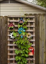
Original color image
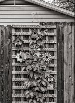
B&W version made using Bill's technique. This is one of the best B&W conversions from a color image that I have done. It has wonderful midtone contrast without losing highlight and shadow detail. Most B&W images from color originals look too flat in the midtones.
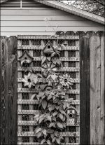
Bill's technique does have one limitation: You have to have the Silver Efex Pro plugin, which is expensive. So I made this one using a modified form of Bill's technique that uses only Lightroom. Instead of using Silver Efex Pro to increase the image contrast, I used the "Clarity" control in Lightroom to increase midtone contrast, then used the "Contrast" control to adjust overall image contrast. A little bit of a curves adjustment was used to lighten it slightly, too. The look is different than the version using Silver Efex, but both look good.

Original color image

B&W version made using Bill's technique. This is one of the best B&W conversions from a color image that I have done. It has wonderful midtone contrast without losing highlight and shadow detail. Most B&W images from color originals look too flat in the midtones.

Bill's technique does have one limitation: You have to have the Silver Efex Pro plugin, which is expensive. So I made this one using a modified form of Bill's technique that uses only Lightroom. Instead of using Silver Efex Pro to increase the image contrast, I used the "Clarity" control in Lightroom to increase midtone contrast, then used the "Contrast" control to adjust overall image contrast. A little bit of a curves adjustment was used to lighten it slightly, too. The look is different than the version using Silver Efex, but both look good.
agentlossing
Well-known
I have used the "flat original" technique before when importing into Silver Exef, but to be honest I'd kind of forgotten about it so this is a welcome reminder! It allows for a very close analogue to the way I scan my B&W film as flat TIFFs and edit them in LR to final. Of course when doing that, you don't need Silver Efex, because the midtones and film characteristics which SE is so good at replicating are already there.
I also get really passable B&W images out of my GR camera with Ricoh's B&W JPEG modes, which can be highly customized.
I also get really passable B&W images out of my GR camera with Ricoh's B&W JPEG modes, which can be highly customized.
Chriscrawfordphoto
Real Men Shoot Film.
My question is: Why should I go through all this software fiddling when I can get the look I want straight from the film?
Some people don't shoot film. If you're digital-only, Bill's technique is very good. Its also useful if you shoot both digital and film and happen to have a photo you shot on digital that you decide would have been better in B&W.
Erik van Straten
Mentor
Erik - just confirm - when you refer to split grade printing, you’re referring to using multigrade paper and exposing various areas of a print using different filters correct? So if one area could use more contrast you’d stick a 4 or a 5 filter in the enlarger, then if another area needs less contrast then you switch to a 00 filter etc. Or start with a 00 for the overall print and to control highlight detail, then switch to a higher-contrast filter to punch up the blacks etc. You can certainly do that in Adobe Camera RAW, and if you need to adjust the contrast of a specific area of an image, you can simply ‘lasso’ that area in PhotoShop, feather it, then take it back into Adobe Camera RAW and make the necessary adjustments. Or you can make two separate copies of the same image (one higher contrast, one lower), then through layers and even the ‘erase’ tool you can get it to the way you want it to look. Lots of options, I think. Not sure about other programs besides PhotoShop and Adobe Camera RAW.
I don’t know that I’d personally be able to say “that’s a split-grade print” just by looking at it. Hopefully if the printer did the job right it should be pretty seamless, at least I’d hope. I did plenty of split-grade printing in the darkroom and I can’t really say that the results jumped out at me as being something out of the ordinary. Just a well-exposed, well-developed and well-printed image, at least I think so, and I’d think that would apply to both film and digital. Maybe someone with more seasoned eyes than mine would be able to tell the difference.
I’ve done a fair bit of print judging for one of the local camera clubs over the years and the one thing I find in digital prints that’s a common habit is over-sharpening, plus the over-use of the structure slide and of course my personal fave, HDR. If sharp is good, then super crazy-sharp is better (and I’m pretty sure that they don’t have replicating darkroom prints on their minds, but I could be wrong). I’m one of those print judges who likes to stick his nose against a print, and I have to say that most times I’m disappointed, but this is strictly my personal weirdness. Funny but I haven’t been asked to do any print judging in a while….hmm
And I suppose if longevity is most important, then platinum-palladium would the way to go. Not sure about carbon.
On a totally different note (hopefully not going too far afield here), one thing that isn’t discussed very much in the darkroom/digital debate is the potential effects of exposure to darkroom chemicals. I don’t know if there have been any definitive studies done on possible adverse effects, health-wise, but I suppose if one wishes to avoid being exposed to chemicals that digital shooting and printing is an alternative. I’ve been asked about it more than a few times this year as I’ve gone through a health issue that one might logically associate with exposure to chemicals. I always say no, but who really knows for sure?
Thank you, Vince, for this information. By "split grade printing" I don't mean the partial exposure of the multigrade photo paper with different filters, as well the exposure of the entire photo with only two different filters, namely the filters that accomplish the gradations 00 and 5 of the Ilford multigrade system. So one part of the exposure time is done with filter 00 and the other part is with filter 5. By varying the two exposure times the best gradation for the entire photo can be achieved. This way of working was originally the intention of the Ilford multigrade paper (it is a two layer paper) and is still used by many professional printers. Most people use the system however completely wrong: they use only one filter. The system has ten filters, but you only need two: the filters 00 and 5. The other filters are completely redundant. The paper consists of two different sensitive layers, one layer responding to the filter 00 (soft) and the other layer to the filter 5 (hard). So by varying the two exposure times for the two filters every gradation can be obtained. Dodging and burning are then completely useless.
The paper I use is silver gelatin white glossy.
Drying the paper is a science in itself. If you are interested, I can tell you how to do it.
I've been working in the darkroom since I was 12. I am now 67, but I've never had any health problems related to the chemicals.
All the best, Vince, and many thanks. I love your work. Erik.
gelatin silver print (heliar classic 50mm f1.5) leica mp

Chriscrawfordphoto
Real Men Shoot Film.
I've been working in the darkroom since I was 12. I am now 67, but I've never had any health problems related to the chemicals.
I have. I had to stop working in the darkroom more than 20 years ago because I was having serious respiratory problems from breathing chemical fumes. My darkroom had an excellent ventilation system to remove the fumes and it wasn't enough. I was just doing B&W printing.
I personally know two photographers who died of cancer after years of doing Cibachrome printing. That stuff was really nasty. One of them was in his late 30s, the other in his 50s.
Erik van Straten
Mentor
I have. I had to stop working in the darkroom more than 20 years ago because I was having serious respiratory problems from breathing chemical fumes. My darkroom had an excellent ventilation system to remove the fumes and it wasn't enough. I was just doing B&W printing.
I personally know two photographers who died of cancer after years of doing Cibachrome printing. That stuff was really nasty. One of them was in his late 30s, the other in his 50s.
Yes, color photography is bad for your health.
The chemicals I am using are almost all produced in Germany. Germany has the strictest regulations regarding chemical products in the world. I'm not so sure that all those China-made digital devices used for digital photography are good for health. I don't think so, but I'm not sure of course.
Erik.
Vince Lupo
Untitled
Thank you, Vince, for this information. By "split grade printing" I don't mean the partial exposure of the multigrade photo paper with different filters, as well the exposure of the entire photo with only two different filters, namely the filters that accomplish the gradations 00 and 5 of the Ilford multigrade system. So one part of the exposure time is done with filter 00 and the other part is with filter 5. By varying the two exposure times the best gradation for the entire photo can be achieved. This way of working was originally the intention of the Ilford multigrade paper (it is a two layer paper) and is still used by many professional printers. Most people use the system however completely wrong: they use only one filter. The system has ten filters, but you only need two: the filters 00 and 5. The other filters are completely redundant. The paper consists of two different sensitive layers, one layer responding to the filter 00 (soft) and the other layer to the filter 5 (hard). So by varying the two exposure times for the two filters every gradation can be obtained. Dodging and burning are then completely useless.
The paper I use is silver gelatin white glossy.
Drying the paper is a science in itself. If you are interested, I can tell you how to do it.
I've been working in the darkroom since I was 12. I am now 67, but I've never had any health problems related to the chemicals.
All the best, Vince, and many thanks. I love your work. Erik.
Many thanks Erik -- I do appreciate it. It's nice to know that there are many paths we can take to achieve what we consider to be a pleasing result.
Bill Pierce
Well-known
I should add to this thread the fact that for digital photographers printing in black-and-white it is worth taking a look at PhotoNinja. Its black-and-white presets have much of that "film" look and its color work is on a par with the other major image processing programs. I have always been at a loss why it does not receive as much attention as some of the other competitors to Lightroom/Photoshop and Capture One. Perhaps it is because its controls are somewhat different from other programs. But it is an excellent all around program that in my opinion excels in b&w department.
Chriscrawfordphoto
Real Men Shoot Film.
I should add to this thread the fact that for digital photographers printing in black-and-white it is worth taking a look at PhotoNinja. Its black-and-white presets have much of that "film" look and its color work is on a par with the other major image processing programs. I have always been at a loss why it does not receive as much attention as some of the other competitors to Lightroom/Photoshop and Capture One. Perhaps it is because its controls are somewhat different from other programs. But it is an excellent all around program that in my opinion excels in b&w department.
I tried Photo Ninja many years ago when it first came out and was impressed with the image quality it produced. A lot of photographers don't realize that raw conversion software makes a big difference in image resolution. Adobe has always done the best job of demosaicing the image from the sensor to get maximum fine detail resolution. Photo Ninja is one of only two RAW converters I have tried that equal Adobe in that regard (Skylum Luminar is the other). Photo Ninja's high-ISO noise reduction was great, as was its ability to save detail in overexposed highlights.
For some reason, they stopped updating it for several years after its release, so I never bought it. It seemed like orphaned software. I see now that they began updating it again. Would be worth looking at again; it would be a good choice for those who don't want to pay the monthly fee to Adobe. As I mentioned before, I liked the image quality from Skylum Luminar, but I found it hard to use. Photo Ninja was easy to use.
Evergreen States
Pierre Saget (they/them)
I haven't made prints since 2013. I'd like to get back to making them but I'd need a new printer and space to store the prints.
I look back at a lot of my old digital photos from that time and recoil at how overprocessed they are. For the past five years or so I've been pulling back the contrast and clarity in my pictures. I still like deep blacks and don't care about losing details I deem unnecessary. I haven't cared about emulating film either... unless the picture calls for it. I'll give you a couple recent examples of pictures that demanded a film look.
This first one I took on 7 October with a Fuji X-Pro3 and 23mm ƒ/2 walking in my neighborhood. I manipulated contrast sliders, used curves and cranked up the clarity in Capture One.
http:// Untitled by Pierre Saget, on Flickr
I took this one on 13 August, 2021 at a roadside lookout between Squamish and Whistler. It was nearing sunset and the air was filled with smoke from a wildfire to the northeast. I brought this into SilverEfex when I got home because I wanted grain to stamp the smoke with texture and make the peaks in the distance more etherial. I eventually settled on either the TMAX 3200 or Delta 3200 preset from which I made my own adjustments. I shot it with a Fuji X-Pro1 and 35mm ƒ/1.4 lens.
 Tantalus Lookout by Pierre Saget, on Flickr
Both of these look exactly as I intended when I took them - at least on a screen.
I look back at a lot of my old digital photos from that time and recoil at how overprocessed they are. For the past five years or so I've been pulling back the contrast and clarity in my pictures. I still like deep blacks and don't care about losing details I deem unnecessary. I haven't cared about emulating film either... unless the picture calls for it. I'll give you a couple recent examples of pictures that demanded a film look.
This first one I took on 7 October with a Fuji X-Pro3 and 23mm ƒ/2 walking in my neighborhood. I manipulated contrast sliders, used curves and cranked up the clarity in Capture One.
http://
 Untitled by Pierre Saget, on Flickr
I took this one on 13 August, 2021 at a roadside lookout between Squamish and Whistler. It was nearing sunset and the air was filled with smoke from a wildfire to the northeast. I brought this into SilverEfex when I got home because I wanted grain to stamp the smoke with texture and make the peaks in the distance more etherial. I eventually settled on either the TMAX 3200 or Delta 3200 preset from which I made my own adjustments. I shot it with a Fuji X-Pro1 and 35mm ƒ/1.4 lens.
 Tantalus Lookout by Pierre Saget, on Flickr
Both of these look exactly as I intended when I took them - at least on a screen.
Share:
-
This site uses cookies to help personalise content, tailor your experience and to keep you logged in if you register.
By continuing to use this site, you are consenting to our use of cookies.

