Darkness prevails.

Yes, indeed. But the Mac default on a lot of third party calibration device software, including Eye-One and Profiler for the Eye-One device, is still Gamma 1.8. At least it was in December when I reinstalled those software on my new Mac.

Marty
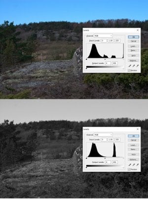
Yesterday my Mac told me that 1.8 is OK if you are working in a dimmed light while in normal office light 2.2 works better.
X-rite Display Pro needs an upgrade to work with Sonoma. Waiting.
 
I still don’t understand the relationship between a display’s gamma versus nits (or if there is one)?


As I understand it, the gamma setting affects the tonal curve used to display images on the screen. Brightness affects all tones, but gamma affects the position of the mid-tones in relation to the whites and blacks (which are not affected by the gamma setting). I may be wrong on that; it is hard to find info on this, but the little I have found seems to point to that definition.
 
As I understand it, the gamma setting affects the tonal curve used to display images on the screen. Brightness affects all tones, but gamma affects the position of the mid-tones in relation to the whites and blacks (which are not affected by the gamma setting). I may be wrong on that; it is hard to find info on this, but the little I have found seems to point to that definition.
That makes sense Chris. (y)
 
I still don’t understand the relationship between a display’s gamma versus nits (or if there is one)?

There isn’t a relationship. One is brightness, one is contrast.

Most calibration devices give you a brightness reading in cd/m² or cm².

Marty
 
Last edited:
The easiest way to understand it is to go to the monitor preferences, play with it, and see what happens.
 
It would help if you could link one of the images you perceive as dark so that others can look on their devices and give you their impression
 
as commented in the other thread, the foreground looks underexposed/ does not seem to correlate with a clear sky, but the shadow details are there. The foreground itself is low contrast/fairly monotone.
 
I see on the third page it was figured out to look at the problem, not just describing it. :)
 
Your opinion?

AndersG is asking about his linked photo.

Link provides entire page with photos. They looks not affected by monitor brightness to me. Just how it is exposed, processed. With sky been in priority. I do same (trying to) and work on darks in PP, but nothing crazy as trying to show things in the deep shadows. I'm not fan of reincarnated HDR stile of images, with unnaturally highlighted objects in the shadows.
 
The recent three posts are about this image by me:
Message # 73 in the thread about rocks. (It might be somewhat underexposed.)

My screen is old and not calibrated so I don't know how it looks to others.
Another image by me in that thread Message #69 this looks nearly overexposed on my screen but it was a bright day.
I hope you don't mind my using your image here, but since you asked: to me it looks ok. It is a little low contrast though. However I decided I want to check something. I put your image into PS and looked at the histogram. Although most of the values are in the low end, it did show that we have a full span of values from white to black. However, sometimes color images can be deceiving, so I desaturated the image and looked again. Now we get a different story. The image does not contain a full range of value. If you set the color image according to the histogram for the monochrome image, you will get a result that has what looks like "normal" contrast.
 

Attachments

  • levels.jpg
    levels.jpg
    608.2 KB · Views: 13
Back
Top