
daveleo
what?
"extreme" processing for a portrait . . .
.

.
kbg32
neo-romanticist
Here is a great article on Eugene Smith and his thoughts on image making.
http://petapixel.com/2015/01/26/w-eugene-smith-considered-darkroom-work-90-photos-creation-process/
I had the great fortune of attending a talk he gave on his work back in 1976. Growing up, I was never under the impression the an image was finished until you put it through the darkroom. This article is a testament to the deep affinity Smith had for printmaking and what the final image should be. The negative was only the starting part. The print was where you put your heart and soul into it. After spending many years in the darkroom printing for myself and for others, I find this quite analogous, though many will not, to working with RAW files on the computer.
airfrogusmc
Mentor
Thanks for the link Keith. And Adams said this:
"The negative is the equivalent of the composer's score, and the print the performance." - Ansel Adams
I don't think much has changed in that regard with digital. I think of it as a process starting with the capture and not being complete until the print. The entire process is important to the final piece. So post production or the darkroom is a very important step in the process. It is just as important as the capture.
As far as heavy manipulation of images it has been around since the very early days in photography. Henry Peach Robinson quickly comes to mind.
airfrogusmc
Mentor
I have a thing for symetry, so a lot of my shots go thru a fair amount of post processing.


Reminds me of the work of John Paul Caponigro
http://www.johnpaulcaponigro.com/pdfs/Wake.pdf
kbg32
neo-romanticist
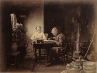
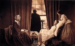
Quite right Allen. Unless someone discovers some unknown photographer, Henry Peach Robinson was the very first photographer to use combination printing, the combining of different negatives, to form the final image.
The first image was a combination of 6 separate negatives. Quite a feat in those days!
The first image was a combination of 6 separate negatives. Quite a feat in those days!
Attachments
charjohncarter
Mentor
I've always like the way you do you images whether extreme or not so extreme. I'm, I guess, a old fashioned photo guy. I do lots of post processing when I take a low contrast image on a roll that I intend to develop for full sun. But they still come out looking pretty straight.
By the way, how do you copy and paste from Flickr now?
By the way, how do you copy and paste from Flickr now?
hitmanh
dum de dum de doo
Some excellent images in this thread. Getting away from the idea that an image must be an accurate representaton of the original can be incredibly liberating.


burancap
Mentor
LOVE both of those! ^
PhotoMat
Well-known
I'll throw one into the mix. An obvious HDR shot, but given the contrast range of the scene, there was no other option than to blend multiple exposures. That being said, I still kind of like it.

Meade Hotel, Bannack State Park, MT
Fuji X-Pro 1 w/14mm XF lens
Meade Hotel, Bannack State Park, MT
Fuji X-Pro 1 w/14mm XF lens
rwintle
Scientist by day
By the way, how do you copy and paste from Flickr now?
Go to any photo page.
At the bottom right are some icons. Choose the one that looks like a bendy
outlined arrow pointing to the right. This opens up a "sharing" popup.
Under "code", choose BBCode. Pick your favourite size from the dropdown menu. Copy the resulting code and paste here in RFF.
")
Caveats:
1) sometimes the code isn't highlighted; choosing a different size then choosing the size you want again results in it all being highlighted by default. Better than click-dragging to select it all.
2) when you paste the BBCode, stupid Flickr puts the title information "dangling" next to the photo instead of underneath it. An extra line break takes care of this.
I love it when Flickr makes things way more complicated than they need to be. :bang:
[now back to your regularly scheduled thread]
charjohncarter
Mentor
Go to any photo page.
At the bottom right are some icons. Choose the one that looks like a bendy
outlined arrow pointing to the right. This opens up a "sharing" popup.
Under "code", choose BBCode. Pick your favourite size from the dropdown menu. Copy the resulting code and paste here in RFF.
Caveats:
1) sometimes the code isn't highlighted; choosing a different size then choosing the size you want again results in it all being highlighted by default. Better than click-dragging to select it all.
2) when you paste the BBCode, stupid Flickr puts the title information "dangling" next to the photo instead of underneath it. An extra line break takes care of this.
I love it when Flickr makes things way more complicated than they need to be. :bang:
[now back to your regularly scheduled thread]
Thanks you, I tried something like that but it didn't work. But again thanks I'll use your instructions and see.
CMur12
Well-known
Digital photography allows a level of plasticity close to that of painting and other arts. I get this intellectually, by my old aesthetic associations with photography still rebel. Even so, I see some images in this thread that I like.
(Reminds me of when I was a young man, living 2000 miles/3000 km up the Amazon. An old woman, telling me it was hard at her age to change her ways, said, "It's hard to untwist an old tree."
- Murray
(Reminds me of when I was a young man, living 2000 miles/3000 km up the Amazon. An old woman, telling me it was hard at her age to change her ways, said, "It's hard to untwist an old tree."
- Murray
peterm1
Mentor
Here are a couple of post processed images where I was just experimenting with texture overlays, blurs, vignettes and the like applied to city skylines. I was inspired at the time by a series of paintings made by 19th century painter James Whistler.
https://www.google.com.au/search?q=...3EYn98QWDloD4CQ&ved=0CD0QsAQ&biw=1920&bih=845
It is interesting that one of the following two turned out to have what I consider to be a very "bleak" mood and the other a quite warm and sensitive one. See if you can guess which is which.
 City Nocturne 3 by yoyomaoz, on Flickr
 City Nocturne 2 by yoyomaoz, on Flickr
The final one in my series. While I like the others better in some ways I think this comes closer to Whistlers series.
 City Nocturne by yoyomaoz, on Flickr
https://www.google.com.au/search?q=...3EYn98QWDloD4CQ&ved=0CD0QsAQ&biw=1920&bih=845
It is interesting that one of the following two turned out to have what I consider to be a very "bleak" mood and the other a quite warm and sensitive one. See if you can guess which is which.
City Nocturne 3 by yoyomaoz, on FlickrCity Nocturne 2 by yoyomaoz, on FlickrThe final one in my series. While I like the others better in some ways I think this comes closer to Whistlers series.
City Nocturne by yoyomaoz, on FlickrLawrence Sheperd
Well-known
I have a thing for symetry, so a lot of my shots go thru a fair amount of post processing.
Very much like the symmetry of Atlanta artist Flournoy Holmes (of the famous Allman Brothers Band "Eat a Peach" album cover.)
fireblade
Vincenzo.
a little cross processing.


02Pilot
Malcontent
It is interesting to see what and how people choose to post-process. I decided to experiment a little bit myself, just to see if I could come up with anything satisfactory - I used (half-)frames from my Olympus PEN D3. Turns out I'm actually rather pleased with these, so I figured I'd add them here, since it was this thread that got me fooling around with them in the first place.


02Pilot
Malcontent
And a few more from the same batch:


thereabouts
Established
There are some great images on this thread. Many are really dealing with the enhancement of captured light in some way or another. The black and white ones, seem to add depth and contrast and the colour ones, 'play' with the individual colour tones. I also really like some of them which (appear to) have played with selective blurring, perhaps on individual channels.
One of mine.

Just to add to the mix, a before and after, which I discuss on this page a little bit.

One of mine.
Just to add to the mix, a before and after, which I discuss on this page a little bit.
OP...I'm not too freaky. I like hyper real HDR like this...
nsfw
http://rangefindercamera.tumblr.com/image/108383705449
Once in a while something like this...
http://rangefindercamera2.tumblr.com/image/110247943972
But most of the time just lite HDR or gritty...
http://rangefindercamera.tumblr.com/image/108385807039
http://familyicp.tumblr.com/image/93351476533
I have a thing for symetry, so a lot of my shots go thru a fair amount of post processing.
[/IMG]
Wow...freaky stuff...what an artist!
Share:
-
This site uses cookies to help personalise content, tailor your experience and to keep you logged in if you register.
By continuing to use this site, you are consenting to our use of cookies.