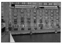
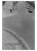
Erik van Straten
Mentor
gelatin silver print (color skopar 50mm f2.5) leica II
Erik.

Erik.

Erik van Straten
Mentor
gelatin silver print (color skopar 50mm f2.5) leica m2
Erik.

Erik.

p.giannakis
Pan Giannakis
gelatin silver print (color skopar 50mm f2.5) leica m3
Erik.
A fellow Leica user - i like the diagonial form of the structure inside the river.
Erik van Straten
Mentor
Thank you, Pan!
Erik.
Erik.
Dustfinder
Member
That's a nice thread. I bought mine 7 years ago for about half the price they are selling it now. Never used it much until I started buying film rangefinders. The most striking trait of this lenses is the nice background blur. It's so pleasing and consistent and allows the scene to have an enviromental context, so to speak, that IMO many other lenses lack. Maybe those others are too much on pinpoint sharpness, so their background is just messed up lines. The best I can explain is that most lenses have blurred backgrounds that seem like an astigmatic vision. I once saw some images from an old english made lens that exhibited something like that, so the expression "structured background blur" stuck on my mind. I think I understand that know.
Godfrey
somewhat colored
I bought my Color-Skopar 50/2.5 new in 2011 (sheesh, that long ago!) and it remains a favorite in my lens kit. I seem to recall that I bought it and one of the Black Label Bag "Oskar's One Day Bag Mark II" (from Photo Village in NYC) at the same time for about $500.
It's a lovely lens, fits well on all of the cameras I've used it with (Leica M4-2, M9, M-P 240, M-D 262, CL, Ricoh GXR). I'm sure it will do well on the Pixii as well when that arrives (next weekend, perhaps).
G
It's a lovely lens, fits well on all of the cameras I've used it with (Leica M4-2, M9, M-P 240, M-D 262, CL, Ricoh GXR). I'm sure it will do well on the Pixii as well when that arrives (next weekend, perhaps).
G
Erik van Straten
Mentor
That's a nice thread. I bought mine 7 years ago for about half the price they are selling it now. Never used it much until I started buying film rangefinders. The most striking trait of this lenses is the nice background blur. It's so pleasing and consistent and allows the scene to have an enviromental context, so to speak, that IMO many other lenses lack. Maybe those others are too much on pinpoint sharpness, so their background is just messed up lines. The best I can explain is that most lenses have blurred backgrounds that seem like an astigmatic vision. I once saw some images from an old english made lens that exhibited something like that, so the expression "structured background blur" stuck on my mind. I think I understand that know.
The Japanese call the background blur "bokeh". The bokeh of the Color Skopar 50mm f2.5 in LTM is very nice indeed.
Erik.
Godfrey
somewhat colored
The Japanese call the background blur "bokeh". The bokeh of the Color Skopar 50mm f2.5 in LTM is very nice indeed.
Erik.
Actually, the Japanese term "bokeh" refers to the visual quality of the out of focus blur, not the out of focus blur itself. Thus "good bokeh" and "bad bokeh" mean "the out of focus blur has a good quality to it" or vice versa. It's not ' background blur", it's the overall quality of a lens's out of focus blur in any part of the image.
The term has been much mis-used/mis-understood in recent times.
G
Erik van Straten
Mentor
Erik van Straten
Mentor
besk
Well-known
Nice! Particularly like the first one.
Erik van Straten
Mentor
besk
Well-known
Yes. The composition is great.
Erik van Straten
Mentor
Besk, many thanks!
Erik.
Erik.
Erik van Straten
Mentor
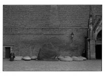
gelatin silver print (color skopar 50mm f2.5) leica lll
The Color Skopar 50mm f2.5 really has no distortion at all, better than the Summicron 50mm rigid (!)
https://www.flickr.com/photos/erik_v...87483/sizes/l/
Unsharpness caused by CLOUDFARE.
Erik.
The Color Skopar 50mm f2.5 really has no distortion at all, better than the Summicron 50mm rigid (!)
https://www.flickr.com/photos/erik_v...87483/sizes/l/
Unsharpness caused by CLOUDFARE.
Erik.

AAlfano
Well-known
gelatin silver print (color skopar 50mm f2.5) leica lll
The Color Skopar 50mm f2.5 really has no distortion at all, better than the Summicron 50mm rigid (!)
https://www.flickr.com/photos/erik_v...87483/sizes/l/
Unsharpness caused by CLOUDFARE.
Erik.
First time I've ever seen an interesting photo of a brick wall. Well done sir!
Erik van Straten
Mentor
Thank you, AAlfano!
Erik.
Erik.
Godfrey
somewhat colored
gelatin silver print (color skopar 50mm f2.5) leica lll
The Color Skopar 50mm f2.5 really has no distortion at all, better than the Summicron 50mm rigid (!)
https://www.flickr.com/photos/erik_v...87483/sizes/l/
Unsharpness caused by CLOUDFARE.
Erik.
My only criticism of this photo is that the tonal scale seems just a little too muted and dull. The geometry and spaces work beautifully; I'd like to see it printed up a small notch with just a little more contrast and a clean white somewhere.
G
Erik van Straten
Mentor
My only criticism of this photo is that the tonal scale seems just a little too muted and dull. The geometry and spaces work beautifully; I'd like to see it printed up a small notch with just a little more contrast and a clean white somewhere.
G
The border of the print is pure white (Ilford Multigrade FB Classic glossy). The tonality you see here is of course different from the tonality of the original print. The computer screens too are all different. There is no standard. But, as I see it now on my screen, the mood of the print reflects the Dutch wheather quite well.
Erik.
Godfrey
somewhat colored
The border of the print is pure white (Ilford Multigrade FB Classic glossy). The tonality you see here is of course different from the tonality of the original print. The computer screens too are all different. There is no standard. But, as I see it now on my screen, the mood of the print reflects the Dutch wheather quite well.
Erik.
Computer displays do differ by a lot, but there are standards that allow color management to do a reasonably high fidelity job. If you calibrate and profile your monitor and then apply the color profile tags in your JPEG images when you output them from your image processing app, most modern browsers will render the image pretty darn close to what showed on your original display, presuming that whomever is using the viewing system has calibrated and profile their display as well.
All my systems are set up with calibrated and profiled displays... With very little variance, what comes out of my printer looks virtually identical to what I see on the screen, whether it is scanned film, scanned prints, or digital capture originals. And what I see on other systems looks virtually identical as well. Similarly, my goal in rendering scanned original prints is to replicate on screen what the print looks like in my proofing box (controlled lighting and intensity for viewing prints).
And of course, if the display JPEG of your photo matches what you think it ought to be, then what I'd like to see isn't really important.
I like a little more range to the B&W tones in most images, but that's my aesthetic preference.
G
Share:
-
This site uses cookies to help personalise content, tailor your experience and to keep you logged in if you register.
By continuing to use this site, you are consenting to our use of cookies.


